
Qianke Medical
A shared identity across medical-equipment touchpoints
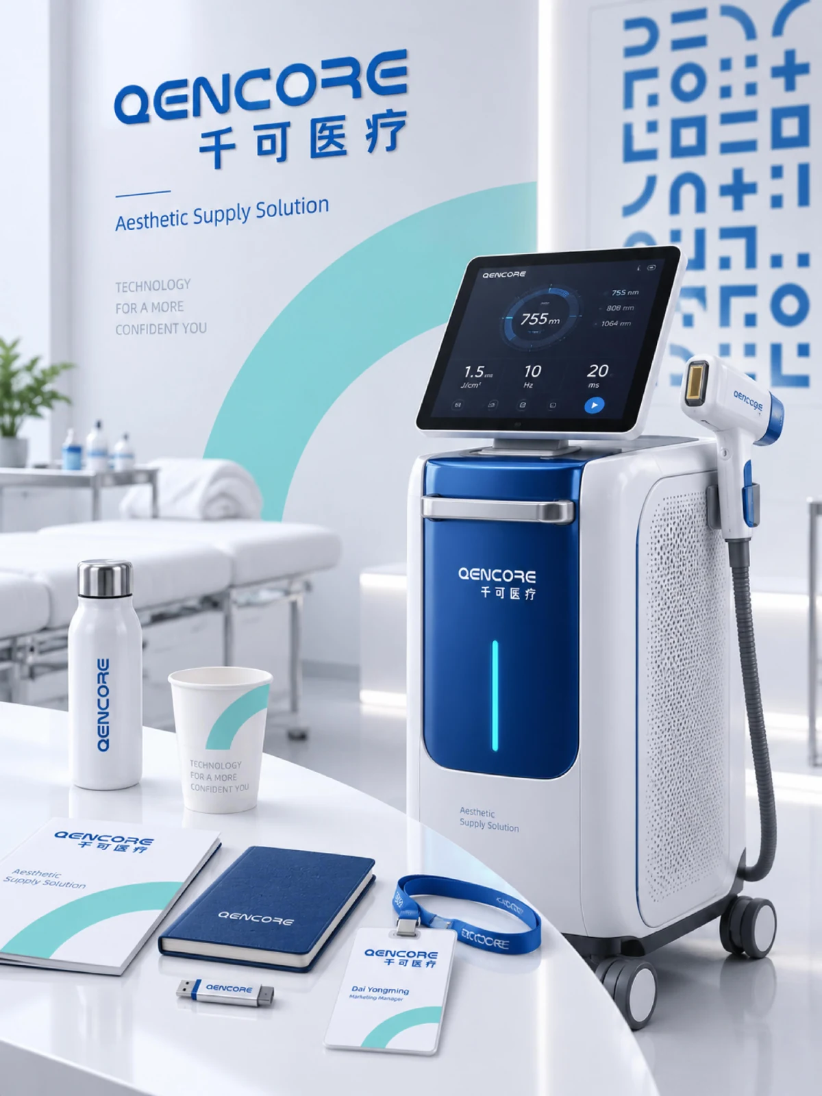
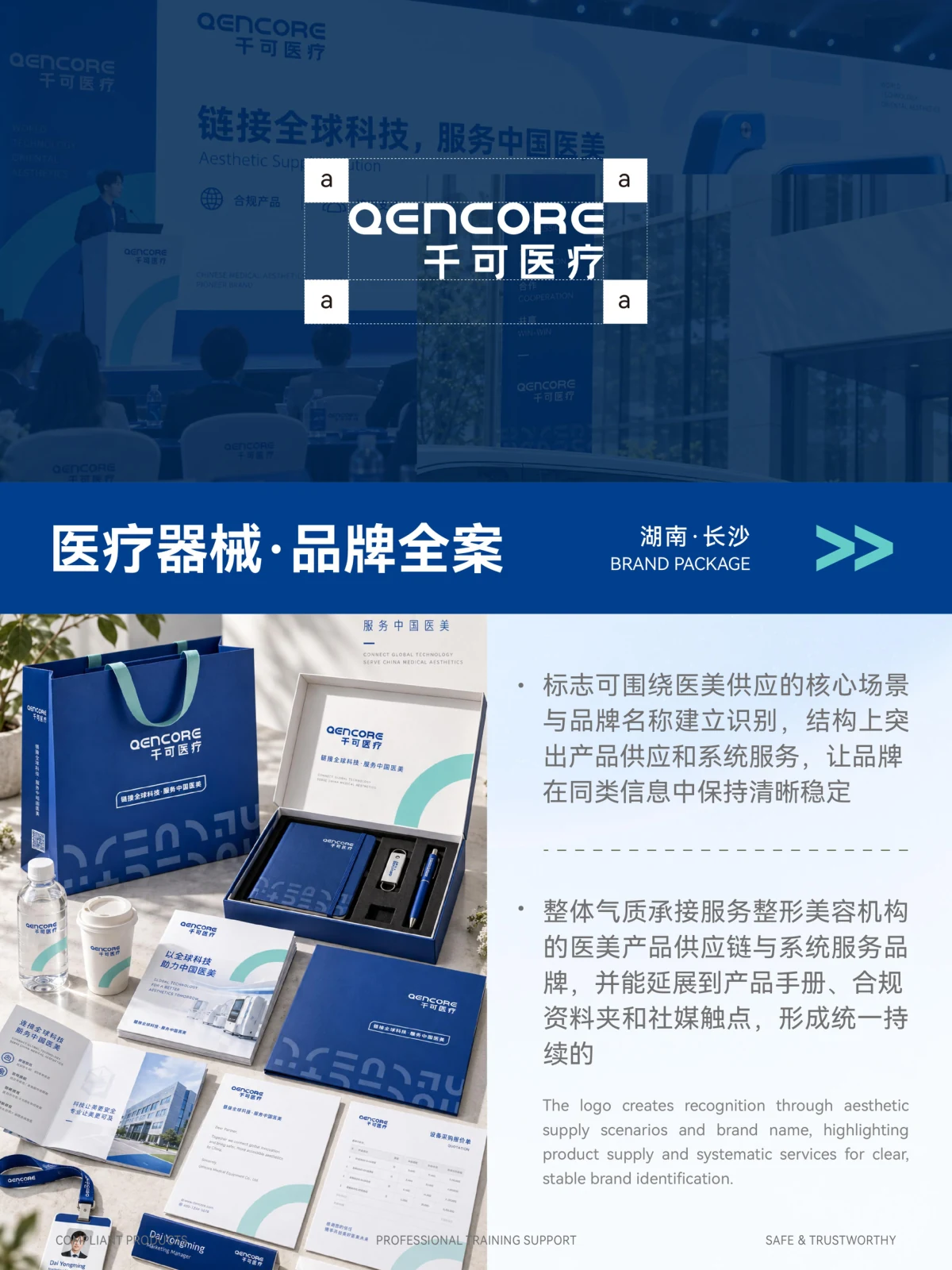
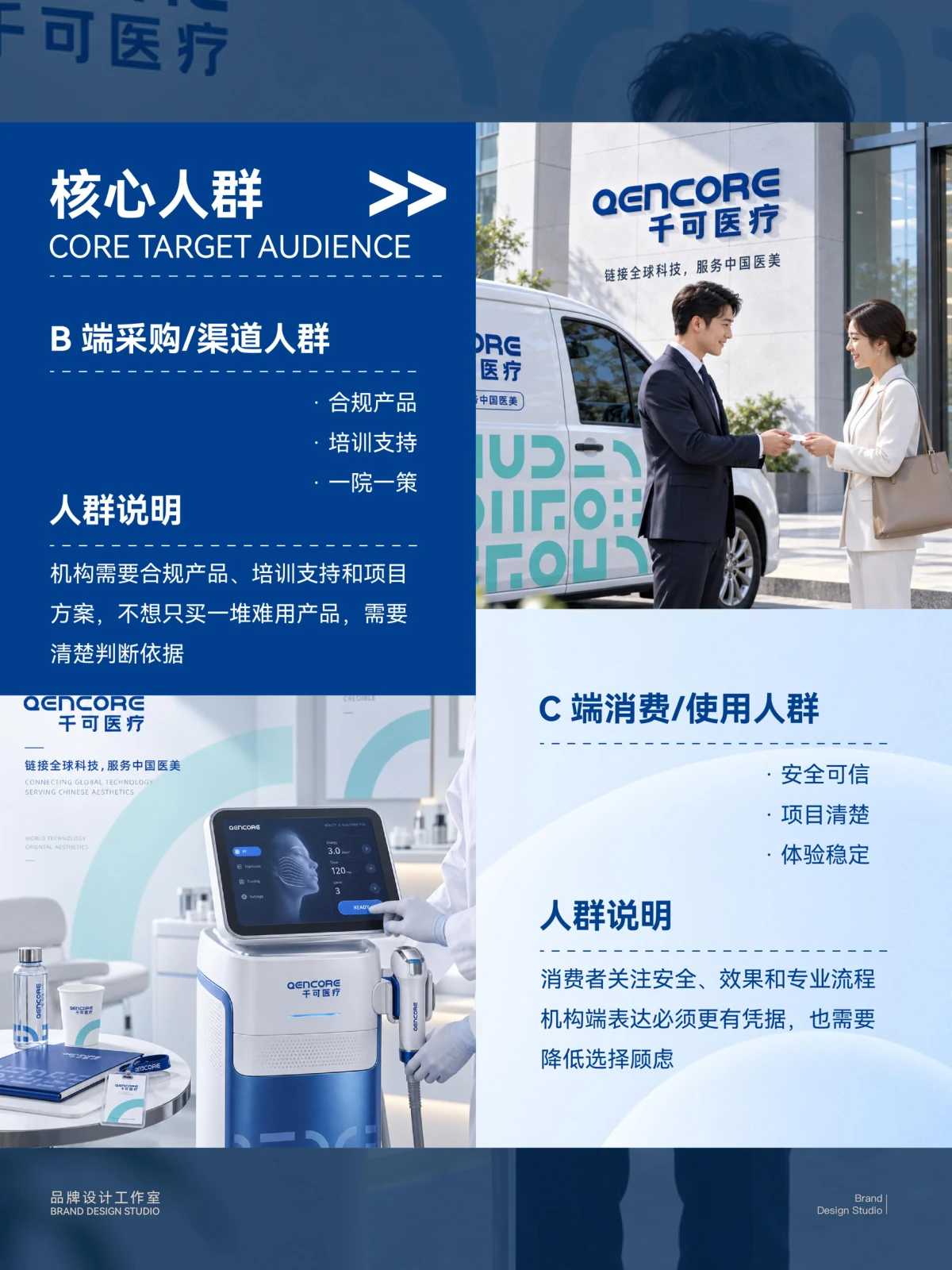
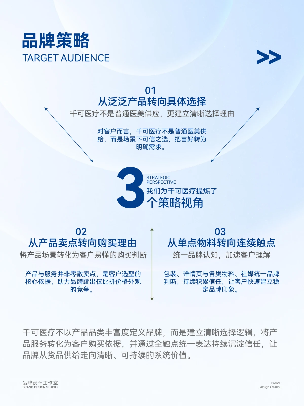
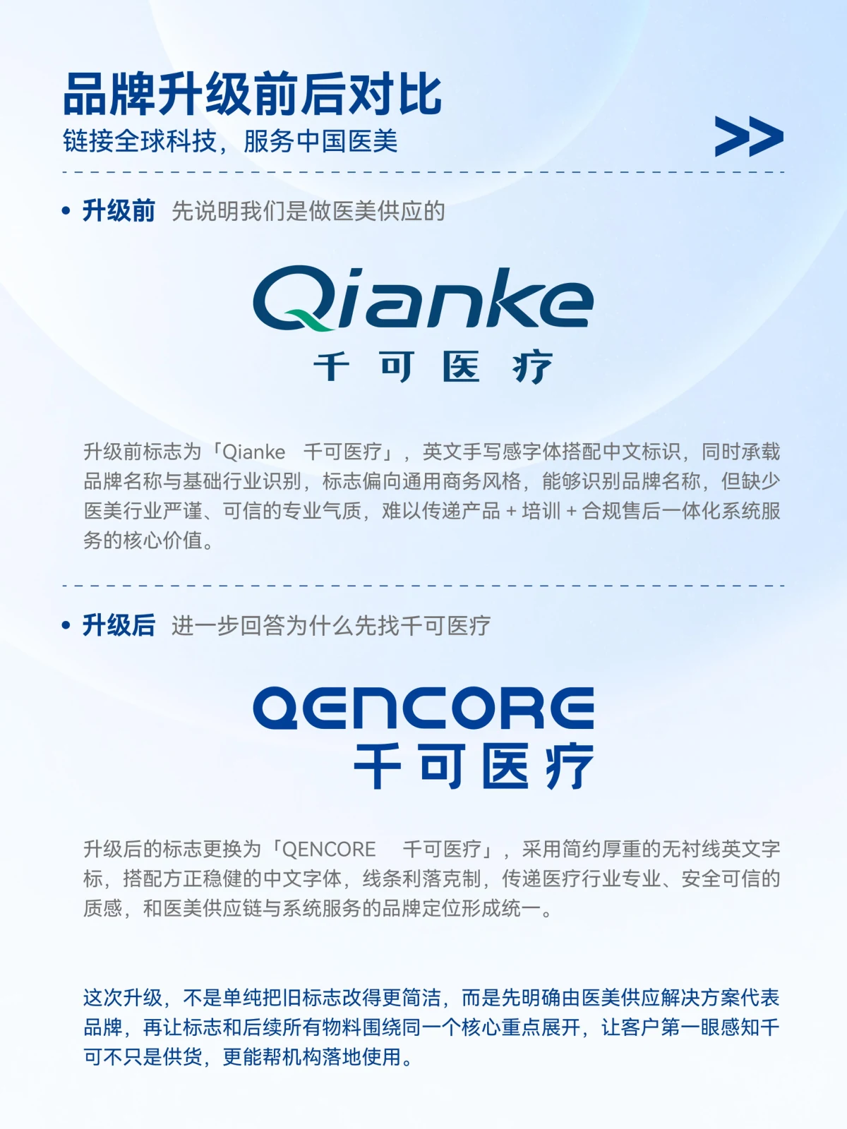
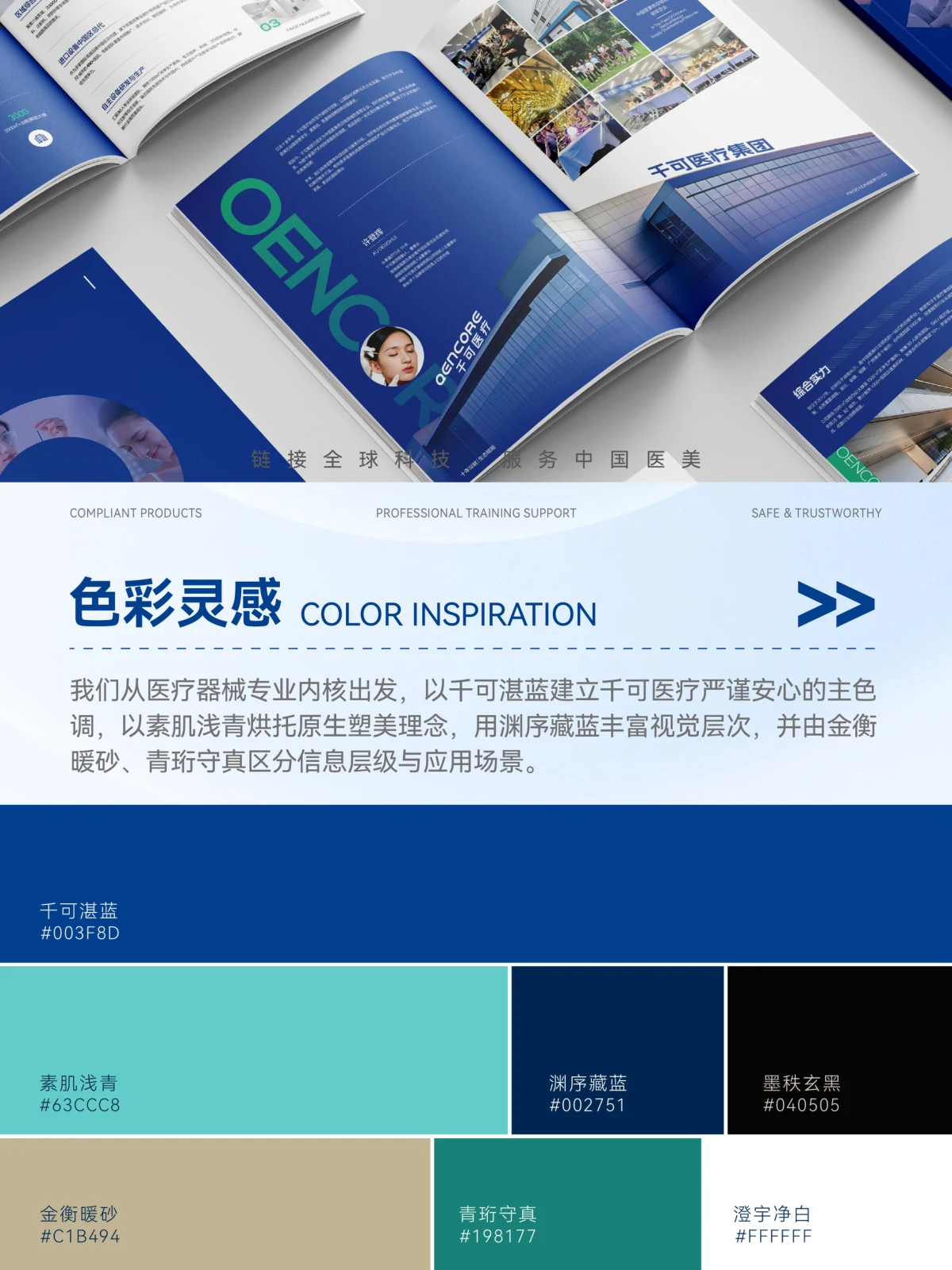
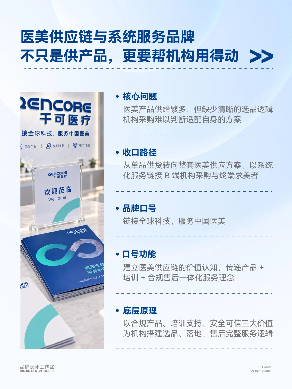
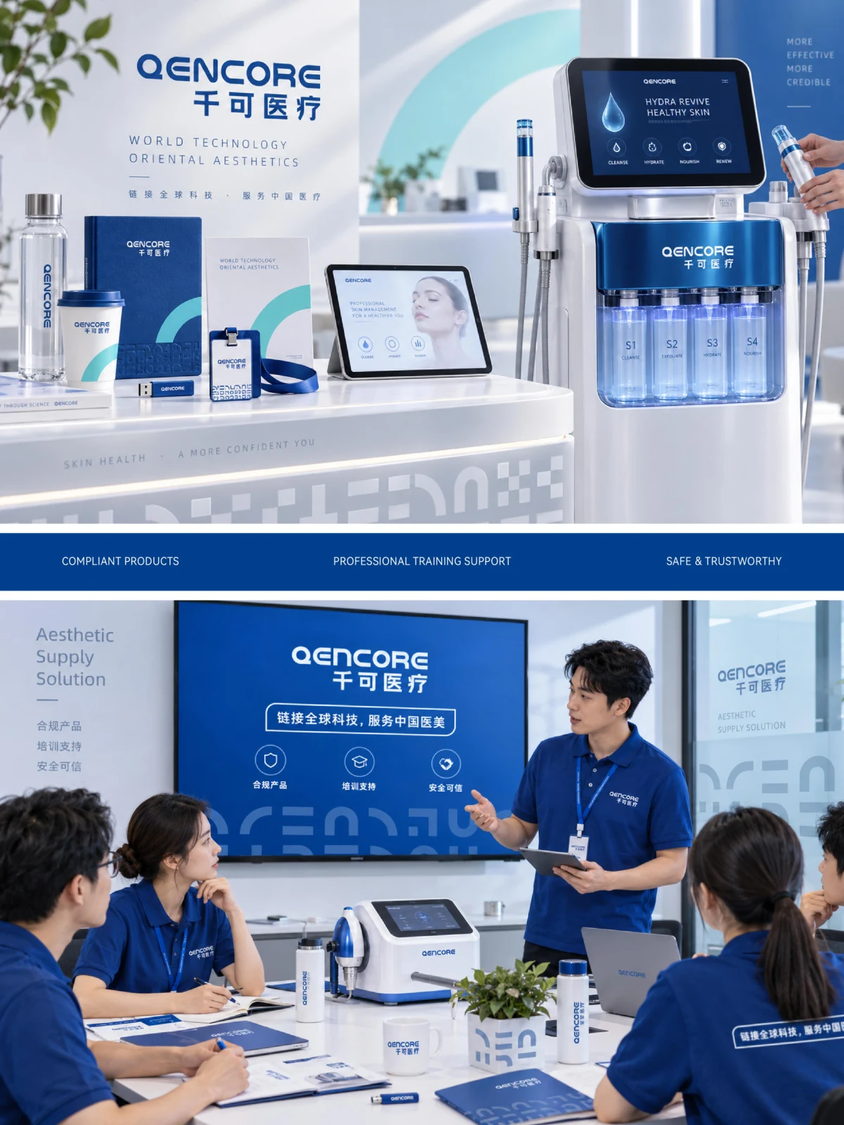
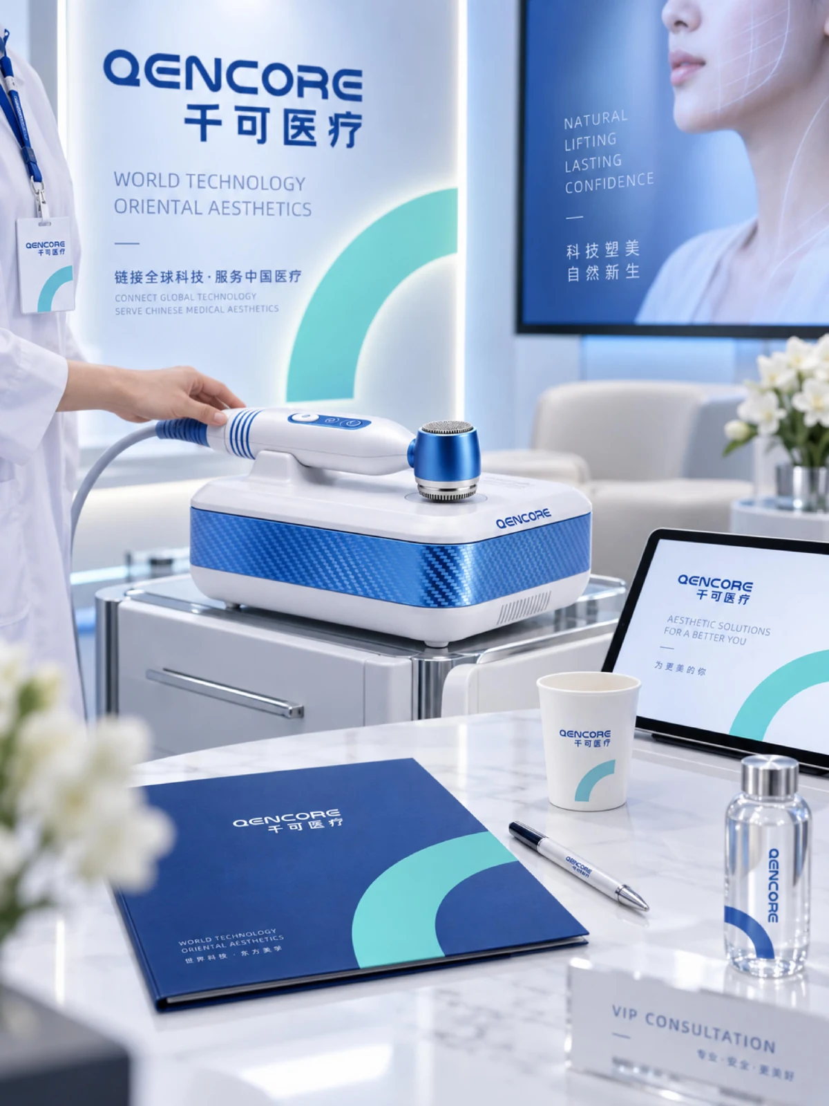
Qianke Medical's project addresses brand communication for medical devices, with documents, equipment and exhibition spaces as its main points of contact. Chinese and English names establish a shared identity, while graphics, colours and information hierarchy connect the different formats, providing clear visual references from company introductions to equipment displays.
- Region
- Changsha, Hunan
- Industry
- Medical equipment
- Scope
- Brand visual design
- Project year
- —
ADesign task
This visual design for Qianke Medical connects brand typography, supporting graphics and consistent colour across materials, equipment illustrations and display settings.
BKey considerations
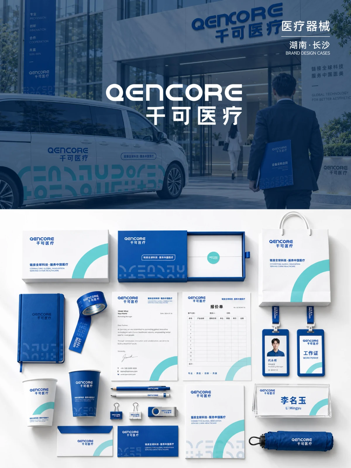
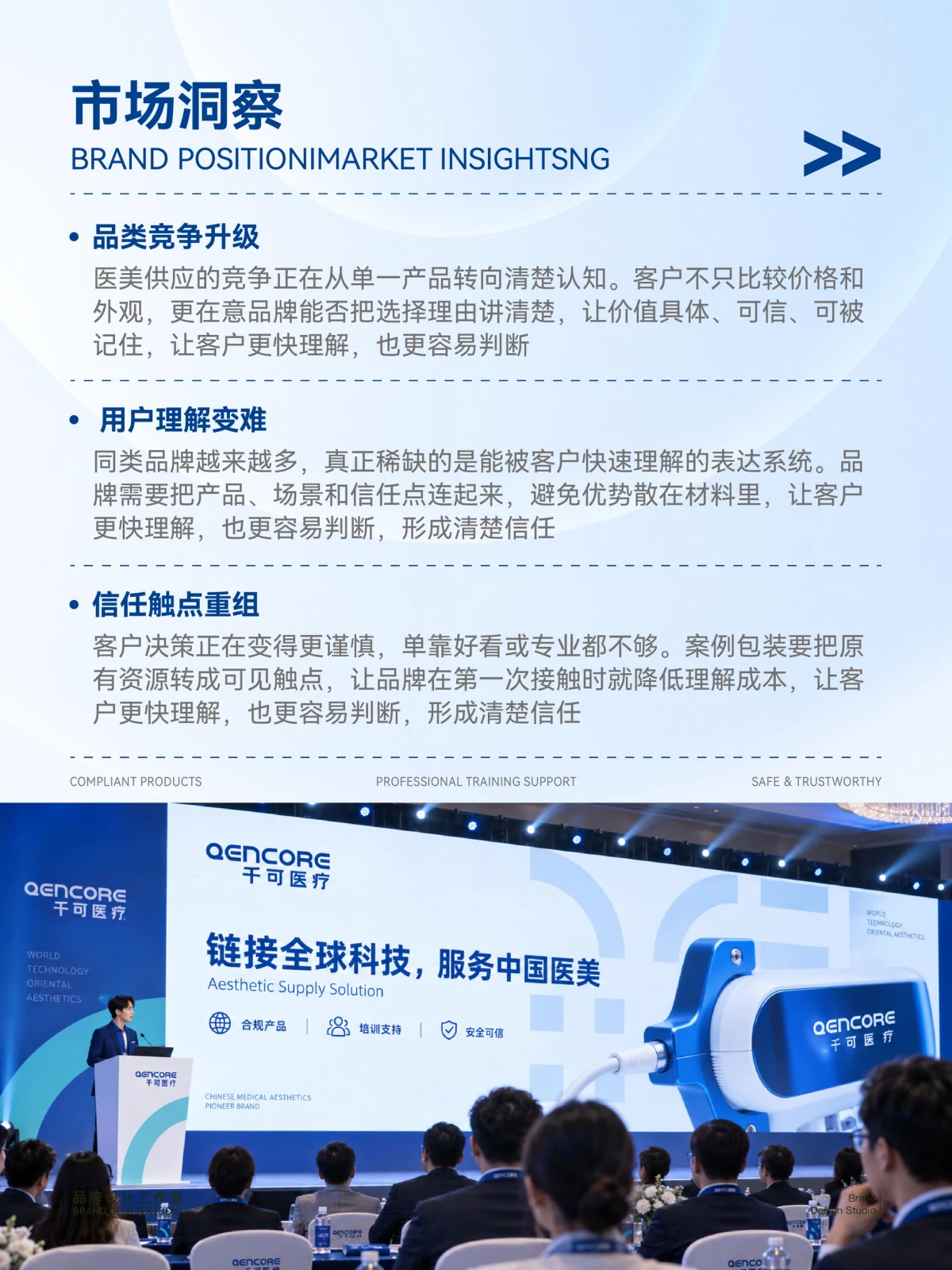
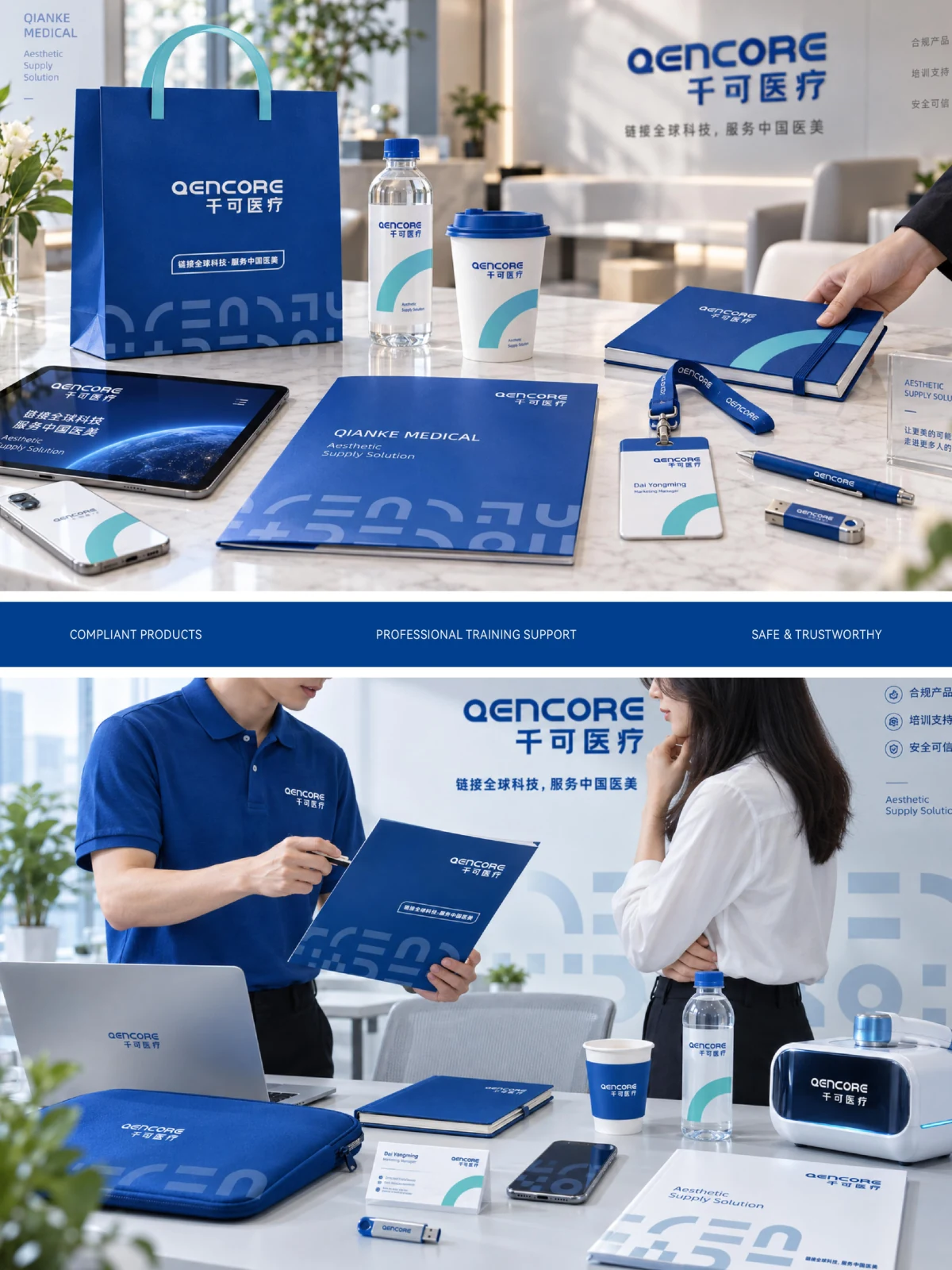
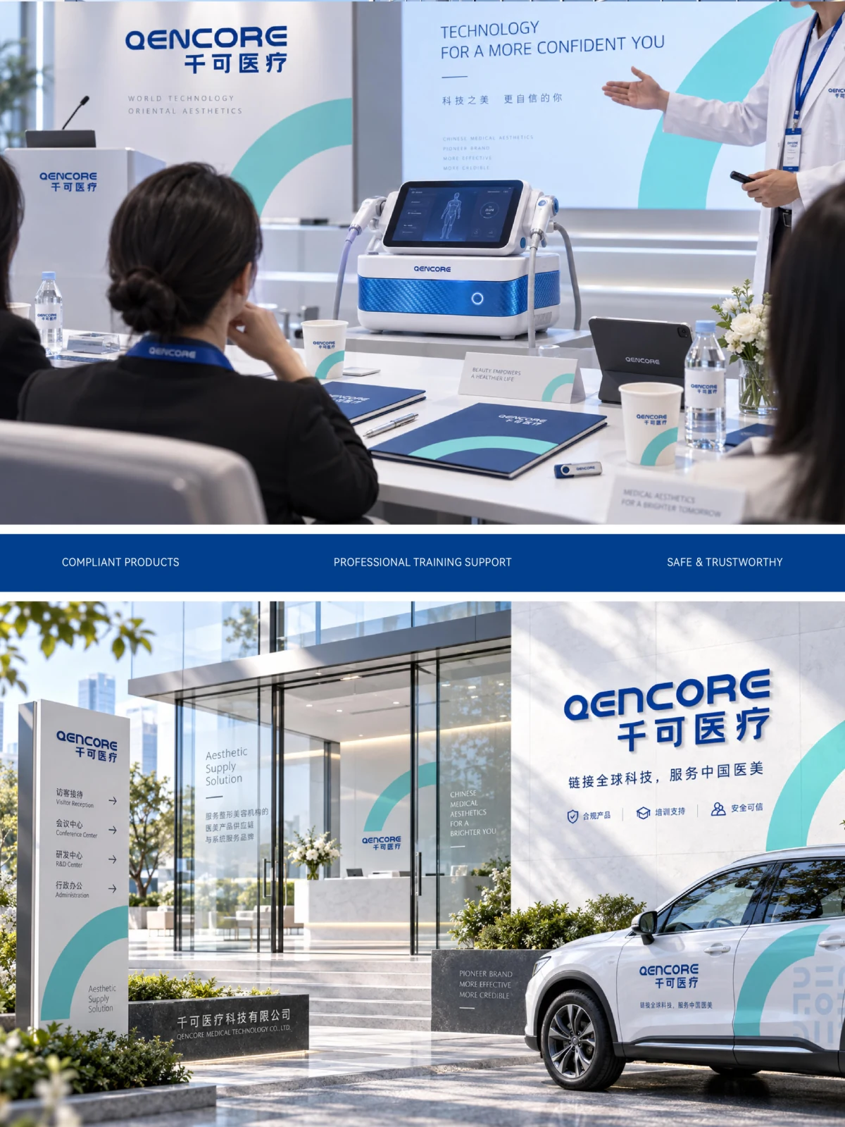
Materials, equipment and spaces require a related visual identity. Consistent marks and information levels connect these communication settings.
CVisual design
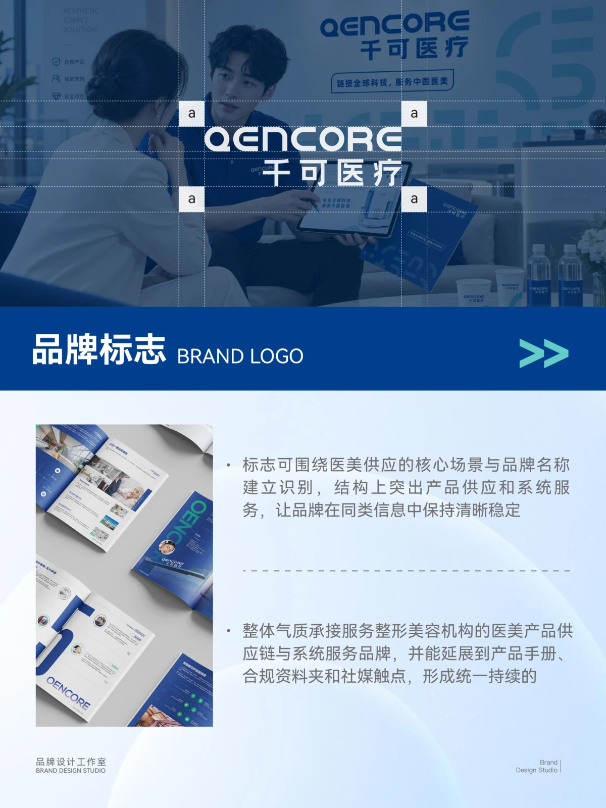
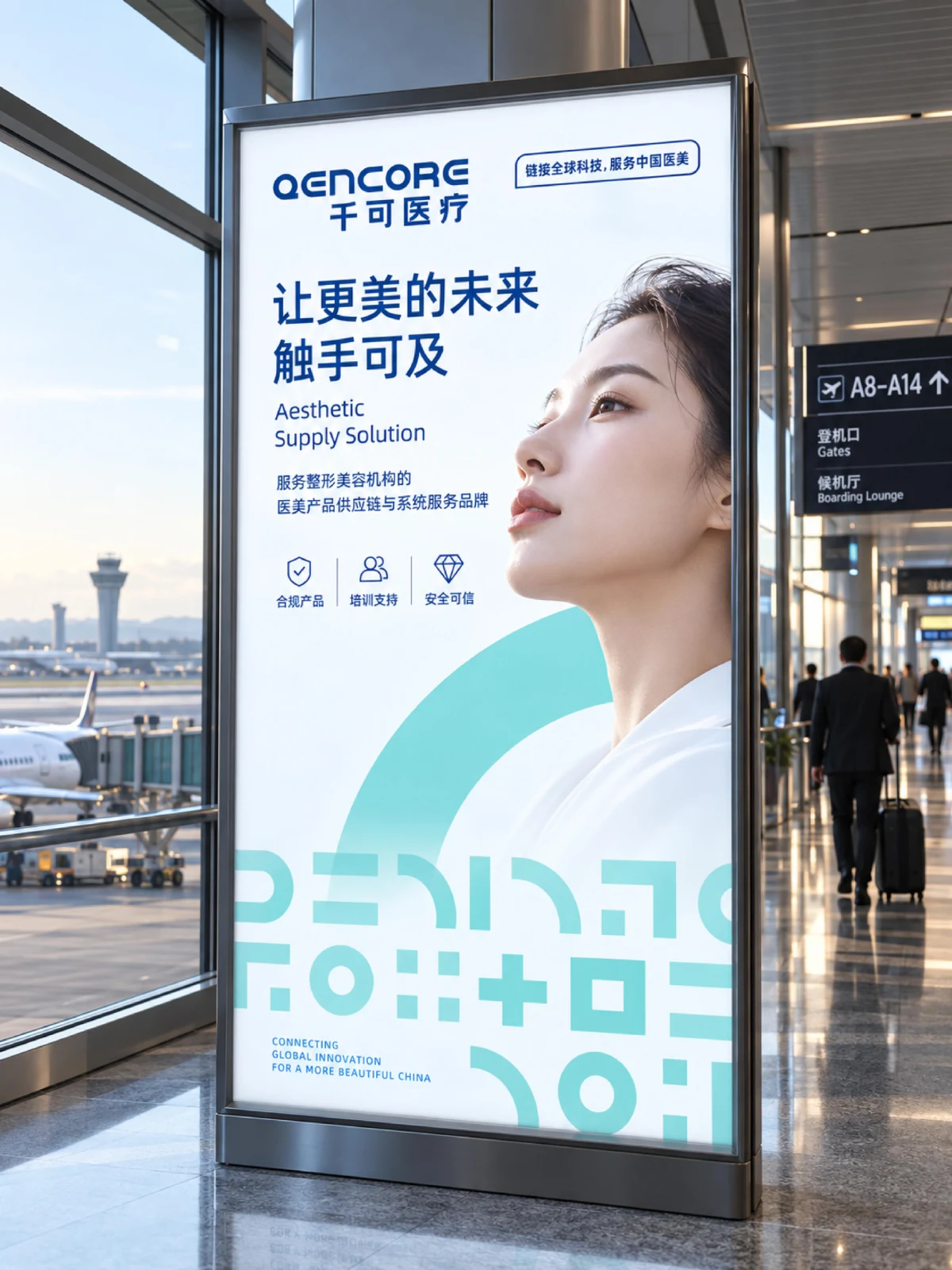
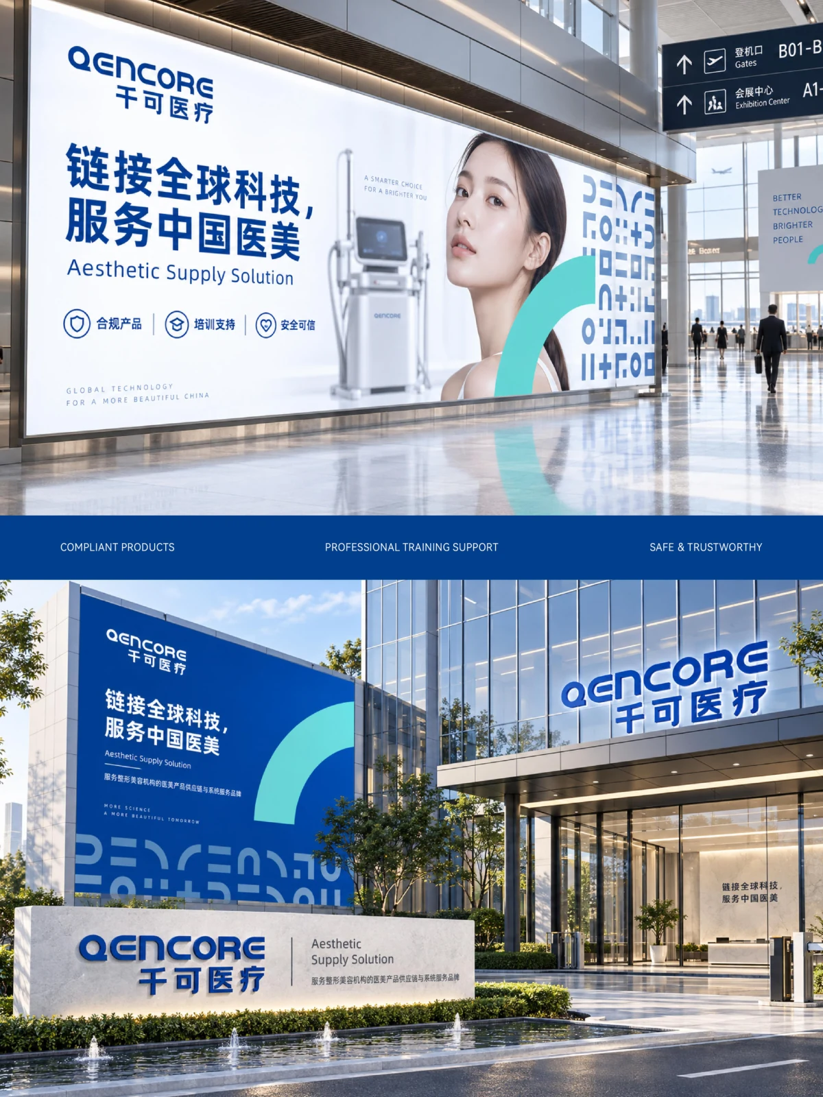
Chinese and English brand typography form the main identifier. Blue and teal establish a visual hierarchy, with related arrangements of graphics and text across different applications.
DApplications
Identity, printed materials, equipment illustrations and spatial applications share a visual hierarchy across communication settings.
ExploreExplore further
Contact
Tell us about your brand
Bring your existing materials and the problem you most want to solveWe will work out the next step together
ouryoung7943
Office
Room 1905, Unit 1, Building 1, North Gate, Yinhe Xijiang Hepan, No. 99 Qunhui North Road, Longquanyi District, Chengdu, Sichuan, China