
Yikang Daren
Distinct illustrated directions for coffee and tea packaging
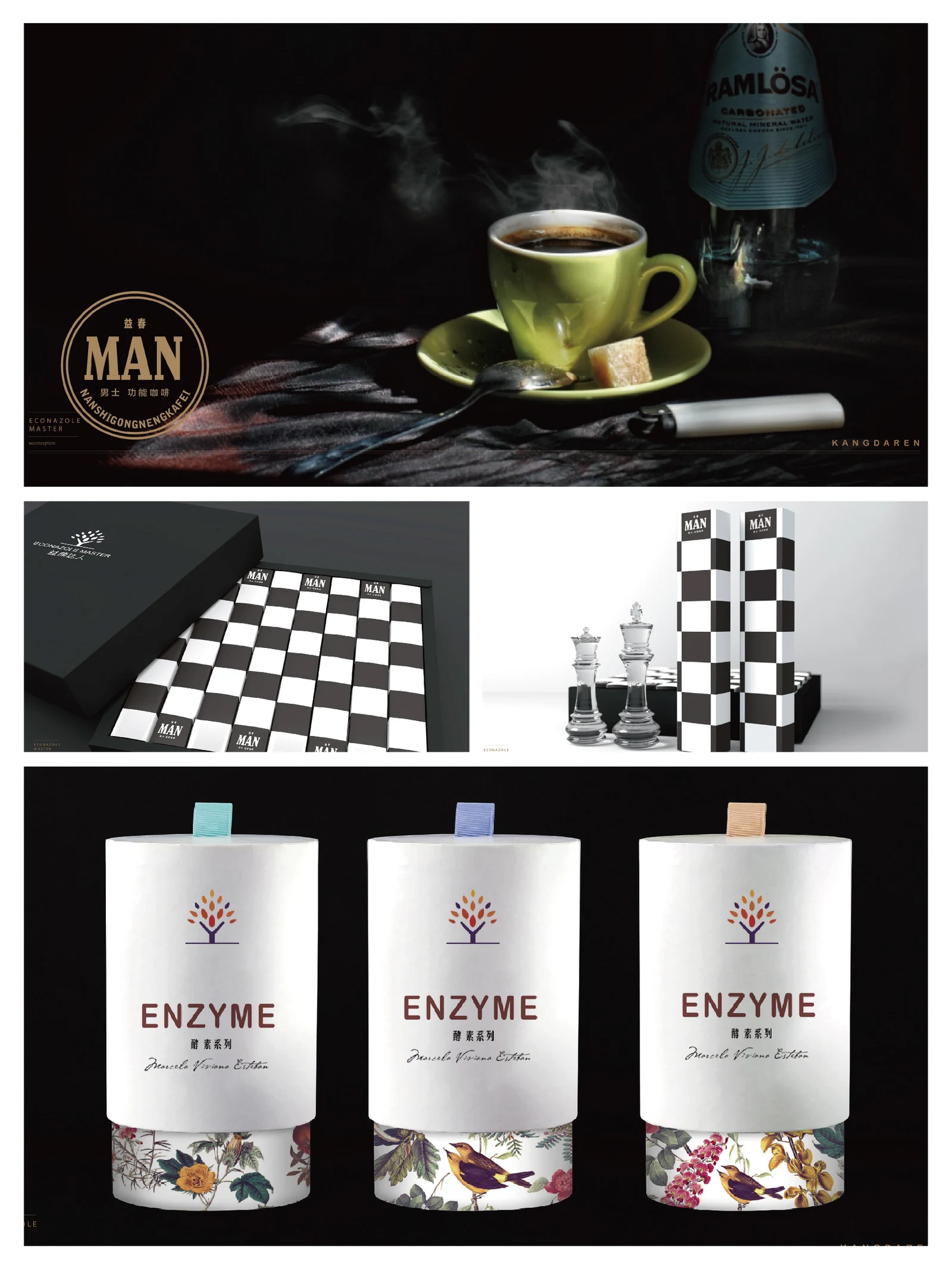
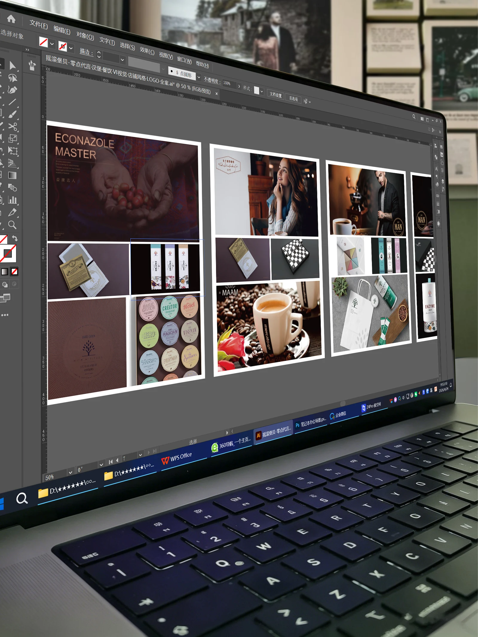
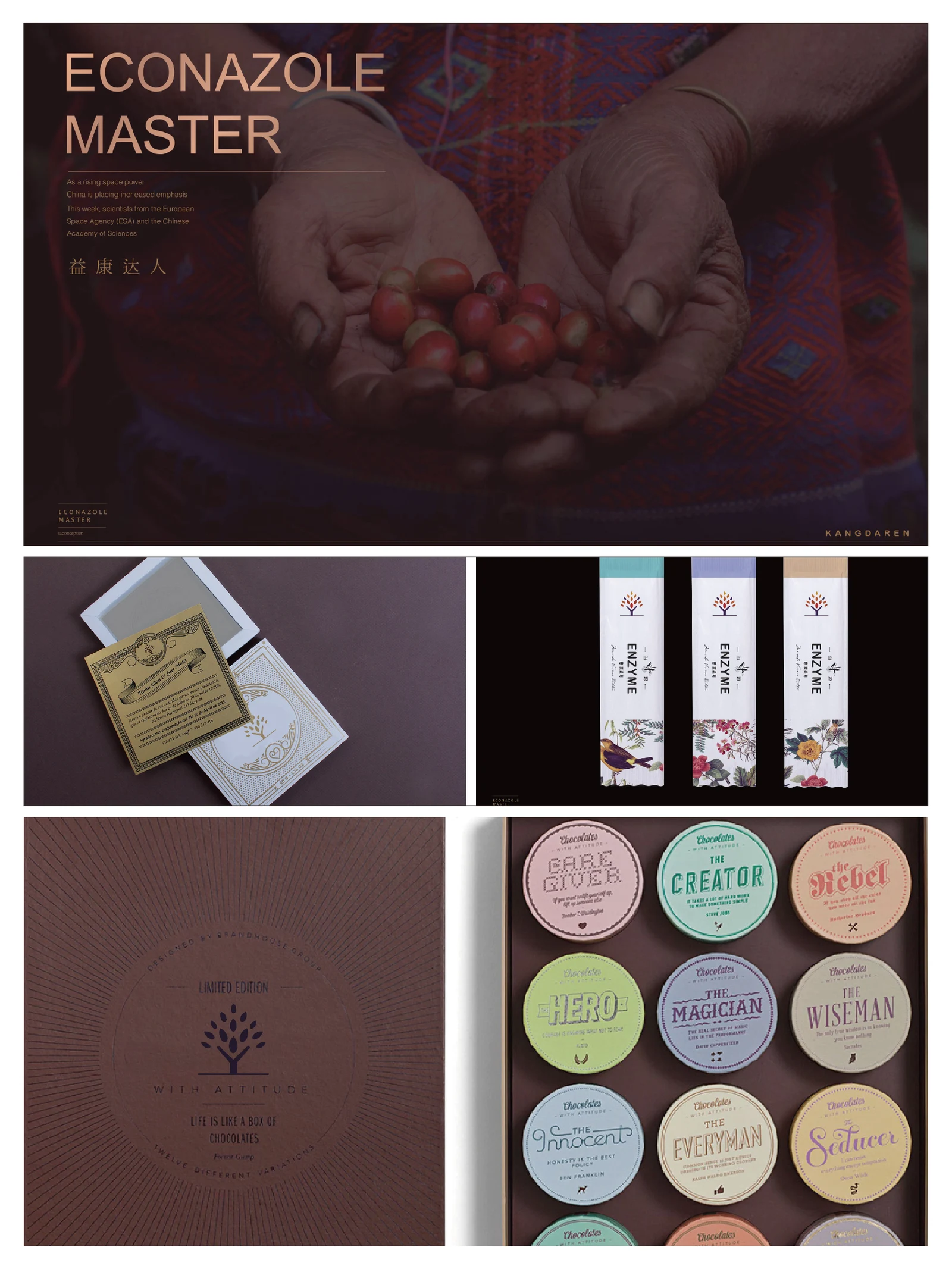
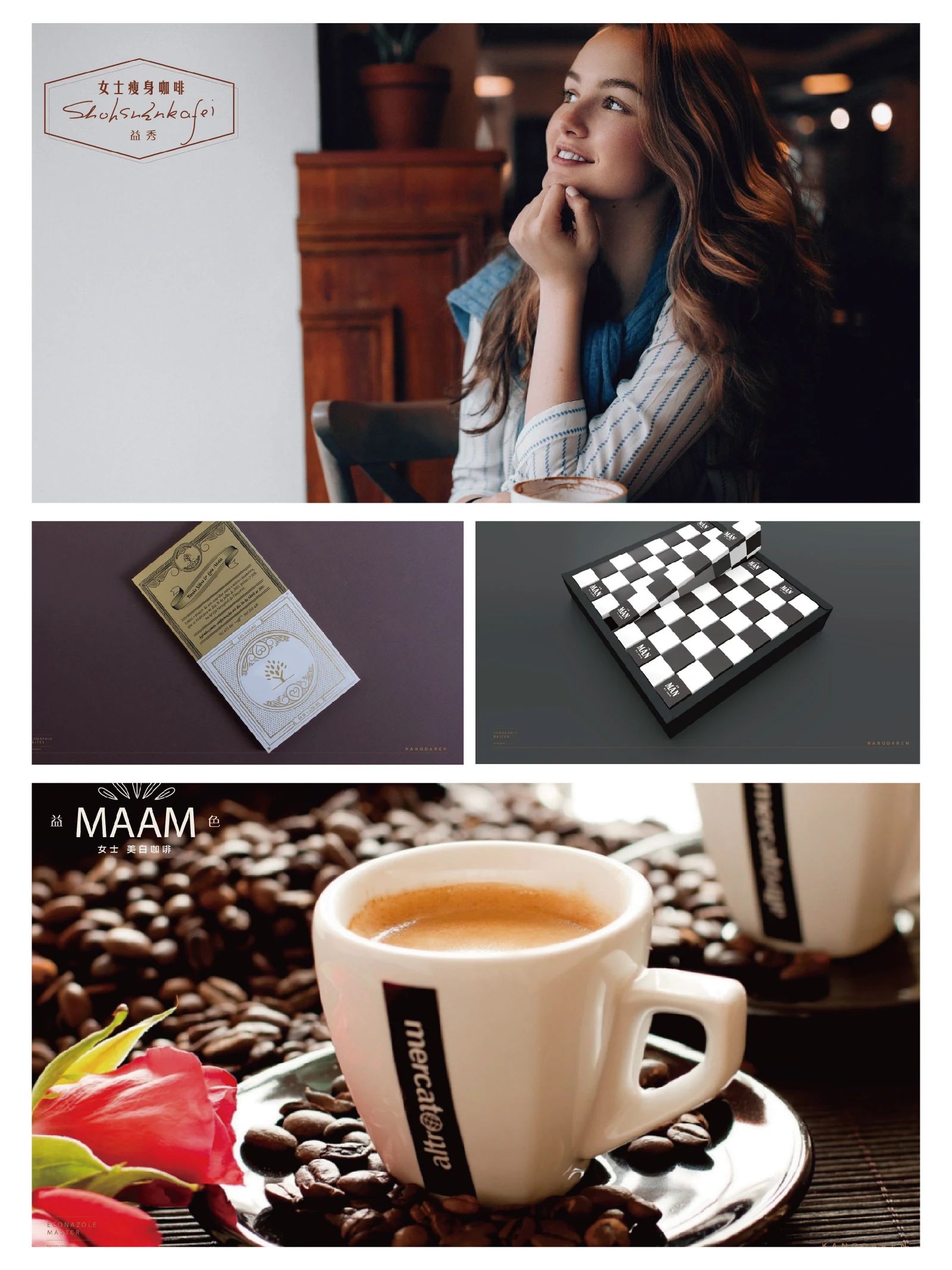
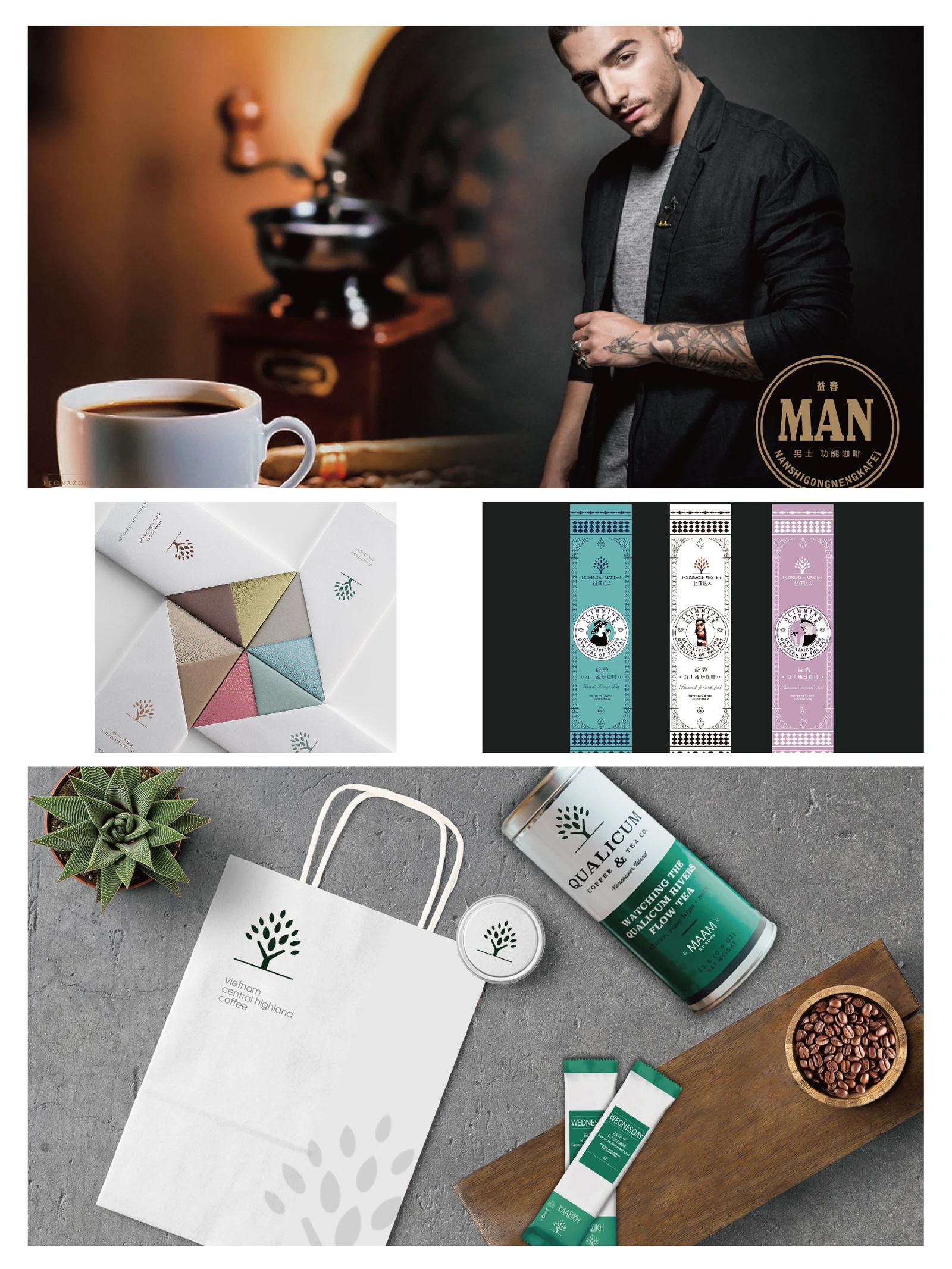
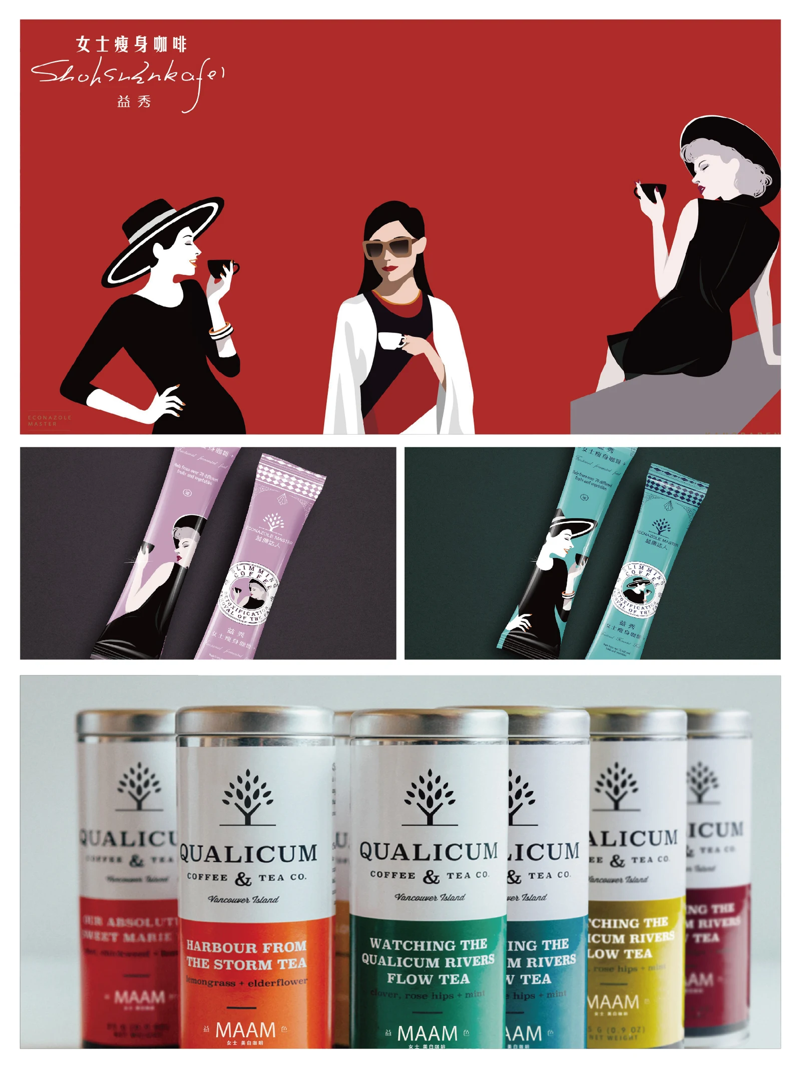
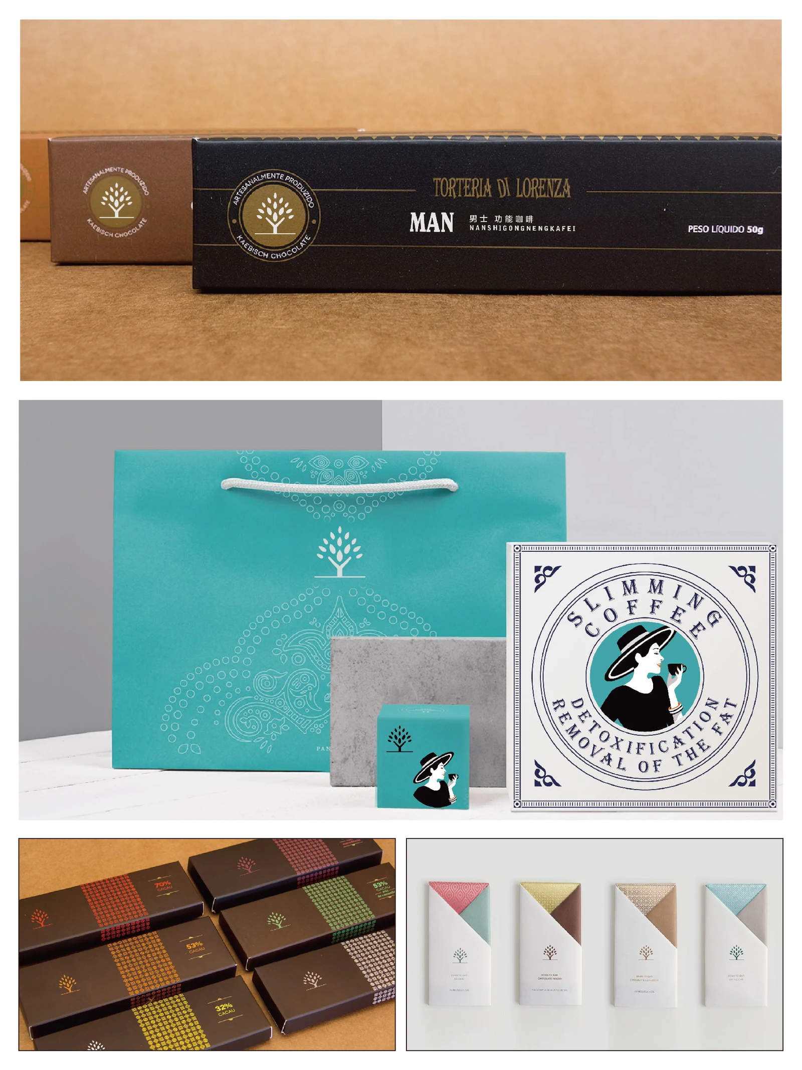
This project focuses on the coffee and tea packaging collected under Yikang Daren, using stick packs, tins and boxes as different formats for product information. People, plants and product imagery distinguish several subranges, with names and flavour information placed clearly so that individual packs and grouped gift bags retain their own characteristics.
- Region
- Beijing, China
- Industry
- Coffee and tea
- Scope
- Packaging design · Product ranges
- Project year
- —
AChallenge
The completed work in the Yikang Daren folder presents coffee and tea packaging with several sub-range directions.
BThinking
Product photography, character illustration and botanical marks offer distinct approaches while names retain separate reading areas.
CDesign
Stick packs use a vertical arrangement, while tins and boxes emphasise front labels. Pink, green, gold and monochrome belong to different directions.
DApplication
Stick packs, tins, boxes and bags are shown as packaging work, not evidence of health benefits.
ExploreExplore further
Contact
Tell us about your brand
Bring your existing materials and the problem you most want to solveWe will work out the next step together
ouryoung7943
Office
Room 1905, Unit 1, Building 1, North Gate, Yinhe Xijiang Hepan, No. 99 Qunhui North Road, Longquanyi District, Chengdu, Sichuan, China