
Duole Play
Connecting playground communication and visual identity
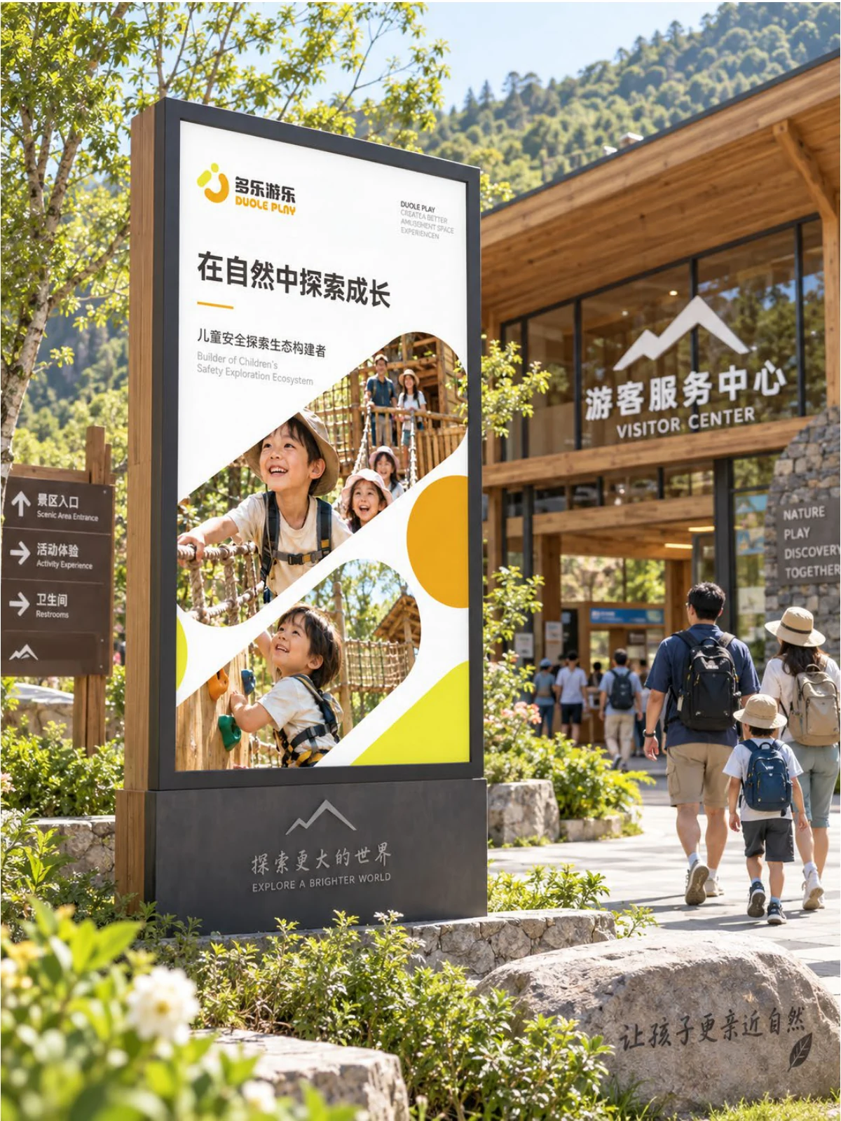
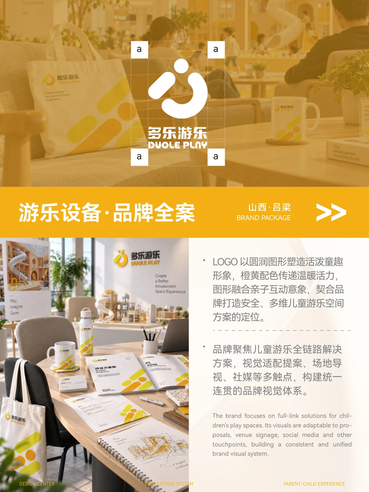
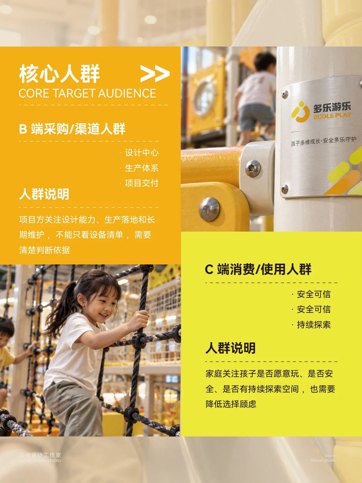
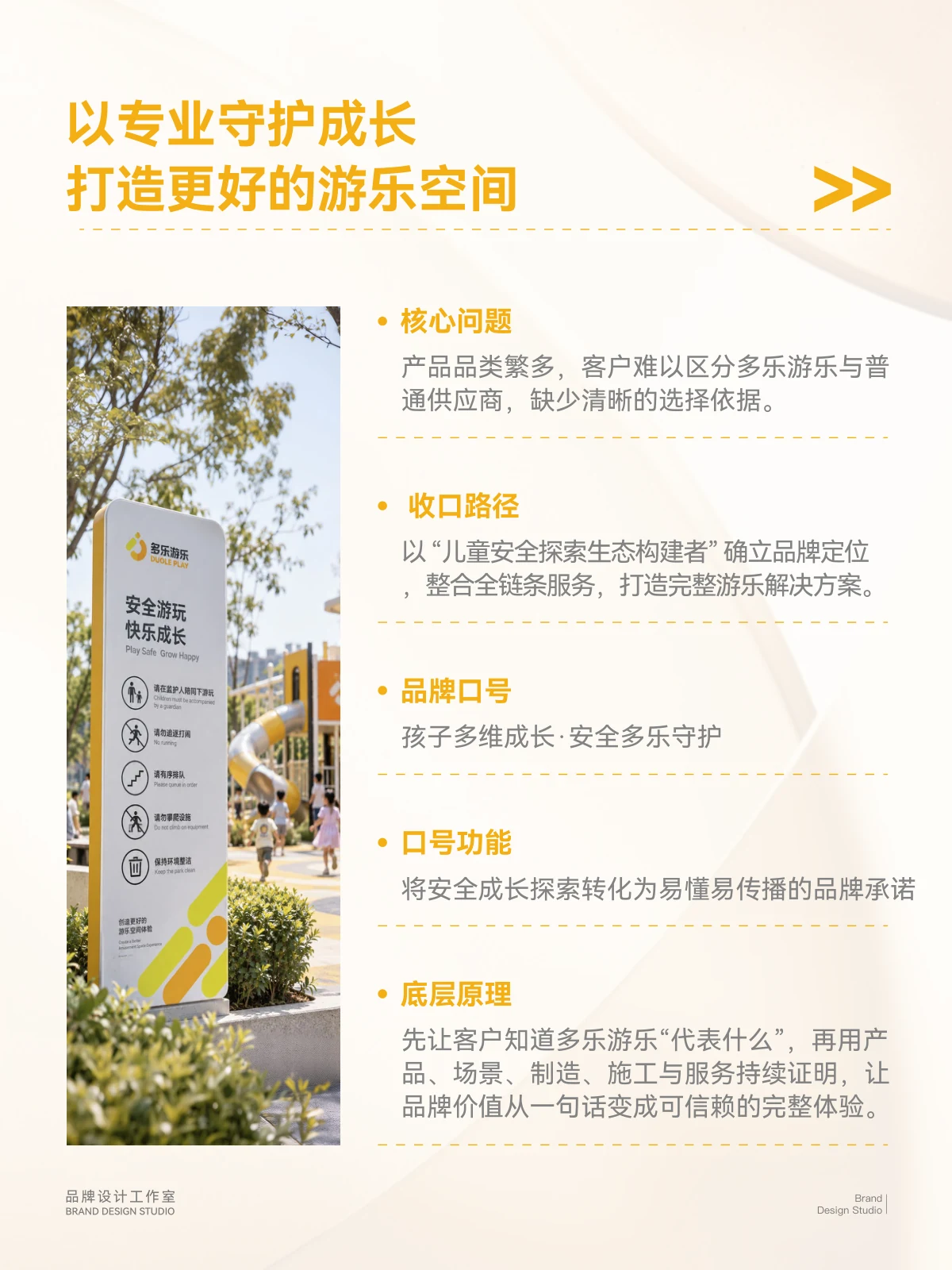
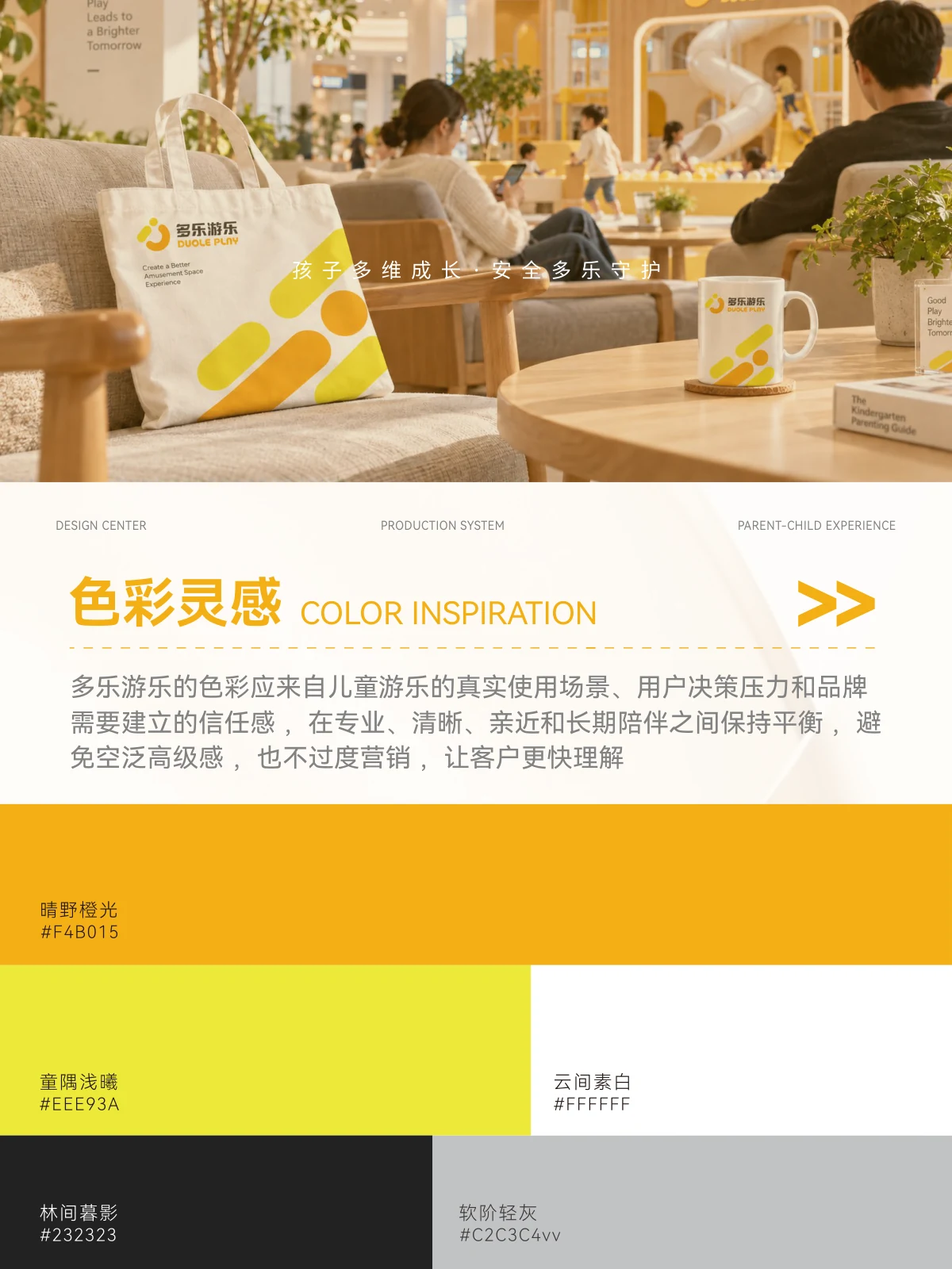
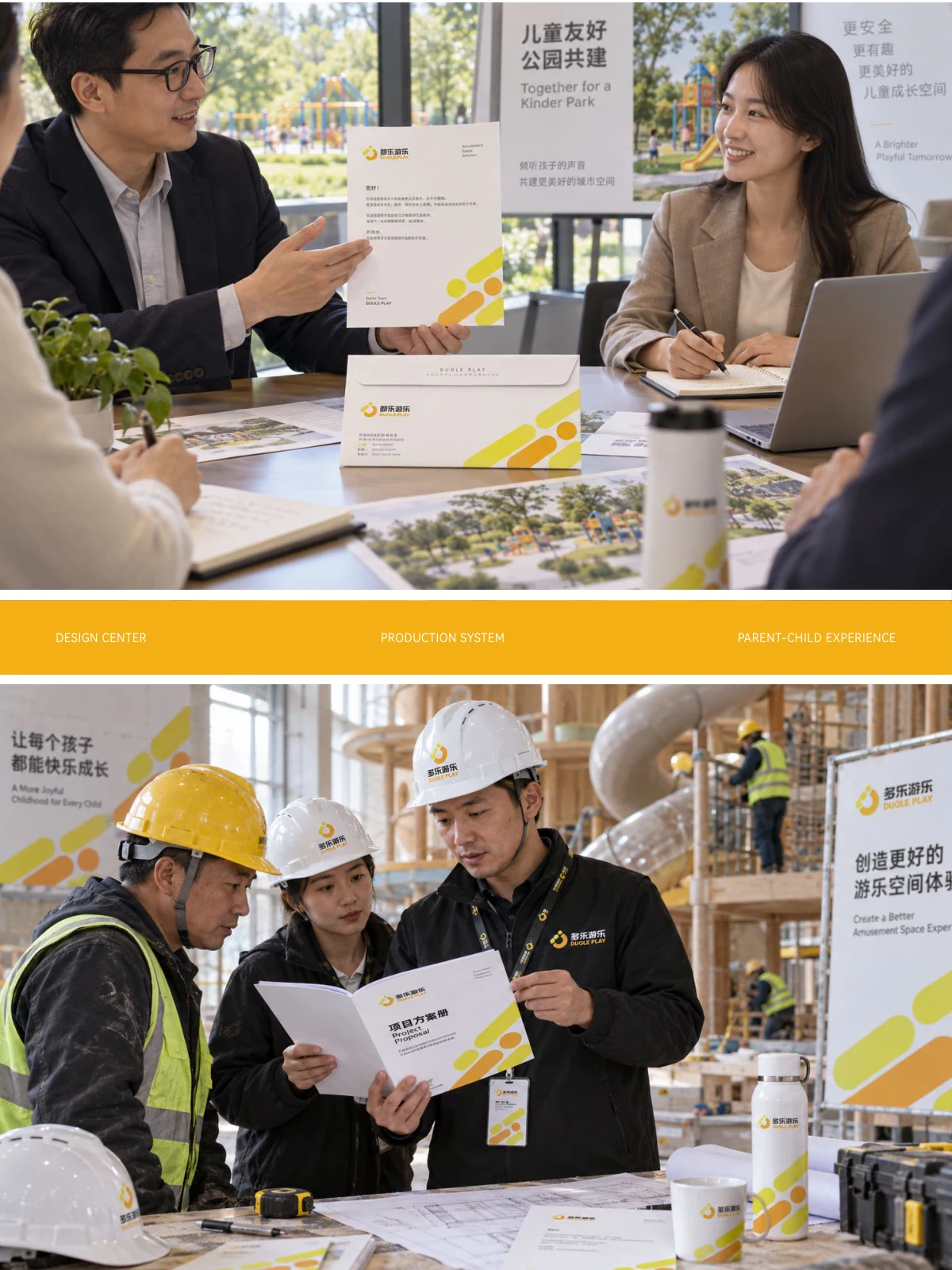
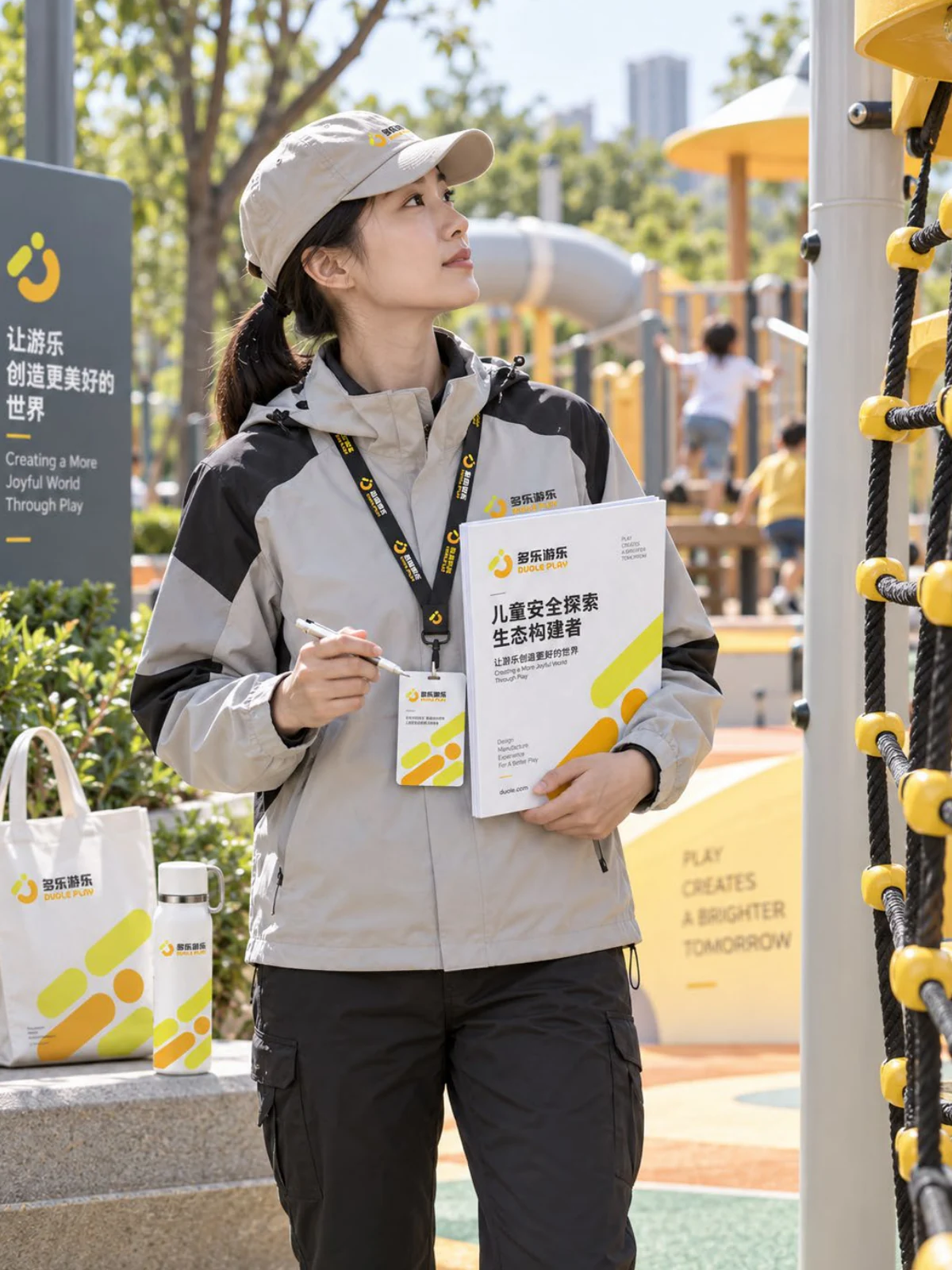
Duole Play's brand expression centres on amusement facilities and family settings, combining information about the facilities with images of activities and experiences. The project connects materials, displays and on-site imagery through one identity, using bright colours and rounded graphics to bring professional communication and family contexts together.
- Region
- Lüliang, Shanxi
- Industry
- Playground equipment
- Scope
- Brand visual design
- Project year
- —
ADesign task
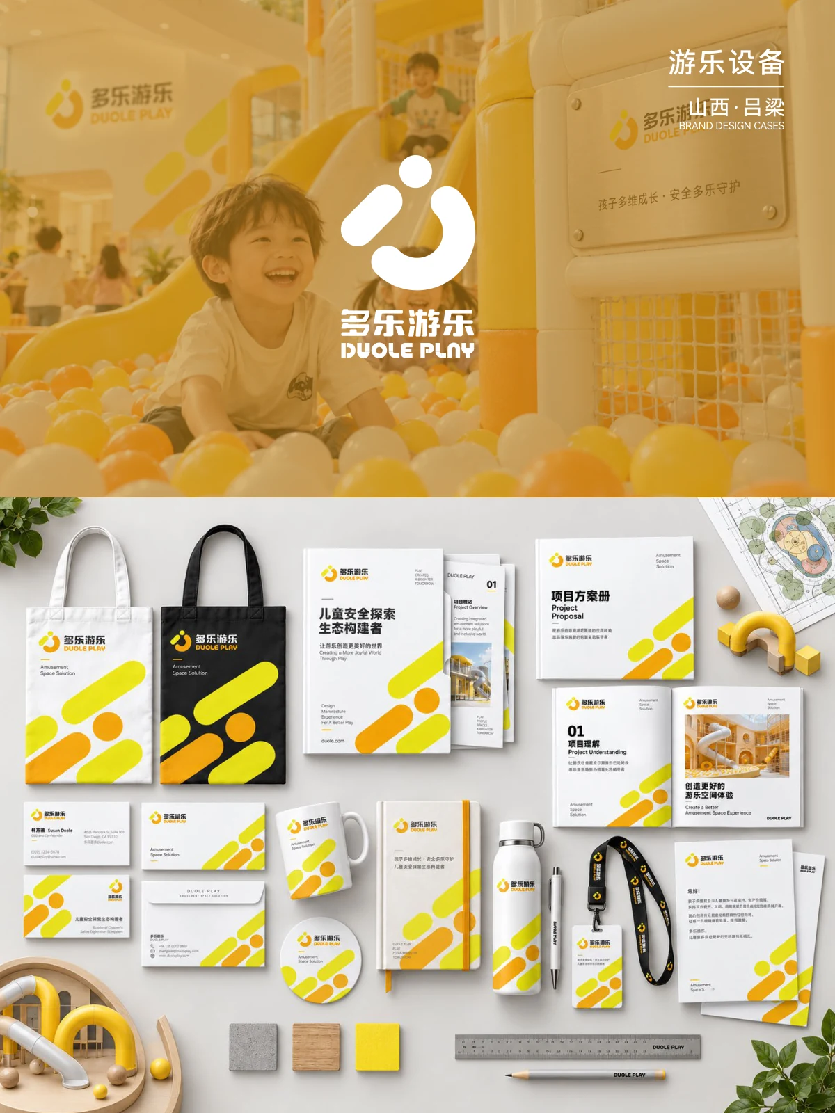
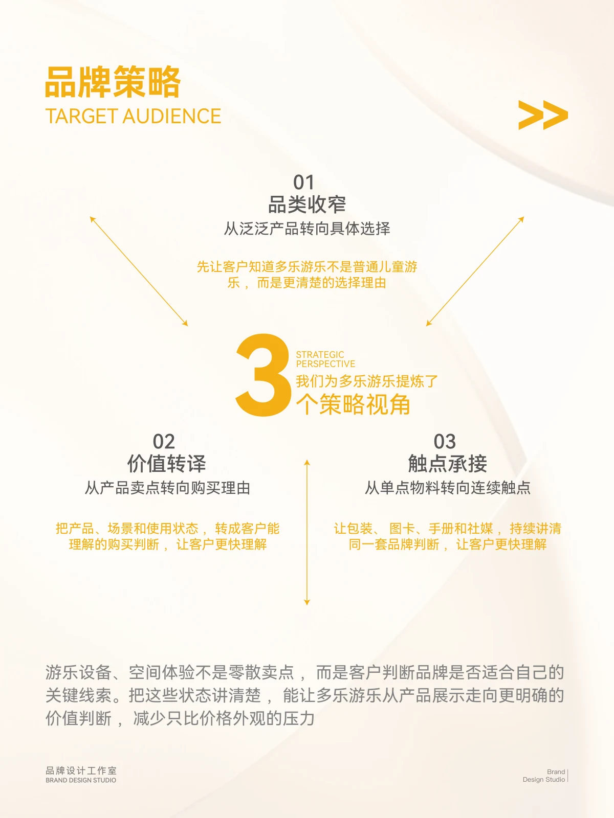
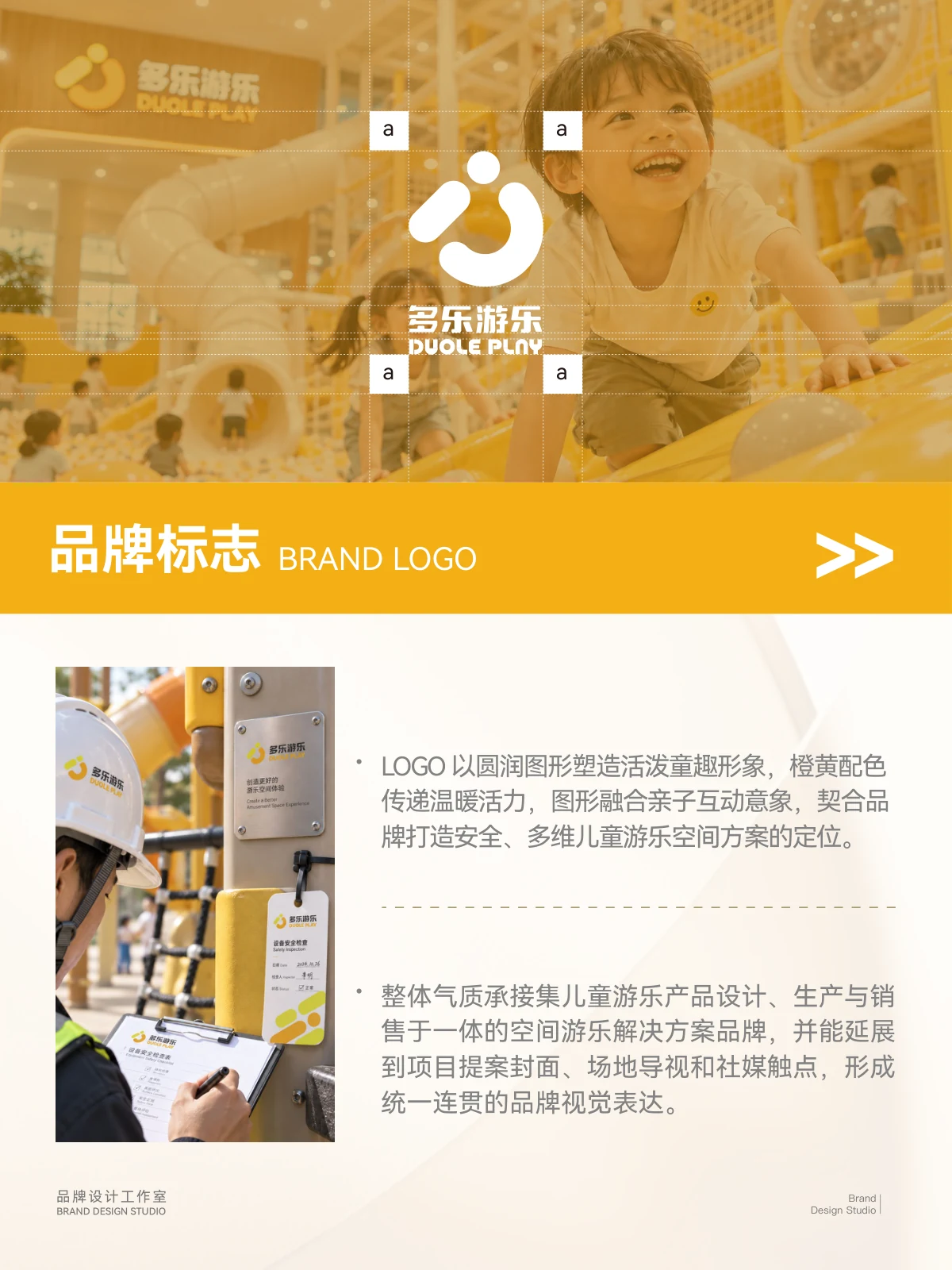
The Duole Play visual design applies a brand mark, supporting graphics and bright colour to materials, displays and playground settings.
BKey considerations
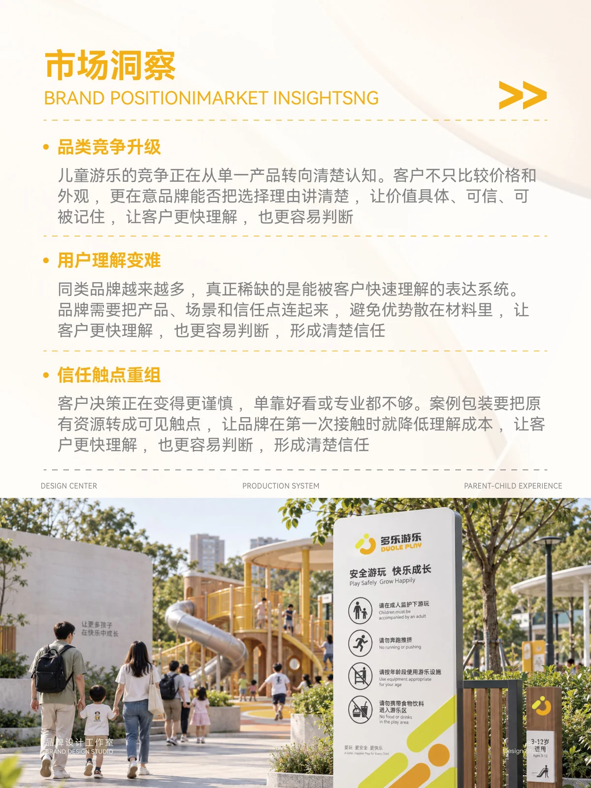
Playground communication combines technical information and use settings. Shared graphics and colour make these elements easier to recognise.
CVisual design
Rounded graphics and yellow provide the main identifiers, with a hierarchy between text and scene imagery. Related graphic arrangements connect different touchpoints.
DApplications
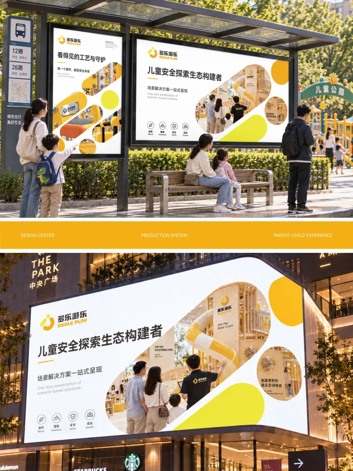
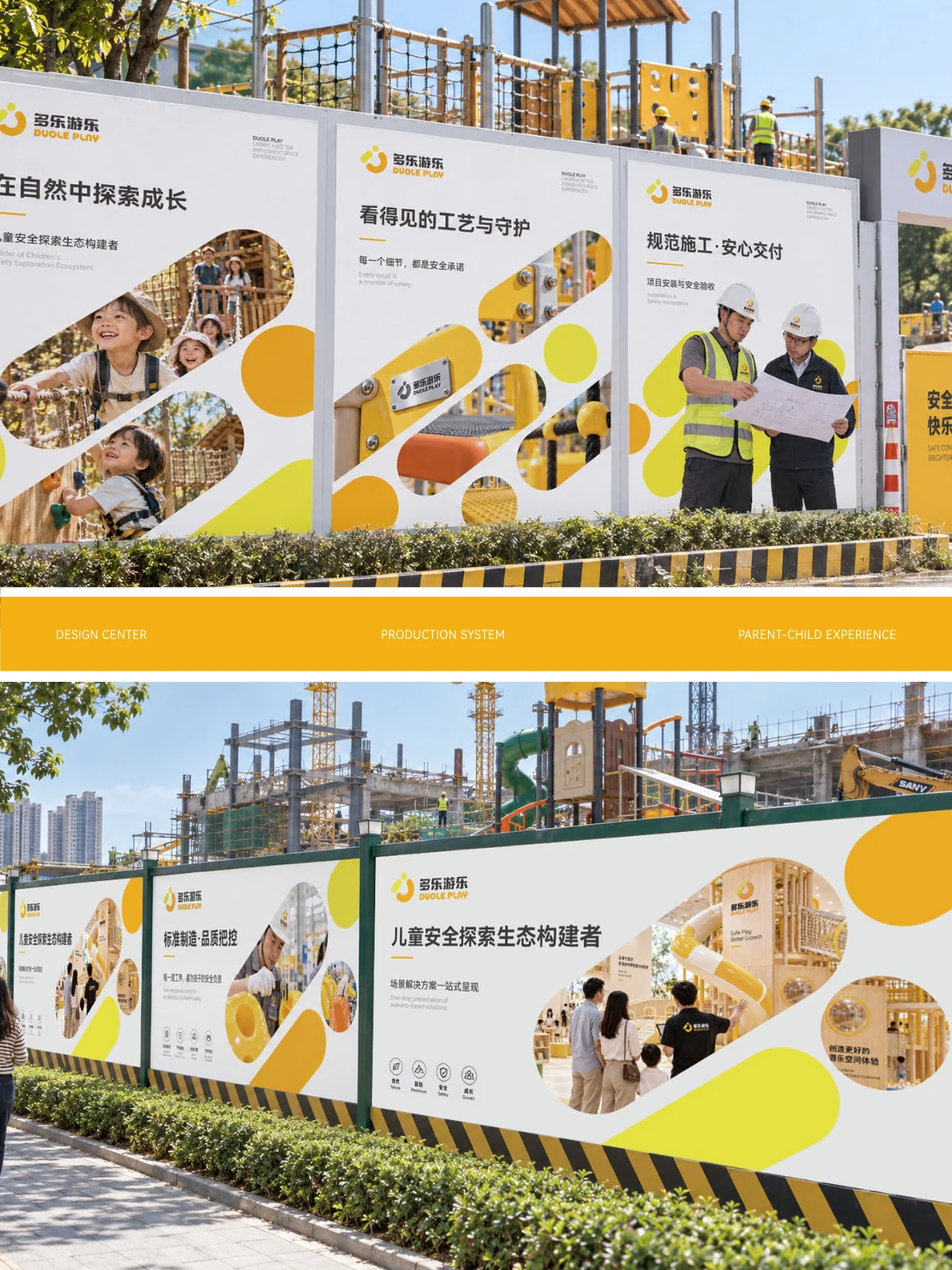
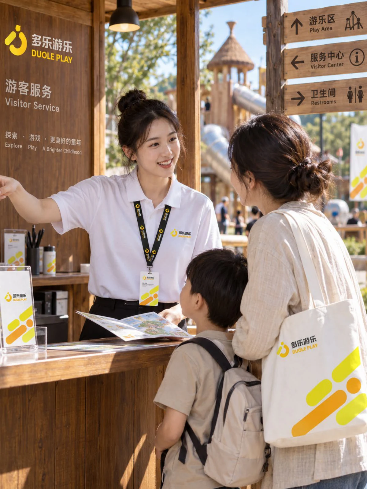
Materials, displays and outdoor communication extend the same identity and supporting graphics across different settings.
ExploreExplore further
Contact
Tell us about your brand
Bring your existing materials and the problem you most want to solveWe will work out the next step together
ouryoung7943
Office
Room 1905, Unit 1, Building 1, North Gate, Yinhe Xijiang Hepan, No. 99 Qunhui North Road, Longquanyi District, Chengdu, Sichuan, China