
Henggu Cement
Colour and construction imagery distinguish product uses
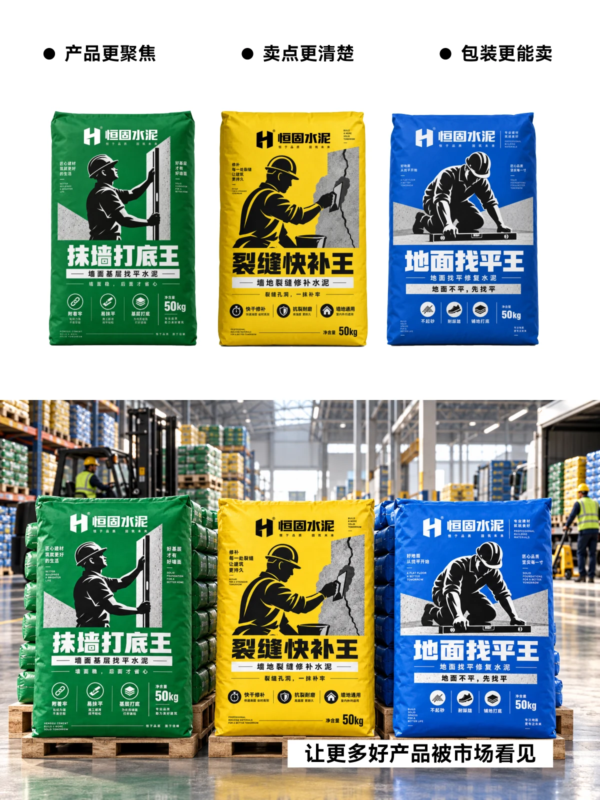
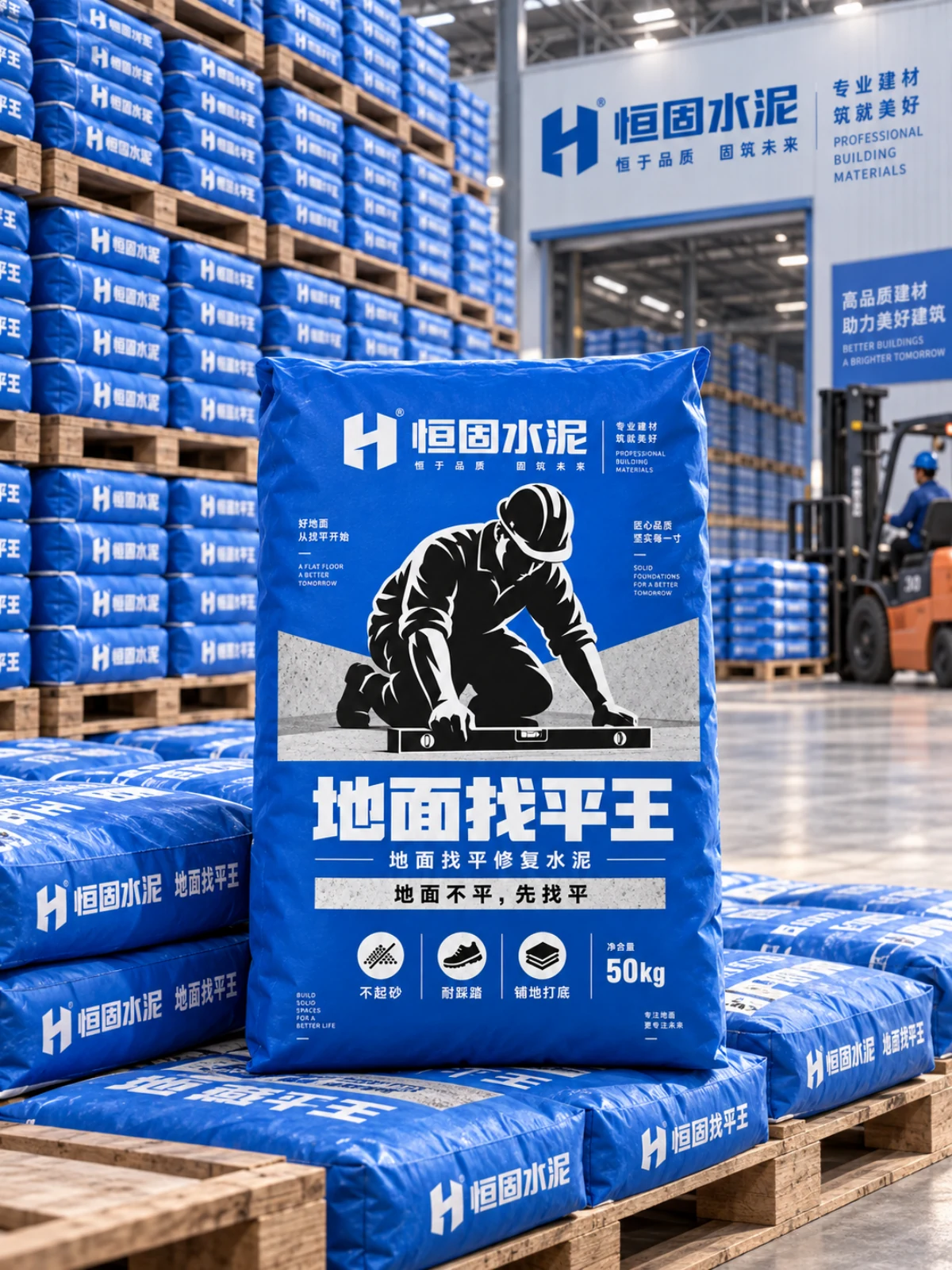
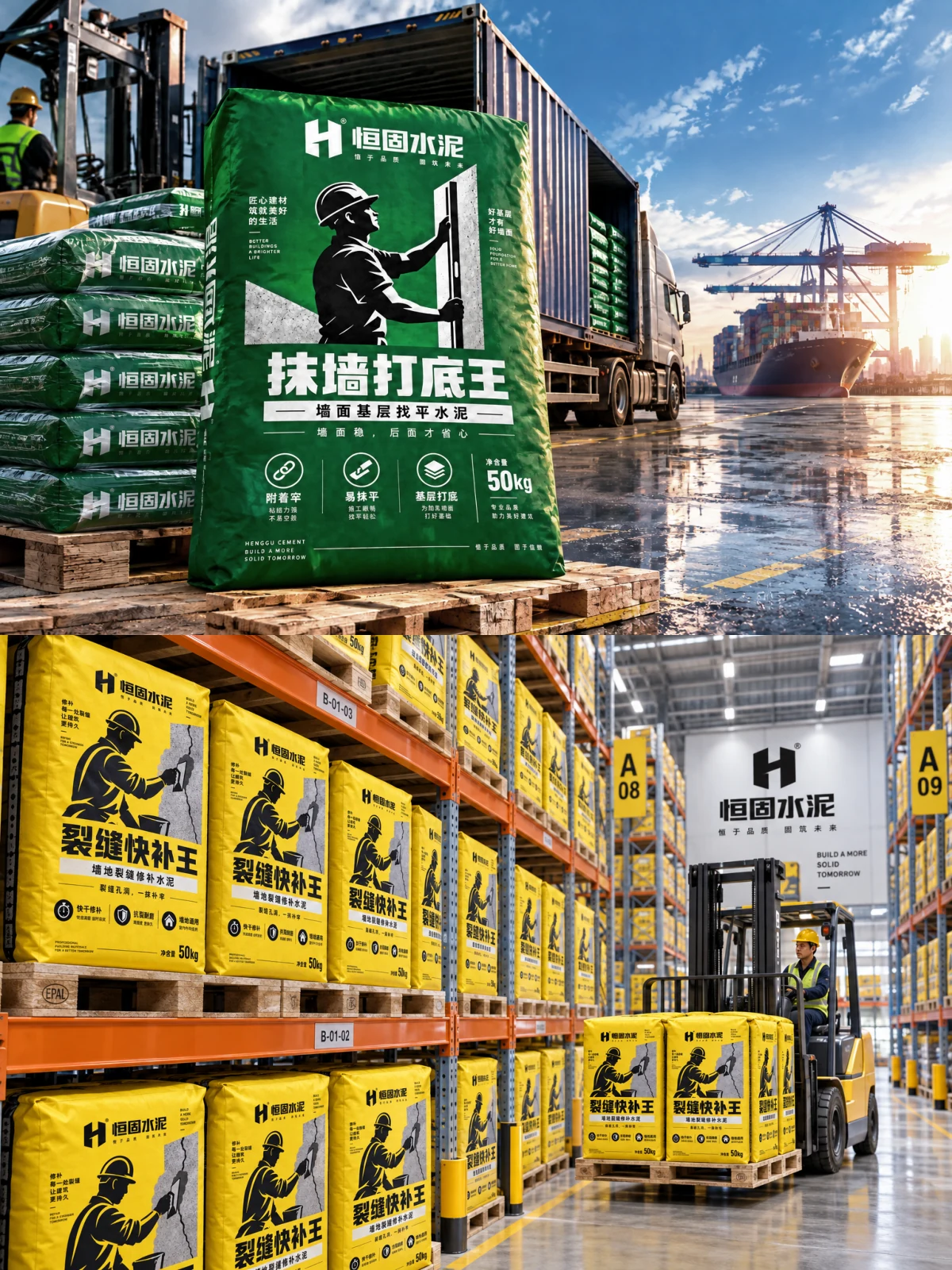
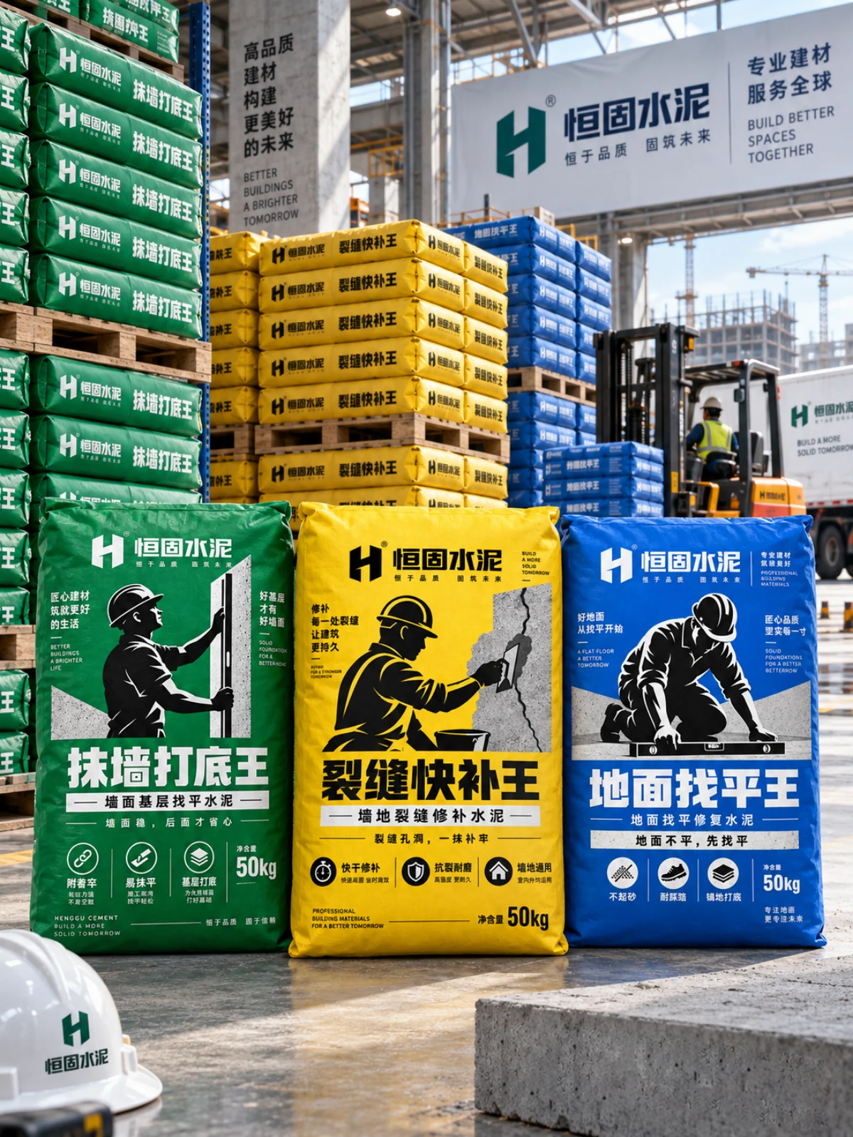
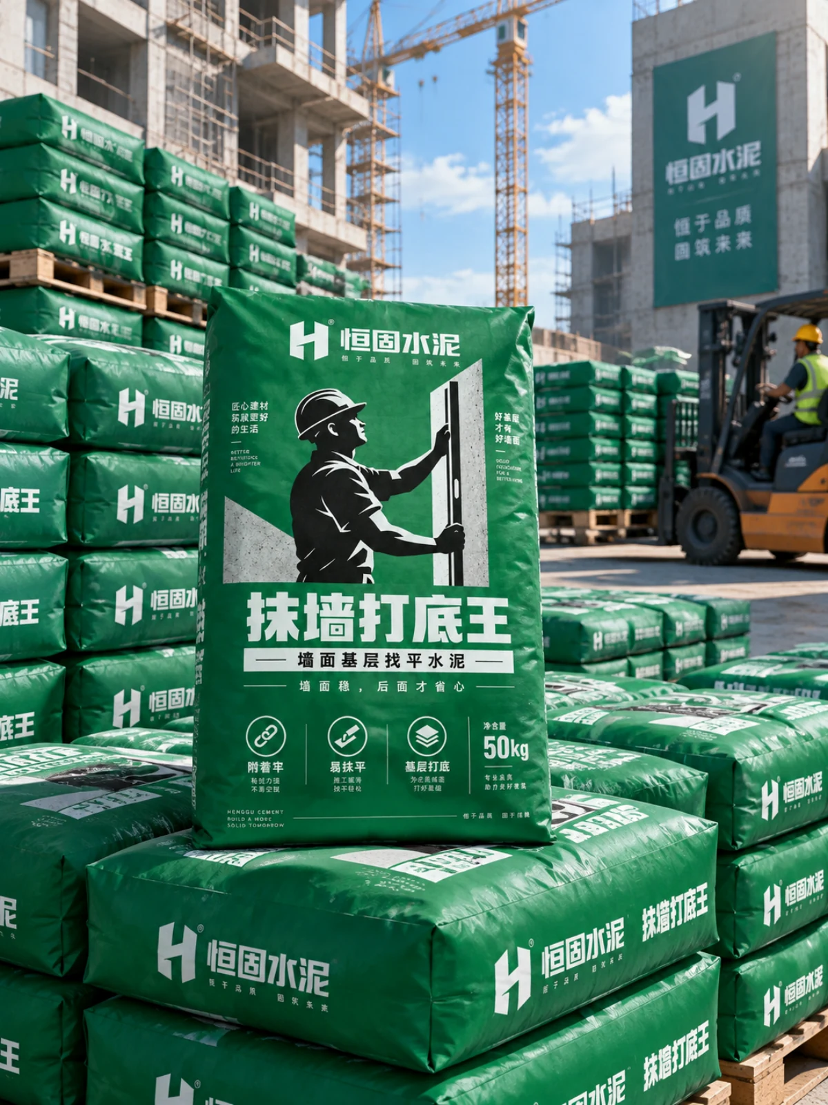
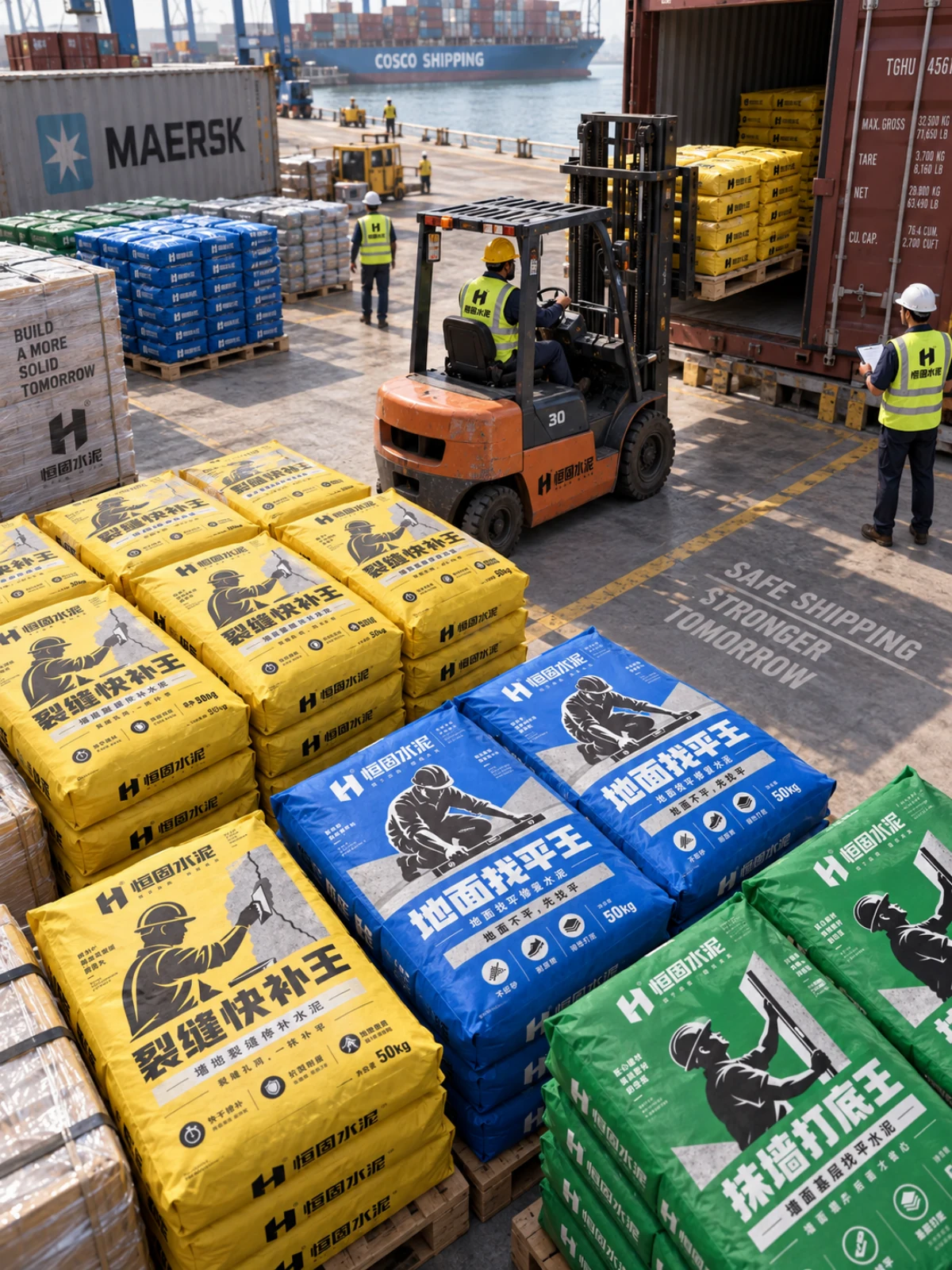
Henggu Cement's packaging project addresses uses such as floor levelling, repairing crumbling surfaces and preparing floor bases. Different purposes need to be clear when selecting a product. Construction figures, usage descriptions, names and specifications are arranged in layers, with colour distinguishing the range and connecting the packs to their intended applications.
- Region
- China · Guangdong
- Industry
- Building materials
- Scope
- Packaging design
- Project year
- —
ADesign task
This cement-packaging design organises information around floor levelling, surface repair and base preparation. It first identifies the intended use, then introduces the product name and specifications.
BKey considerations
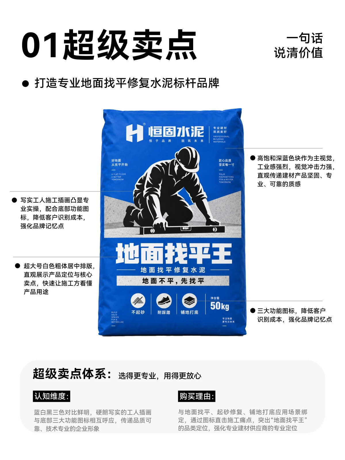
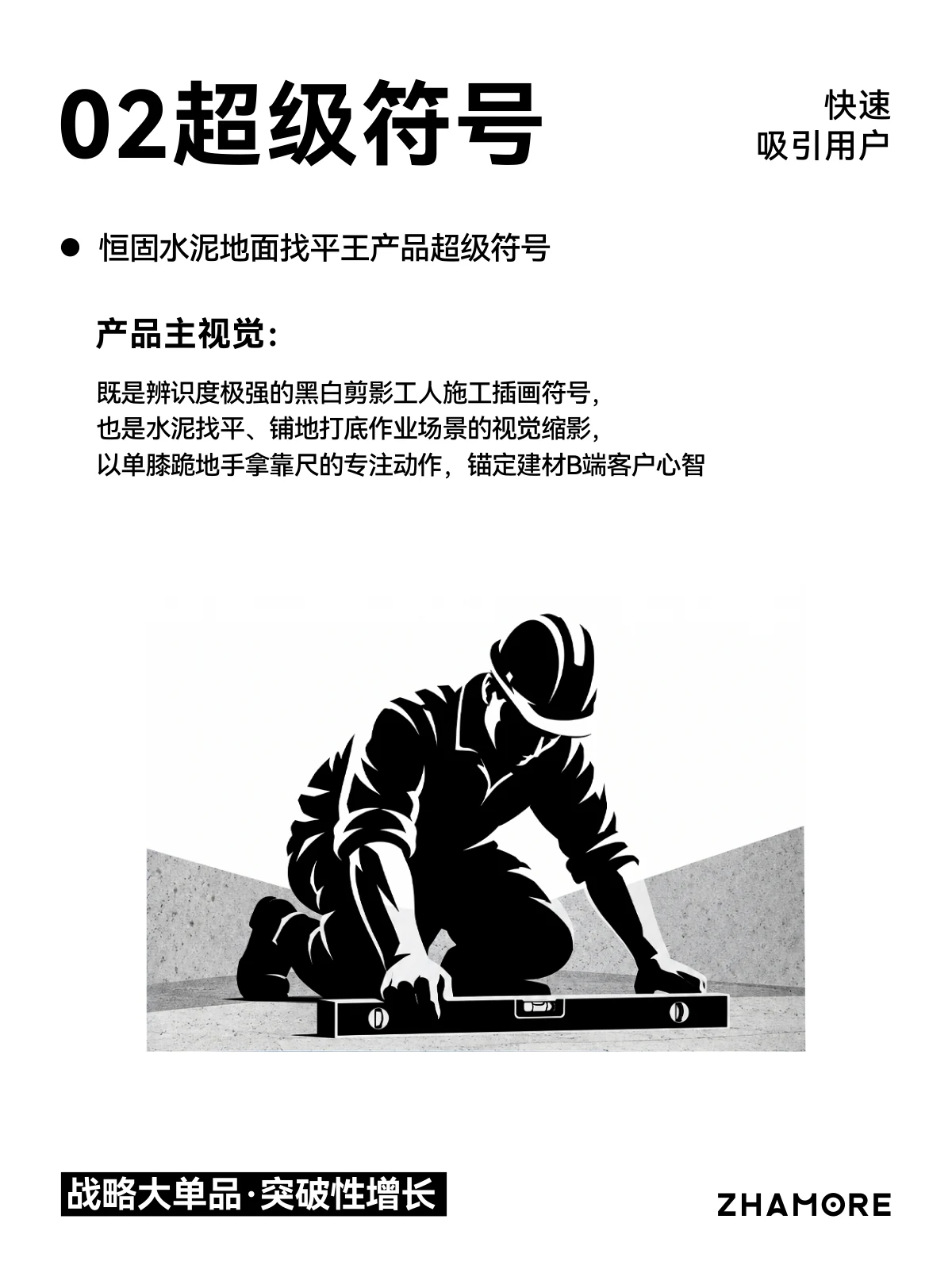
A construction-worker illustration forms the main visual identifier and connects the pack to its use. Product names, use descriptions and supporting icons establish a clear reading hierarchy.
CVisual design
Blue, green and yellow distinguish products while retaining consistent positions for names and graphics. Range illustrations emphasise the shared identity, while individual packs highlight their proposed use.
DApplications
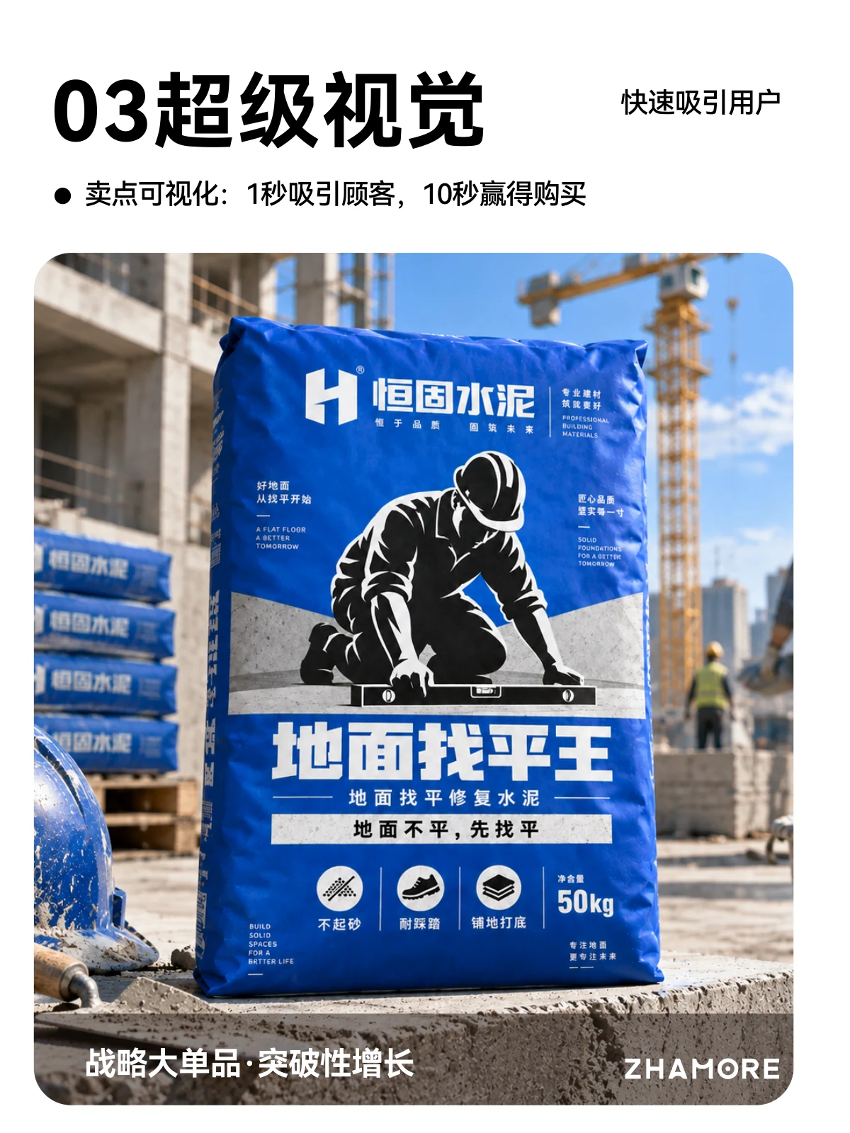
The gallery preserves the effective design pages in their original order. Display, storage and transport illustrations explore how the packaging works across different settings.
ExploreExplore further
Contact
Tell us about your brand
Bring your existing materials and the problem you most want to solveWe will work out the next step together
ouryoung7943
Office
Room 1905, Unit 1, Building 1, North Gate, Yinhe Xijiang Hepan, No. 99 Qunhui North Road, Longquanyi District, Chengdu, Sichuan, China