
Yishi Liangfang
A consistent visual identity for lotus-seed foods
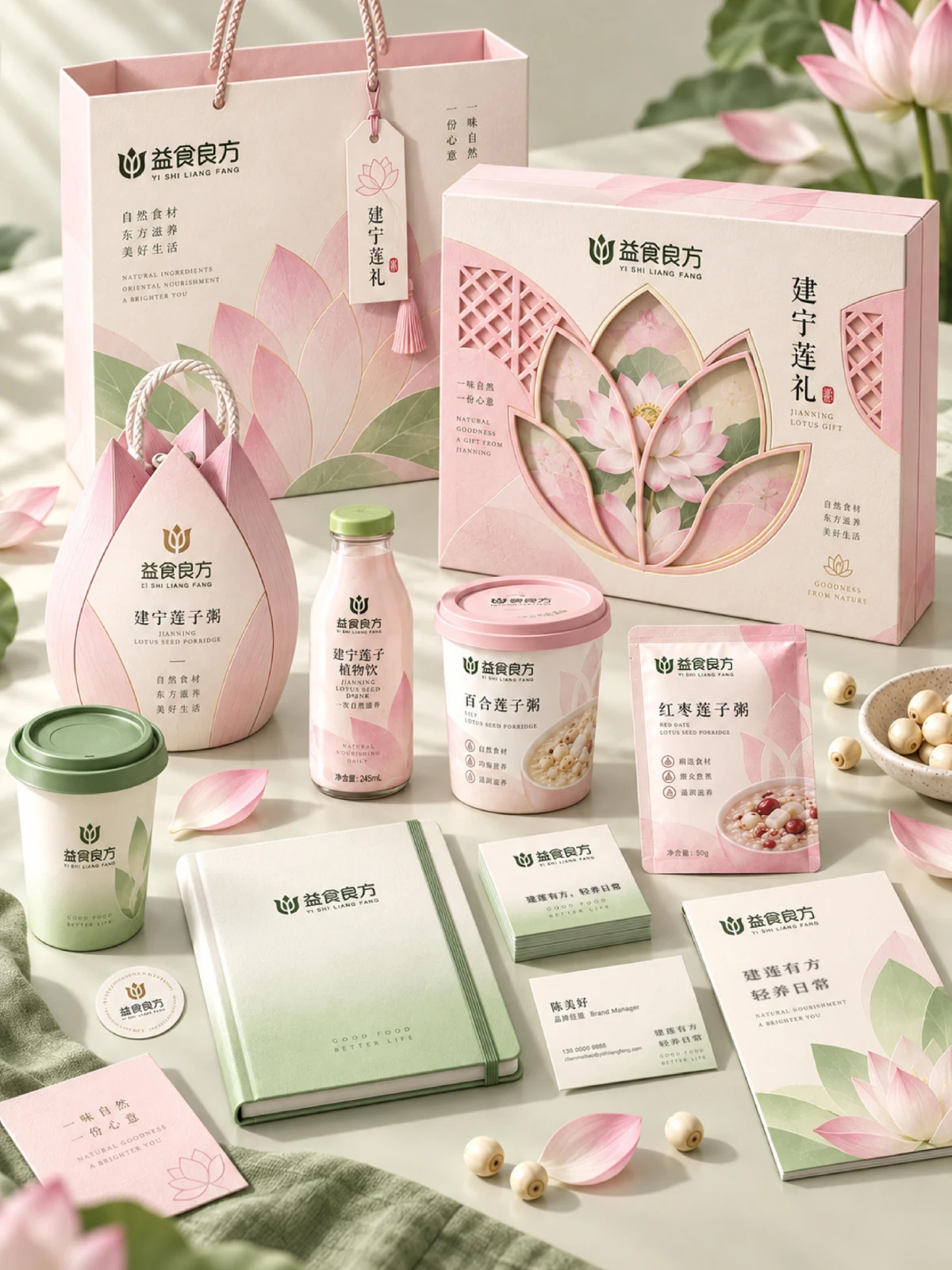
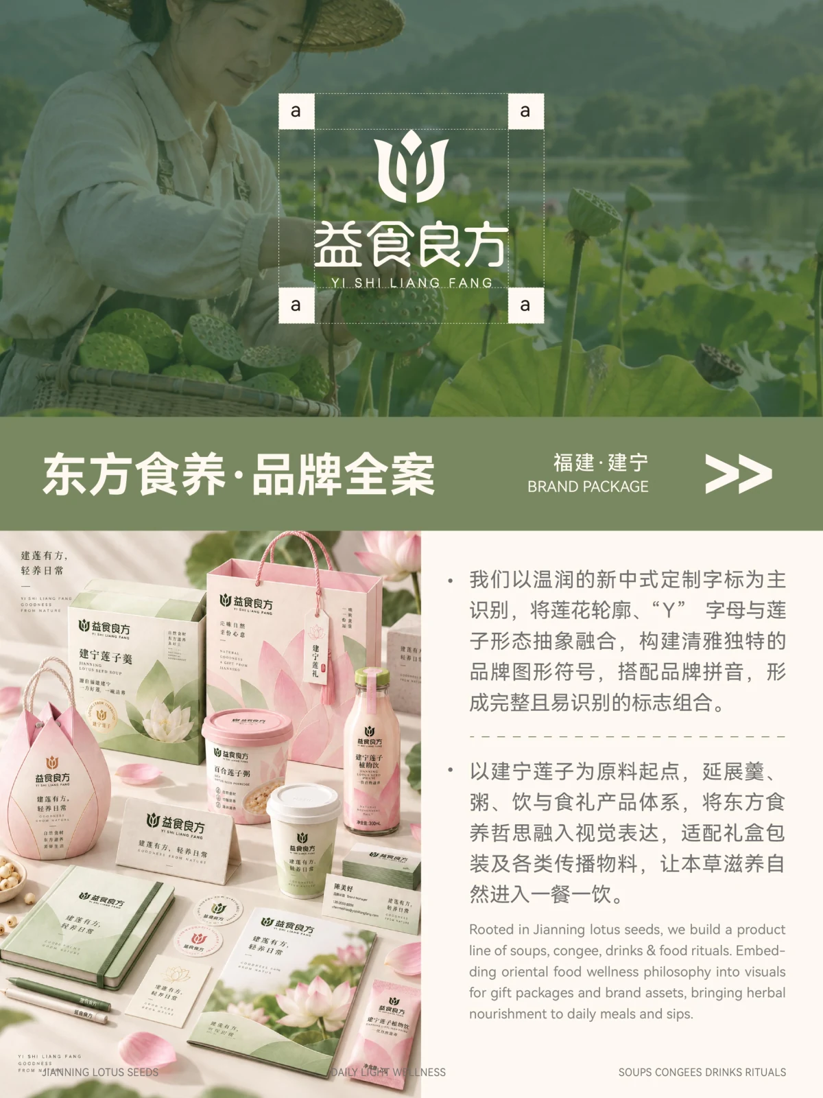
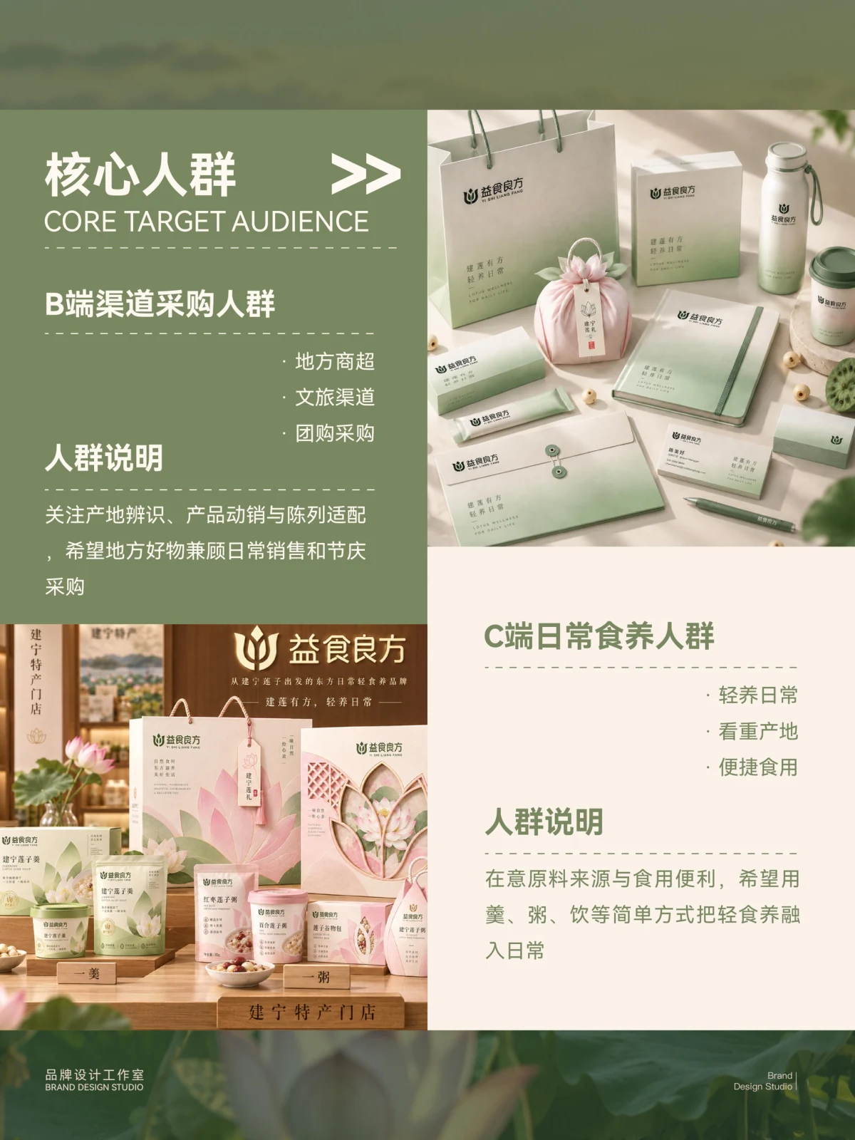
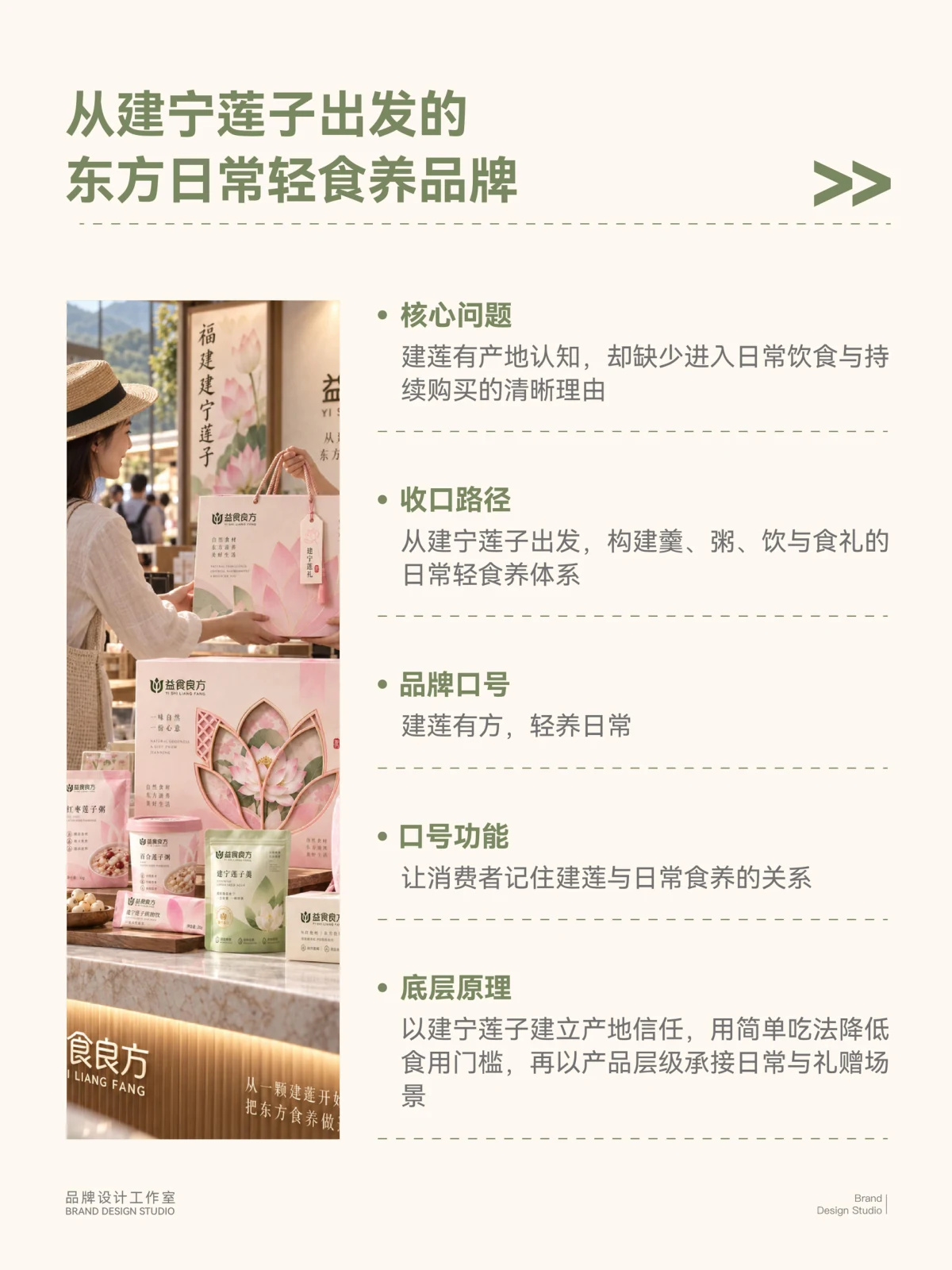
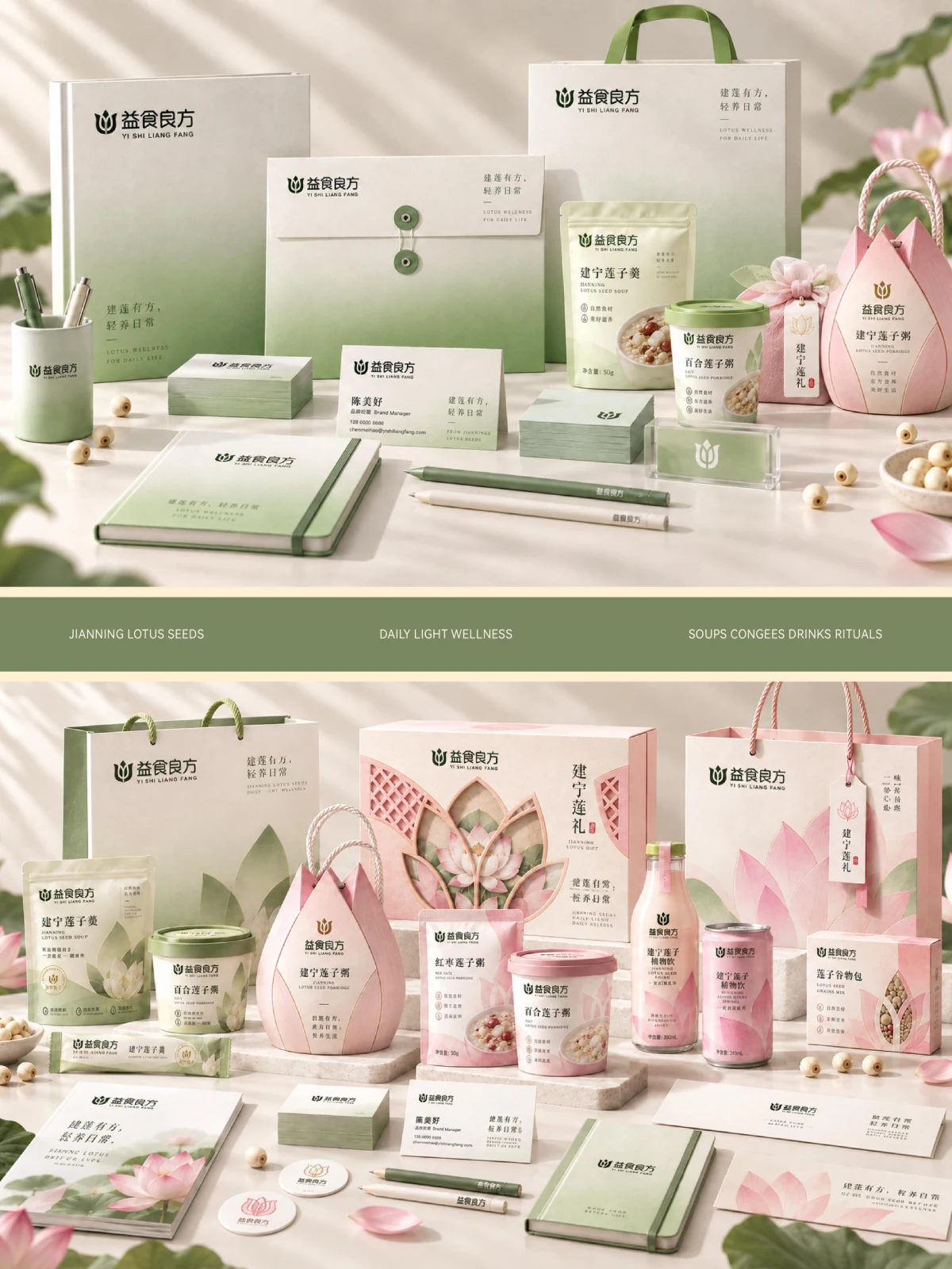
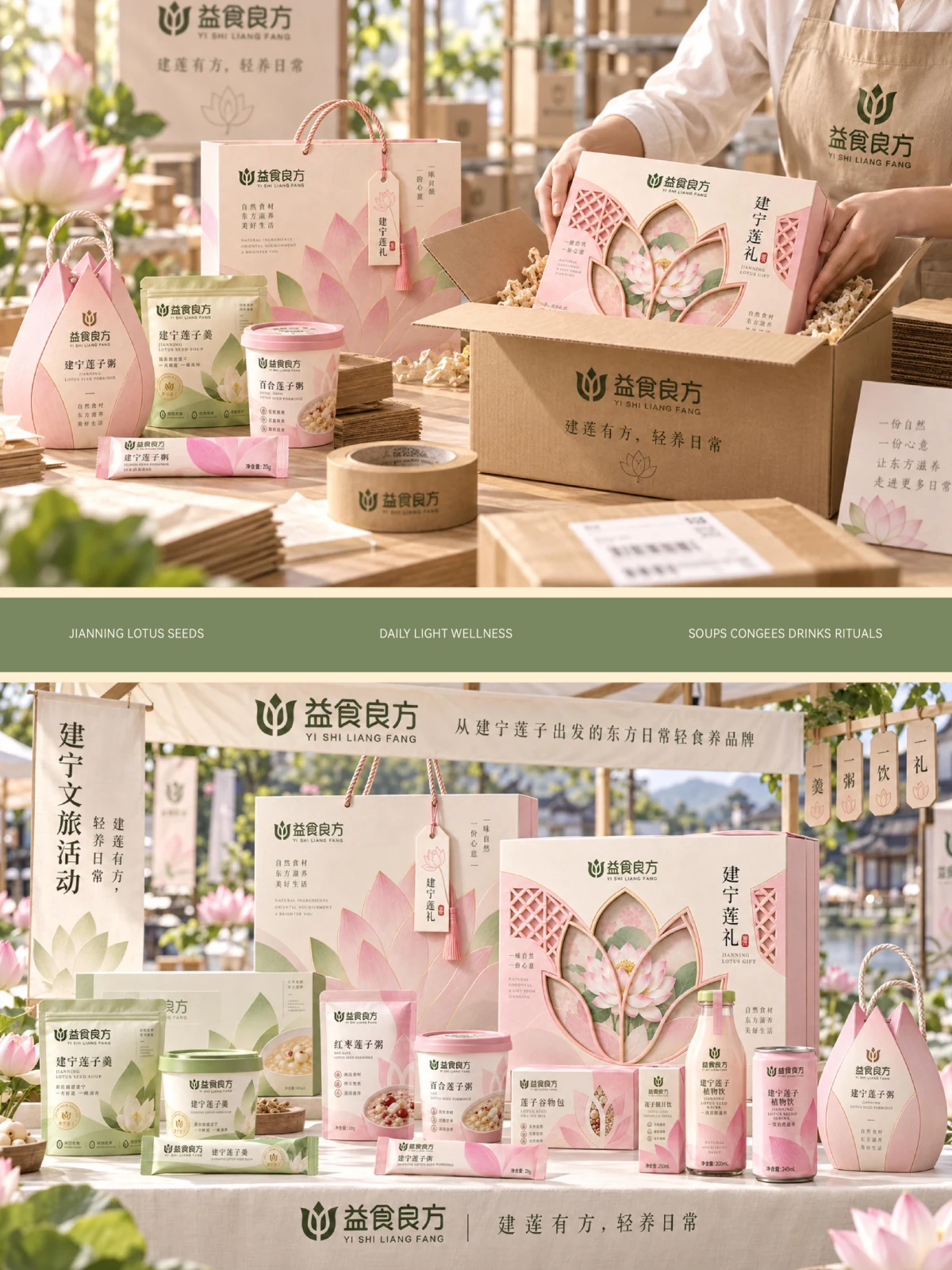
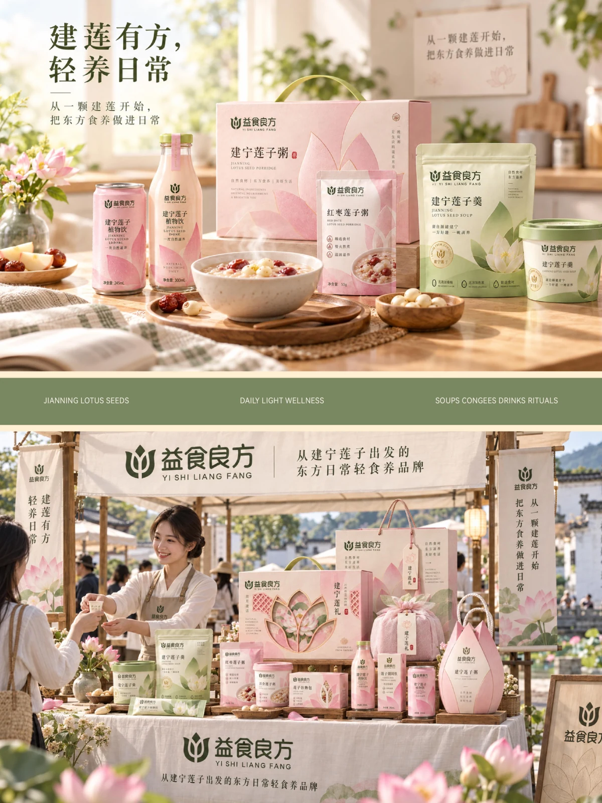
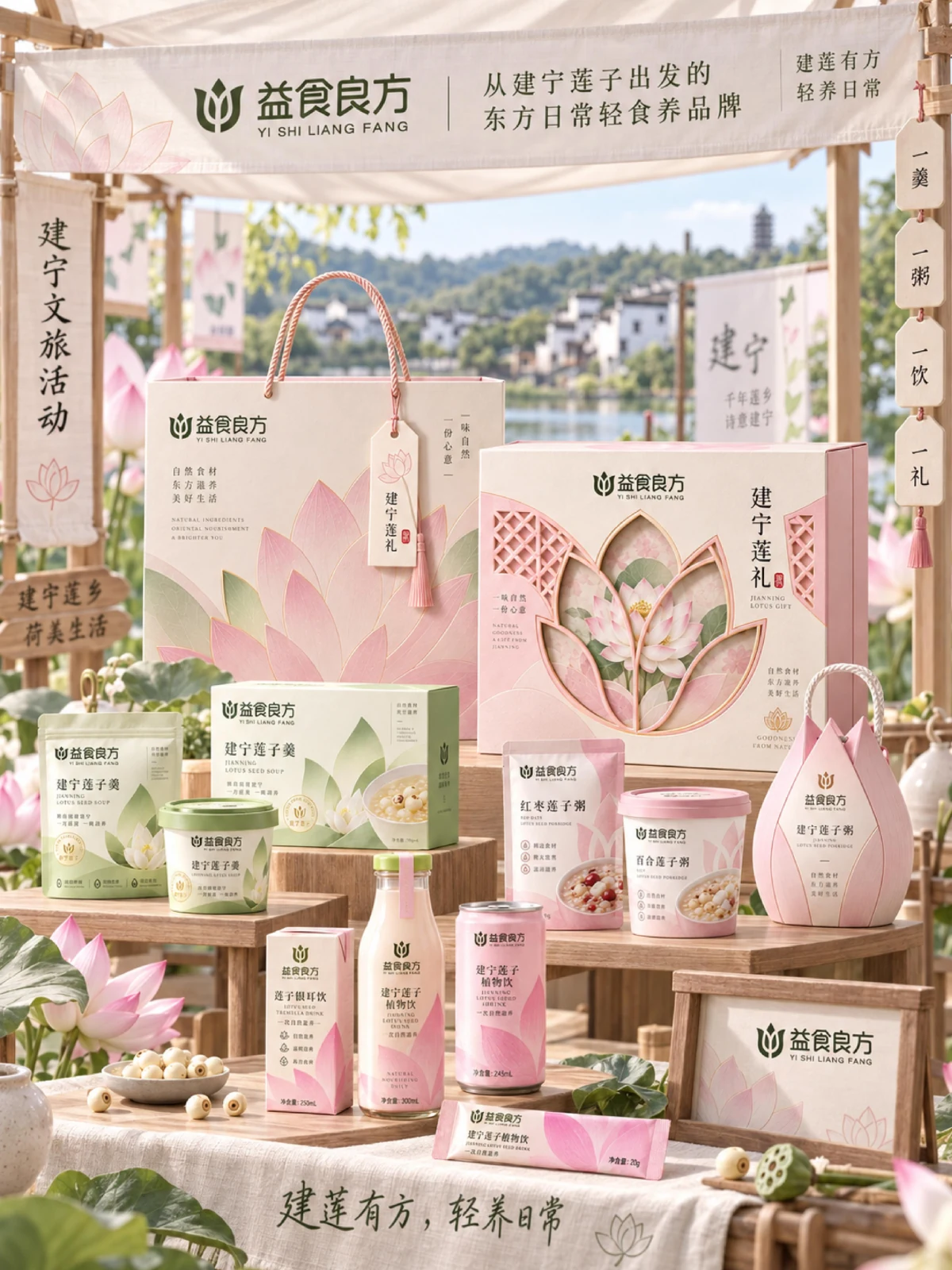
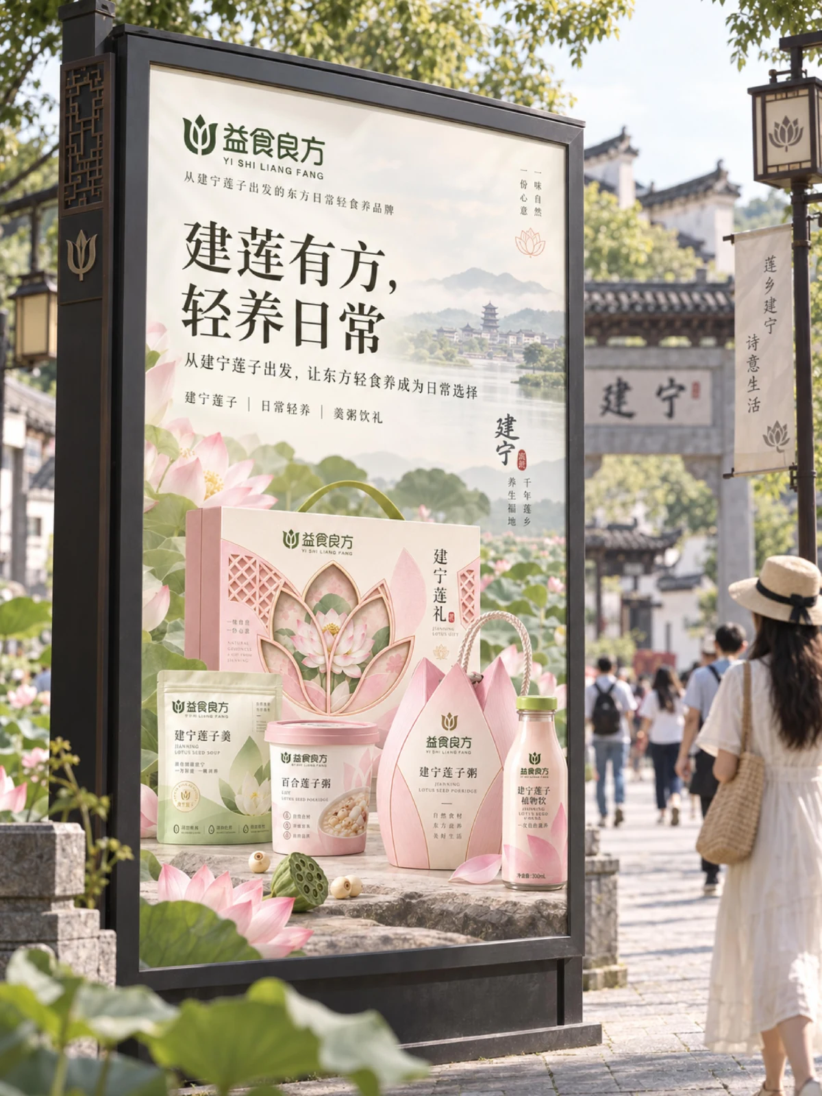
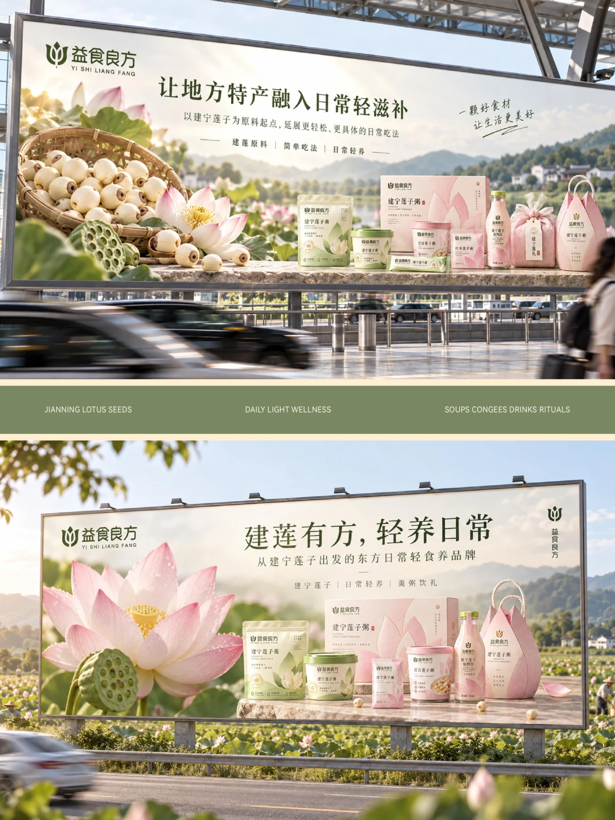
Yishi Liangfang's project centres on lotus-seed foods, connecting ingredient imagery, different sizes and packaging ranges. Lotus-seed graphics and brand lettering establish the identity, distinguishing product names from supporting information across boxes, bags and displays so that ingredient content and the food-nourishment expression remain consistent.
- Region
- China · Jiangsu
- Industry
- Lotus-seed foods
- Scope
- Brand identity and packaging design
- Project year
- —
ADesign task
The Yishi Liangfang design brings ingredient imagery, brand typography and packaging information into a shared visual system for lotus-seed foods.
BKey considerations
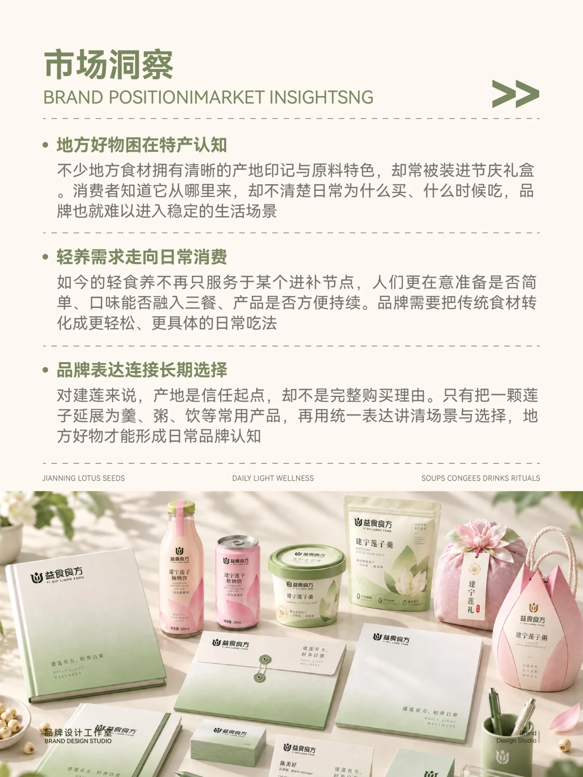
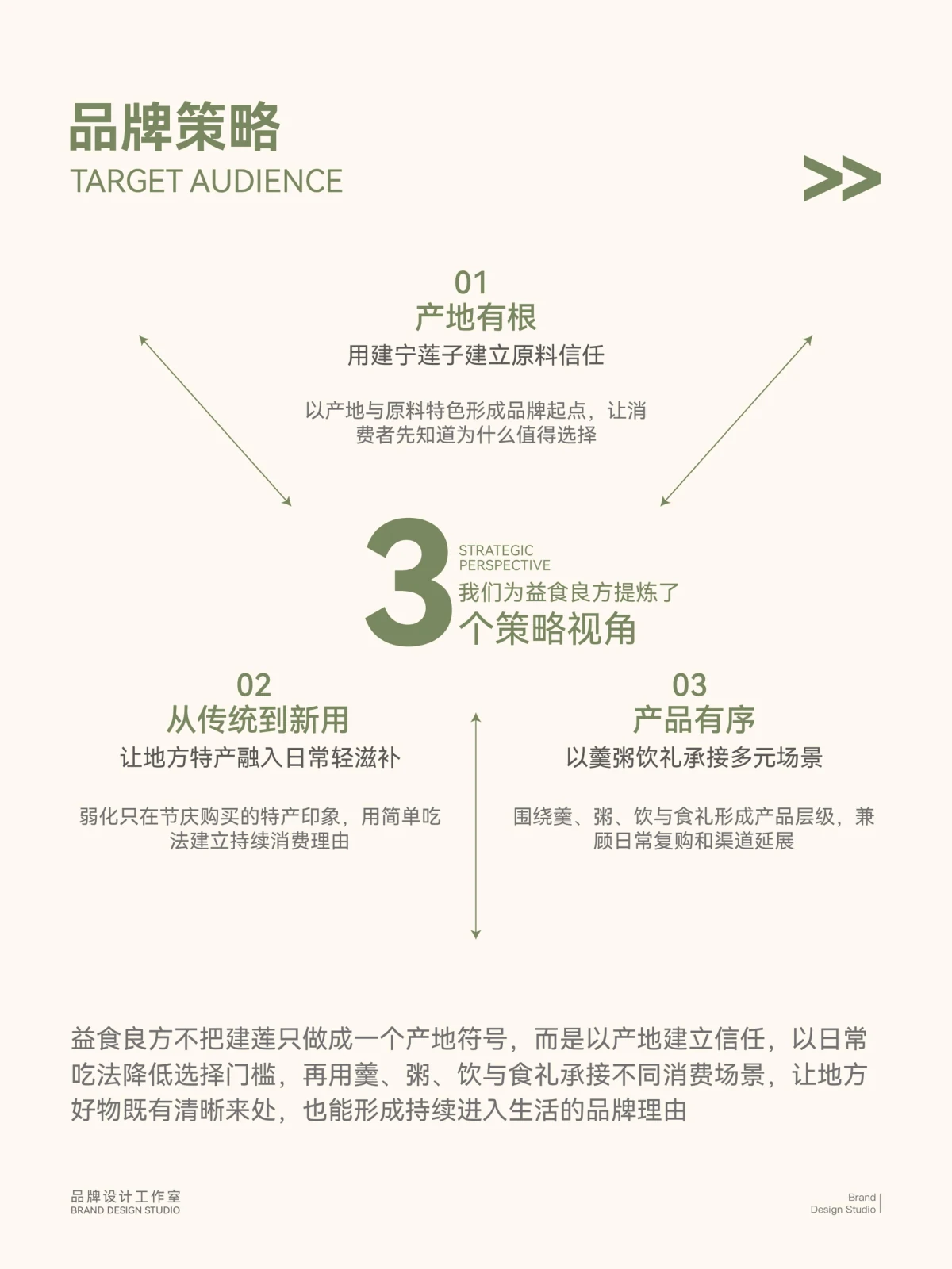
The design balances ingredient recognition with consistency across product formats, using a stable order for ingredient, product and brand information.
CVisual design
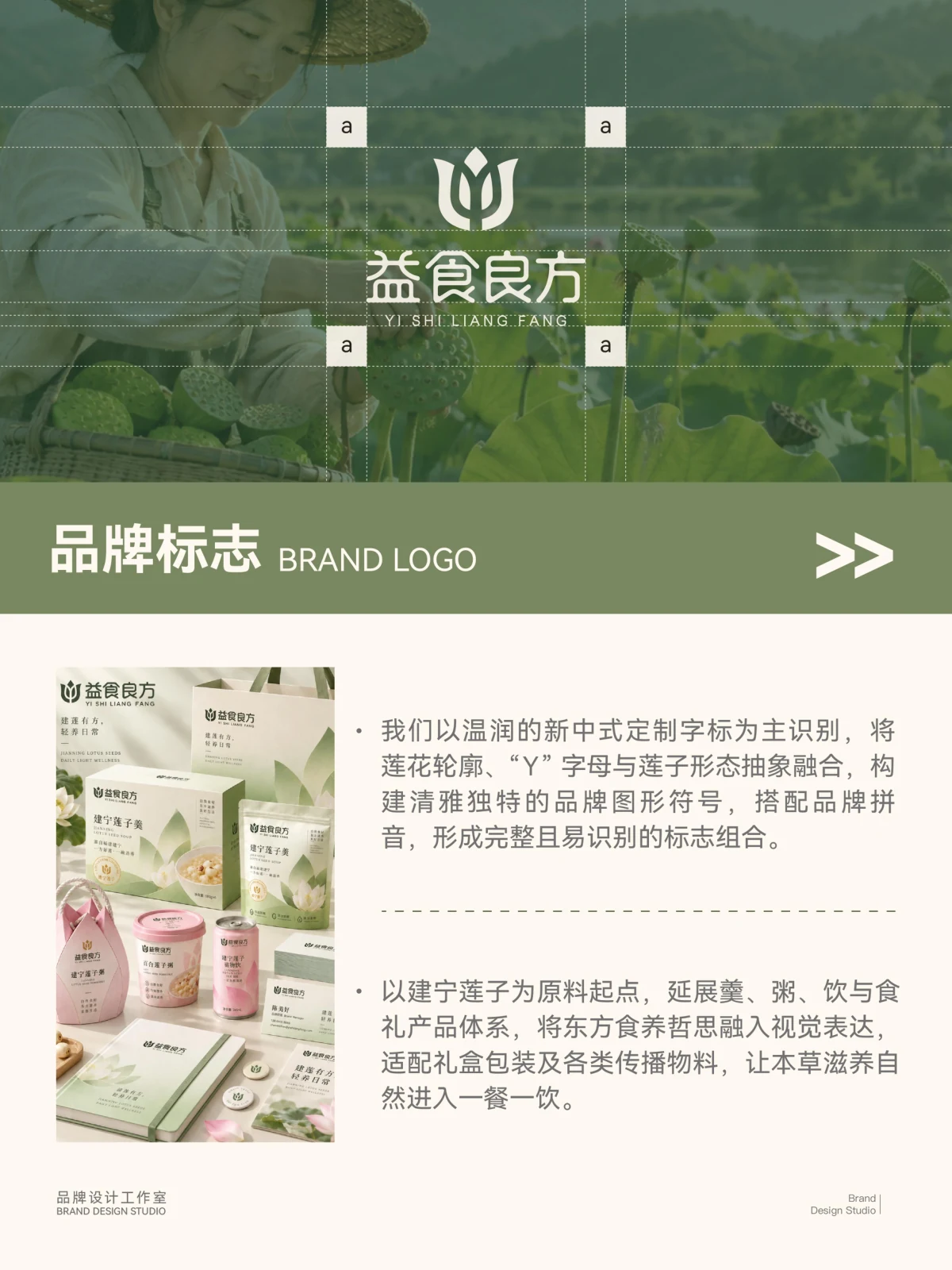
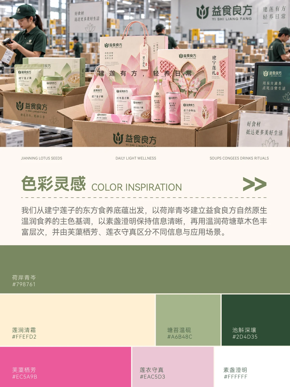
The logo and lotus-seed graphics establish a recognisable identity, while green and pink organise packaging ranges. Brand names, product names and supporting information have distinct reading levels.
DApplications
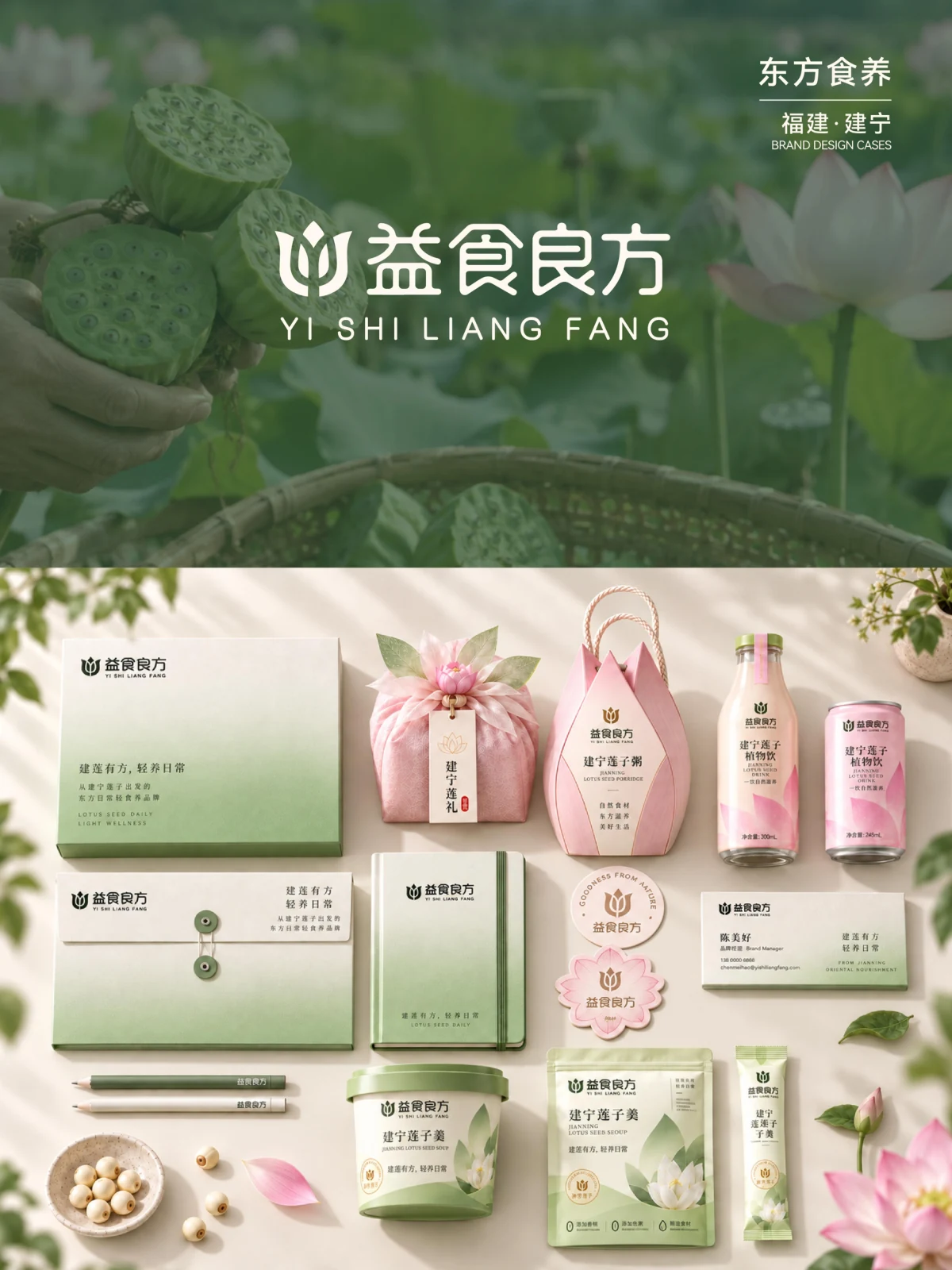
Boxes, pouches and display imagery extend the same identity, connecting ingredient imagery with product ranges across touchpoints.
ExploreExplore further
Contact
Tell us about your brand
Bring your existing materials and the problem you most want to solveWe will work out the next step together
ouryoung7943
Office
Room 1905, Unit 1, Building 1, North Gate, Yinhe Xijiang Hepan, No. 99 Qunhui North Road, Longquanyi District, Chengdu, Sichuan, China