JONAFAY
Botanical colour and restrained lettering for skincare
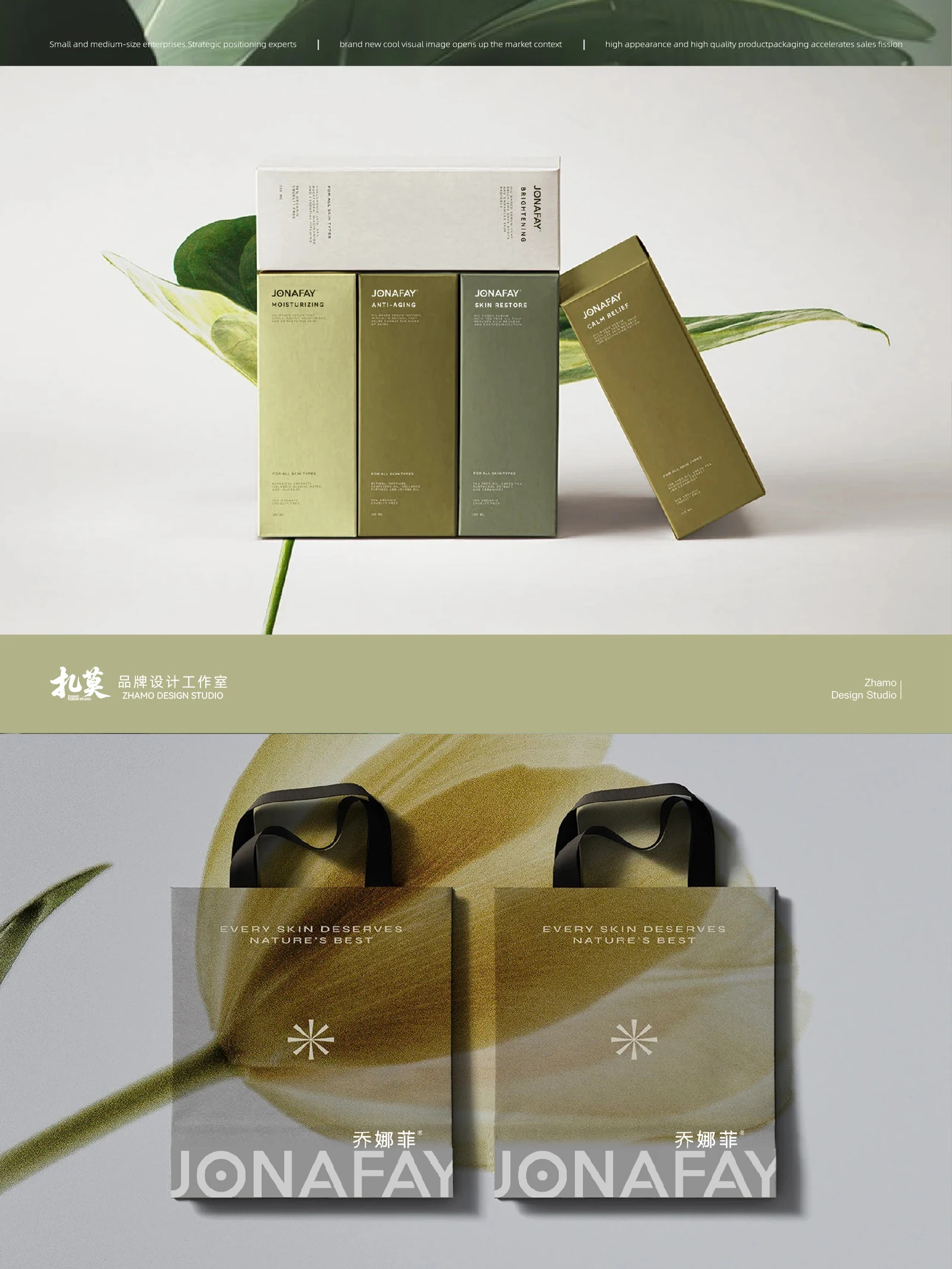
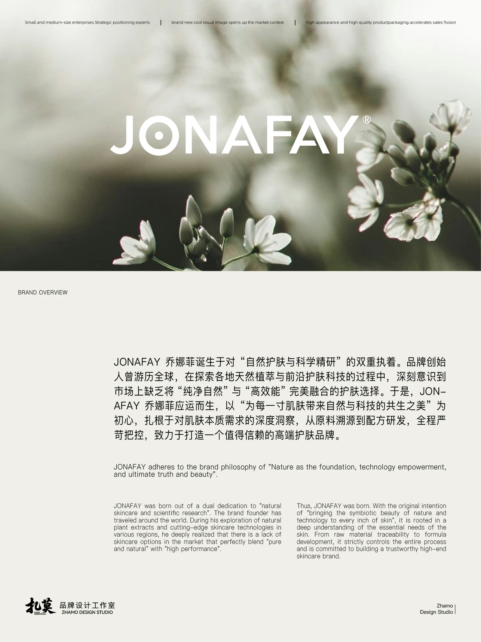
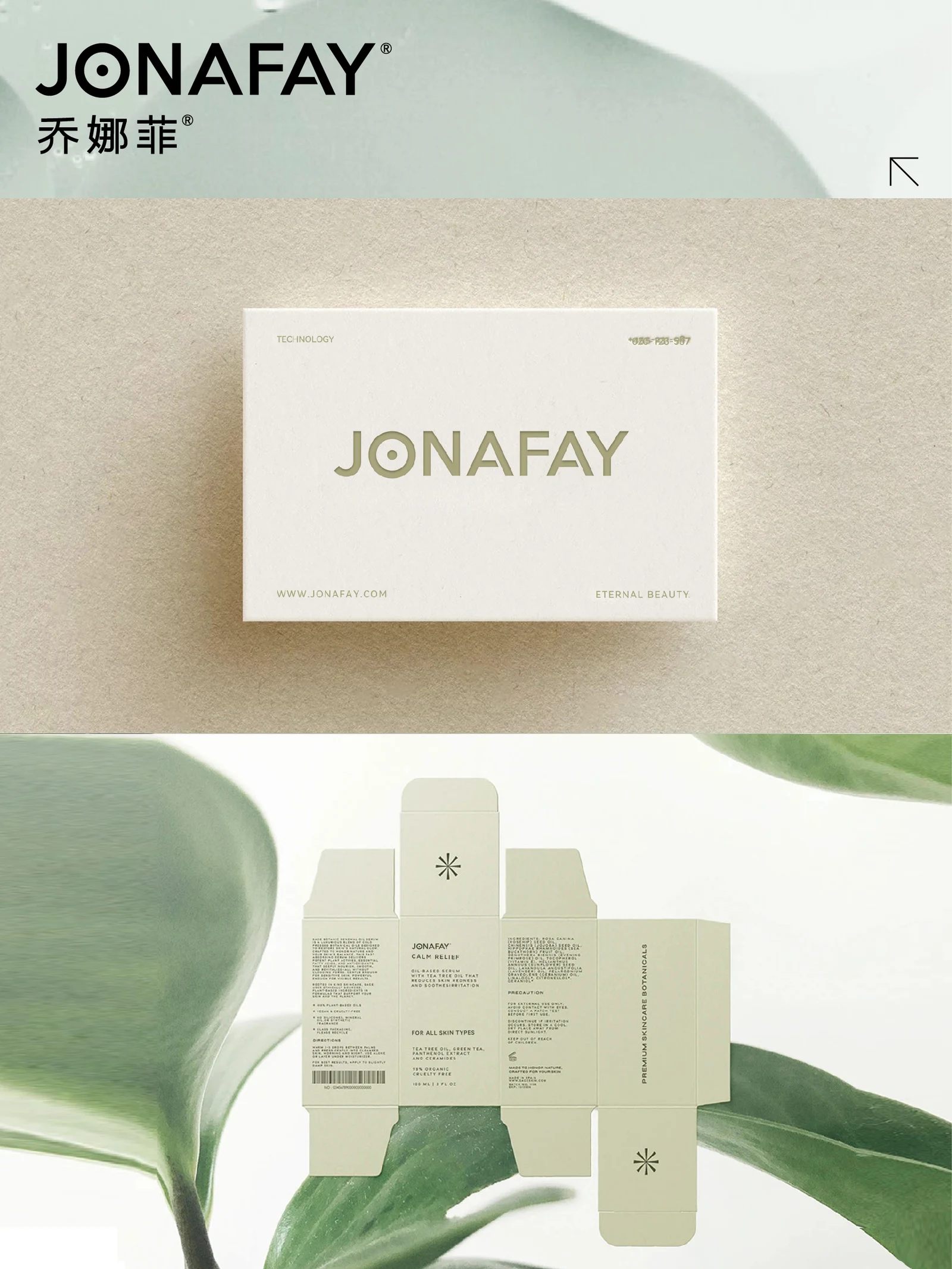
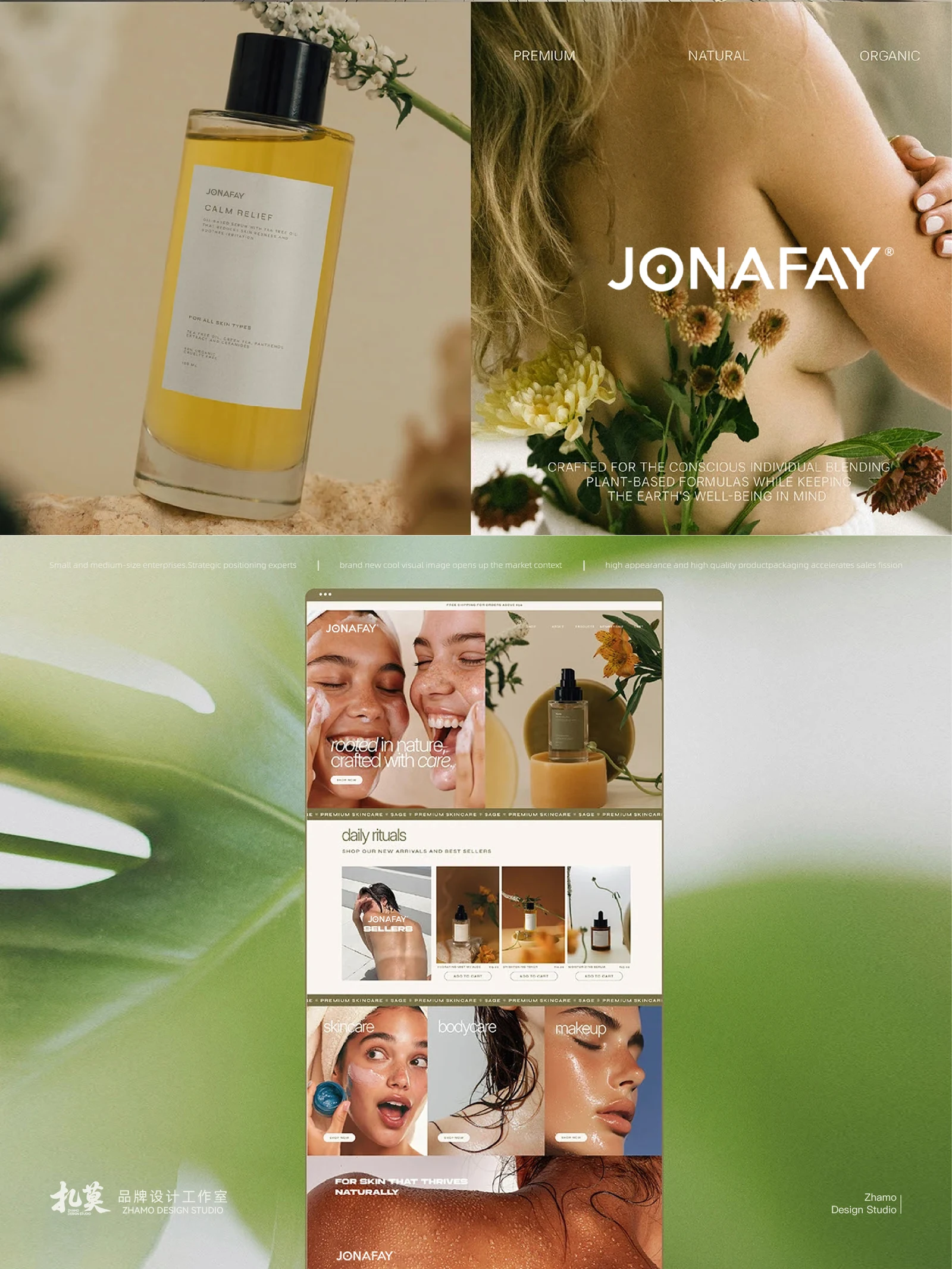
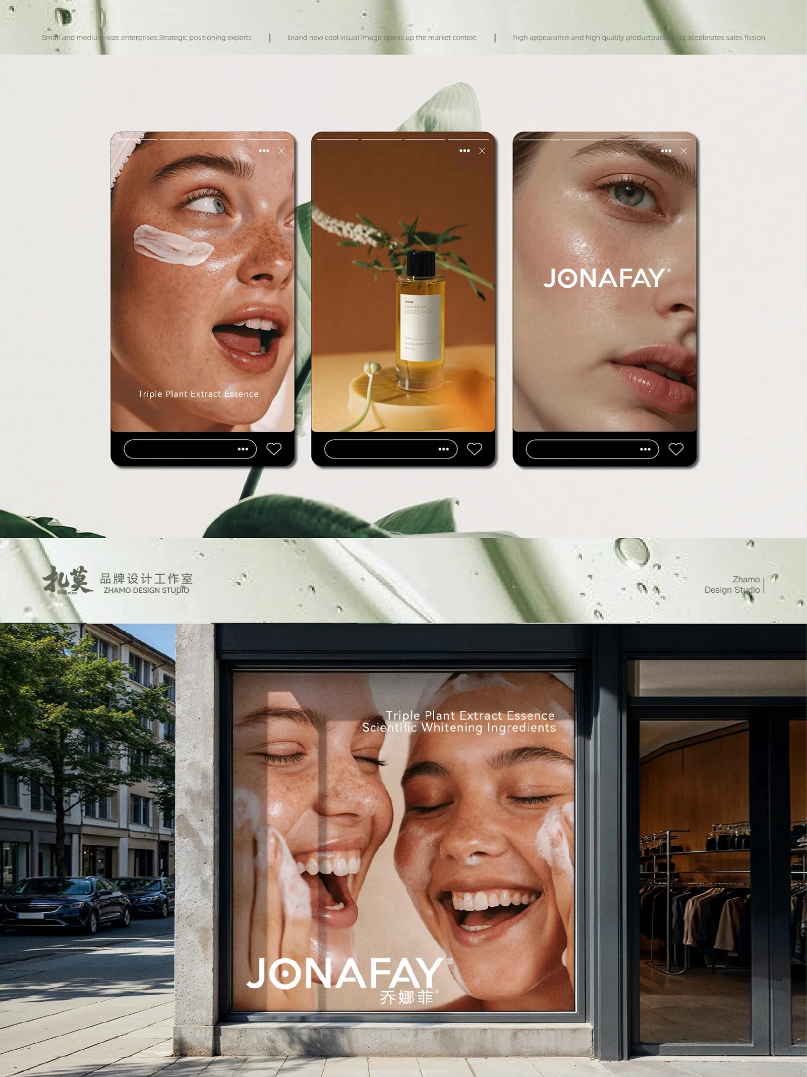
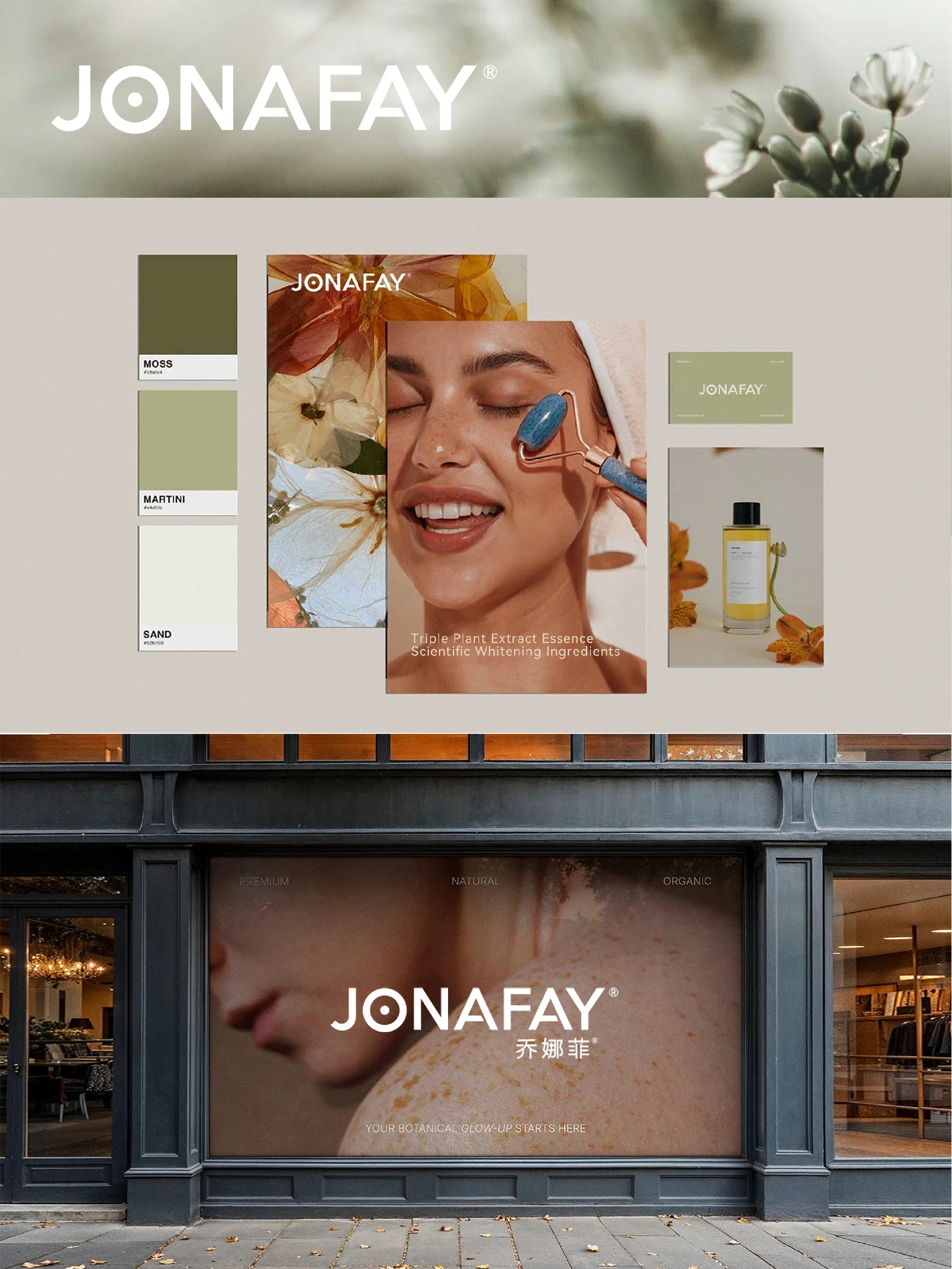
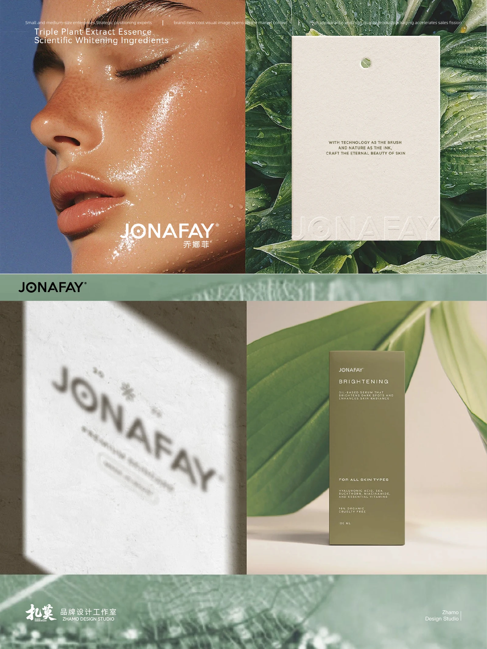
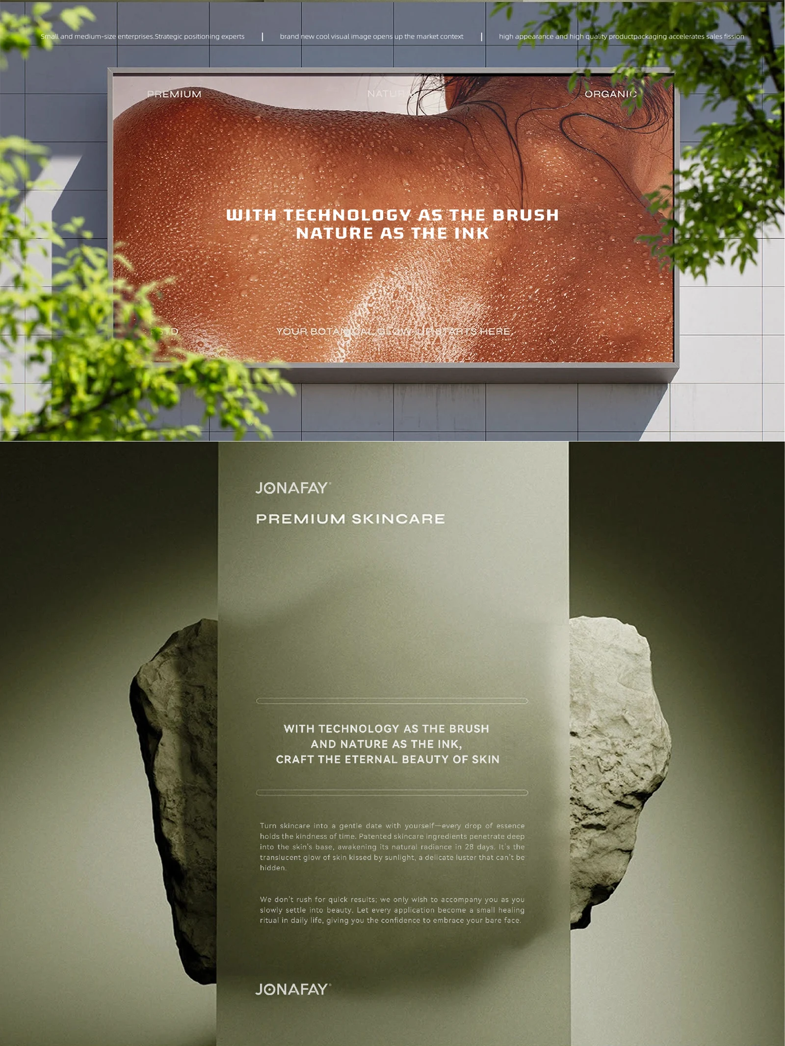
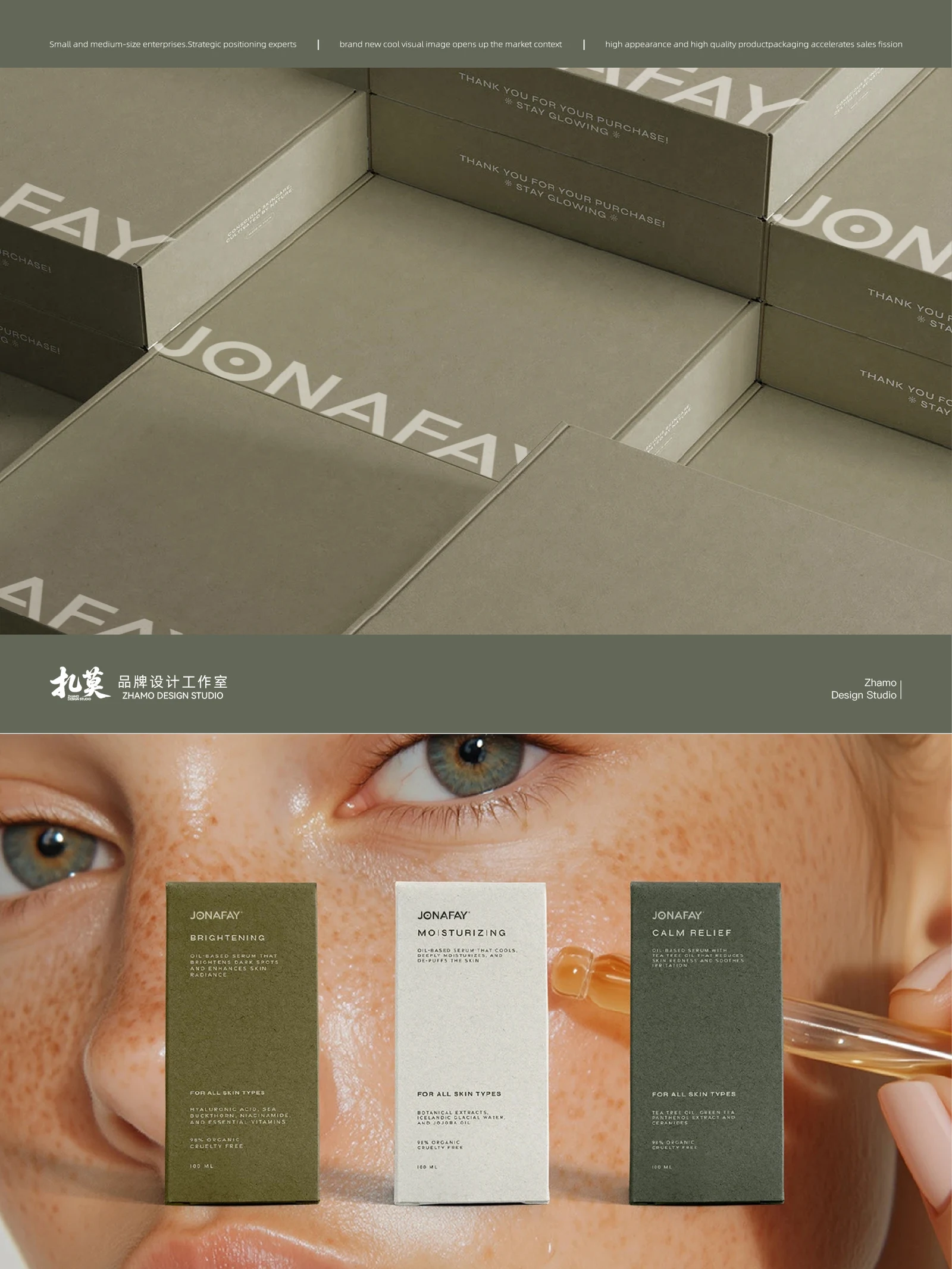
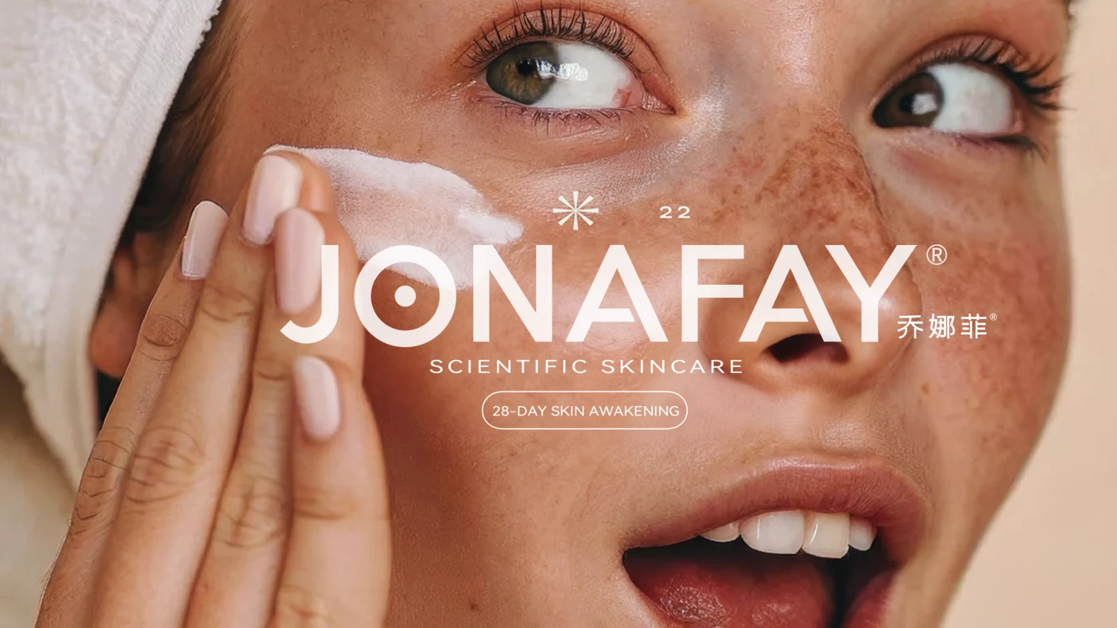
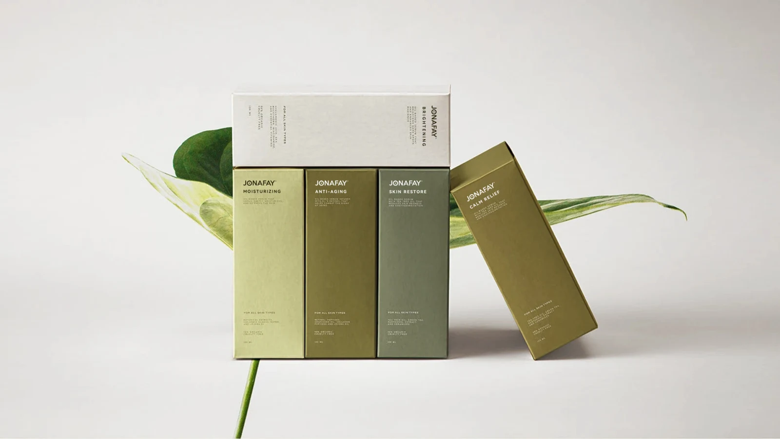
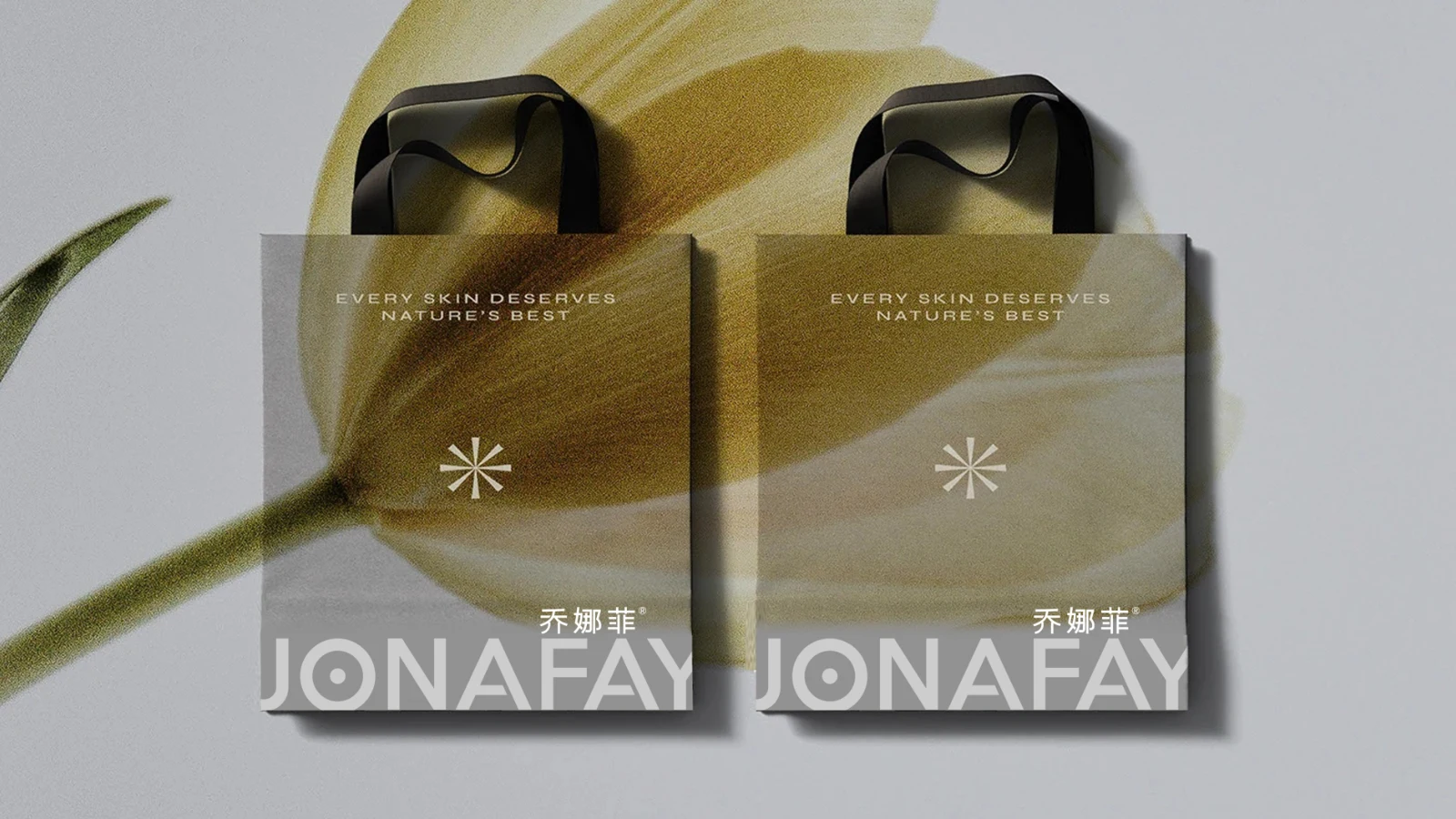
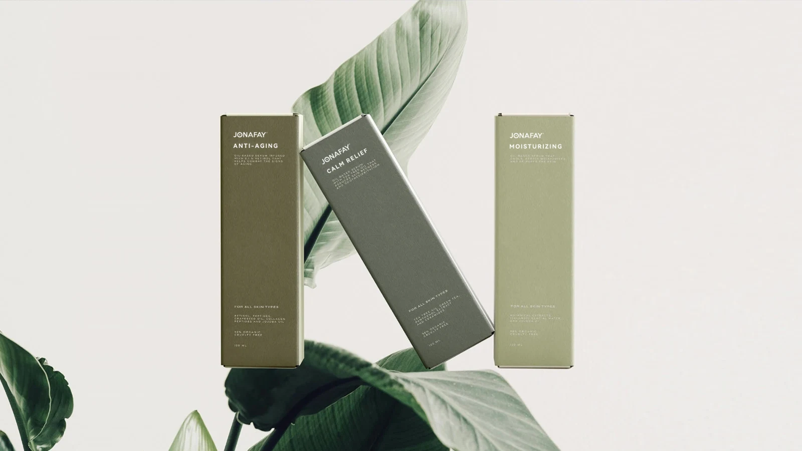
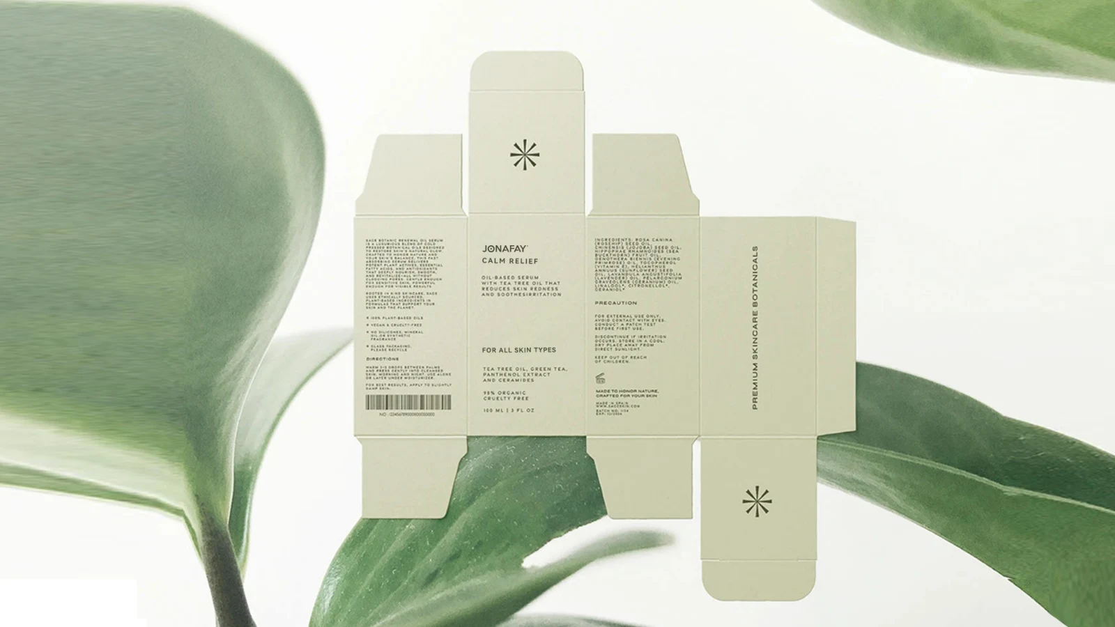
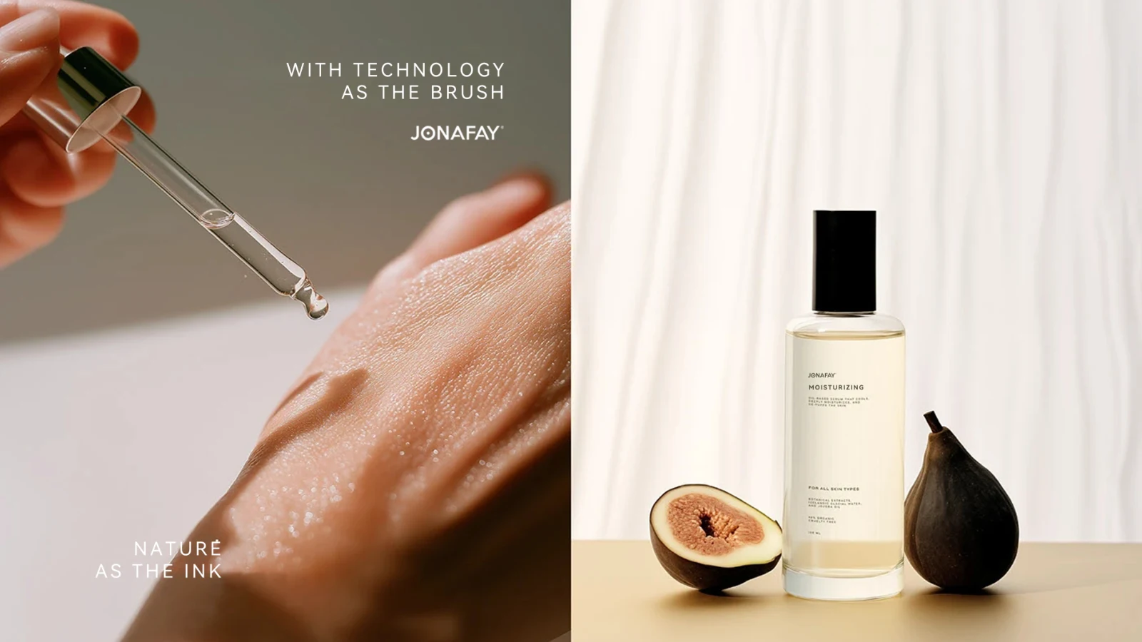
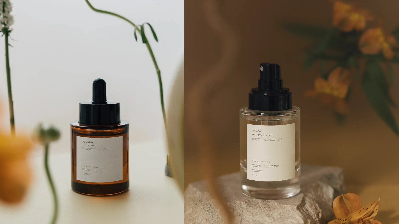
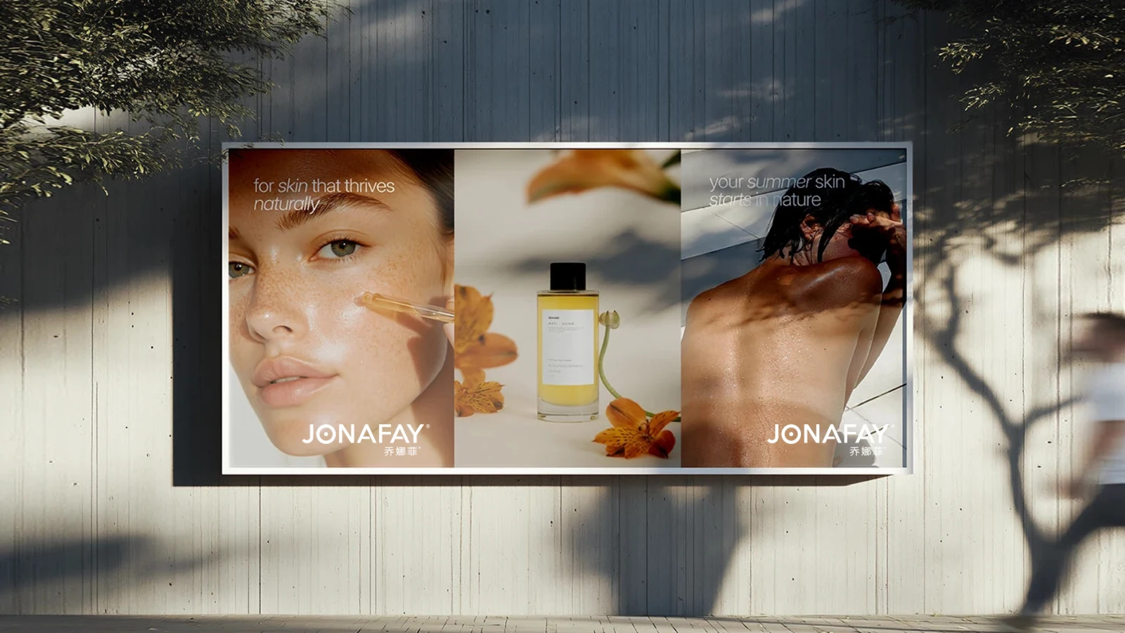
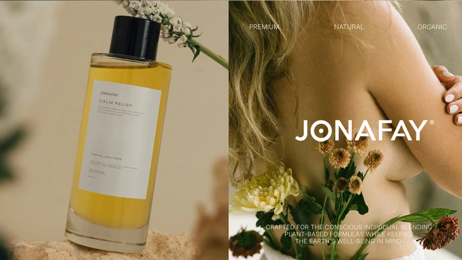
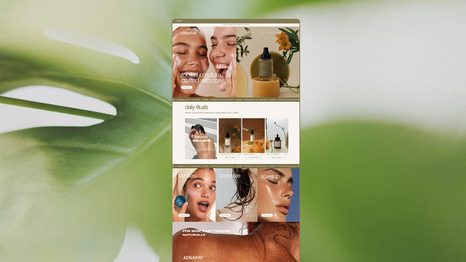
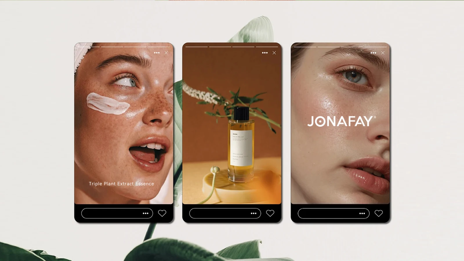
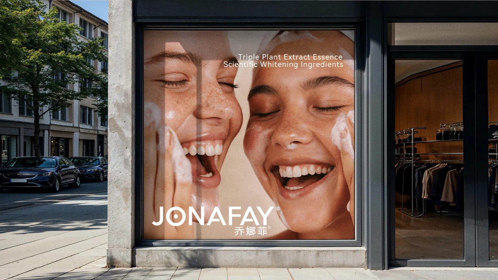
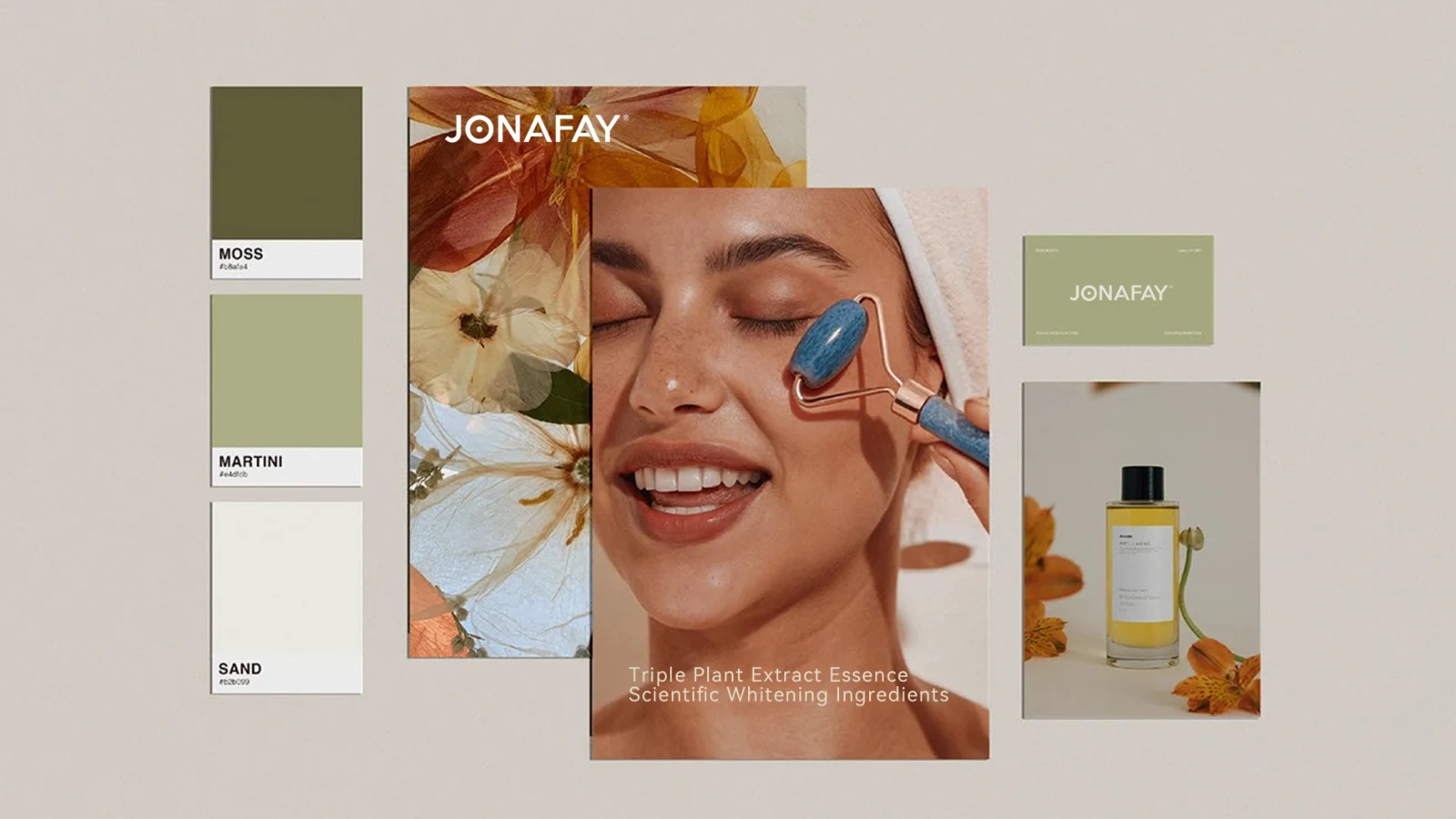
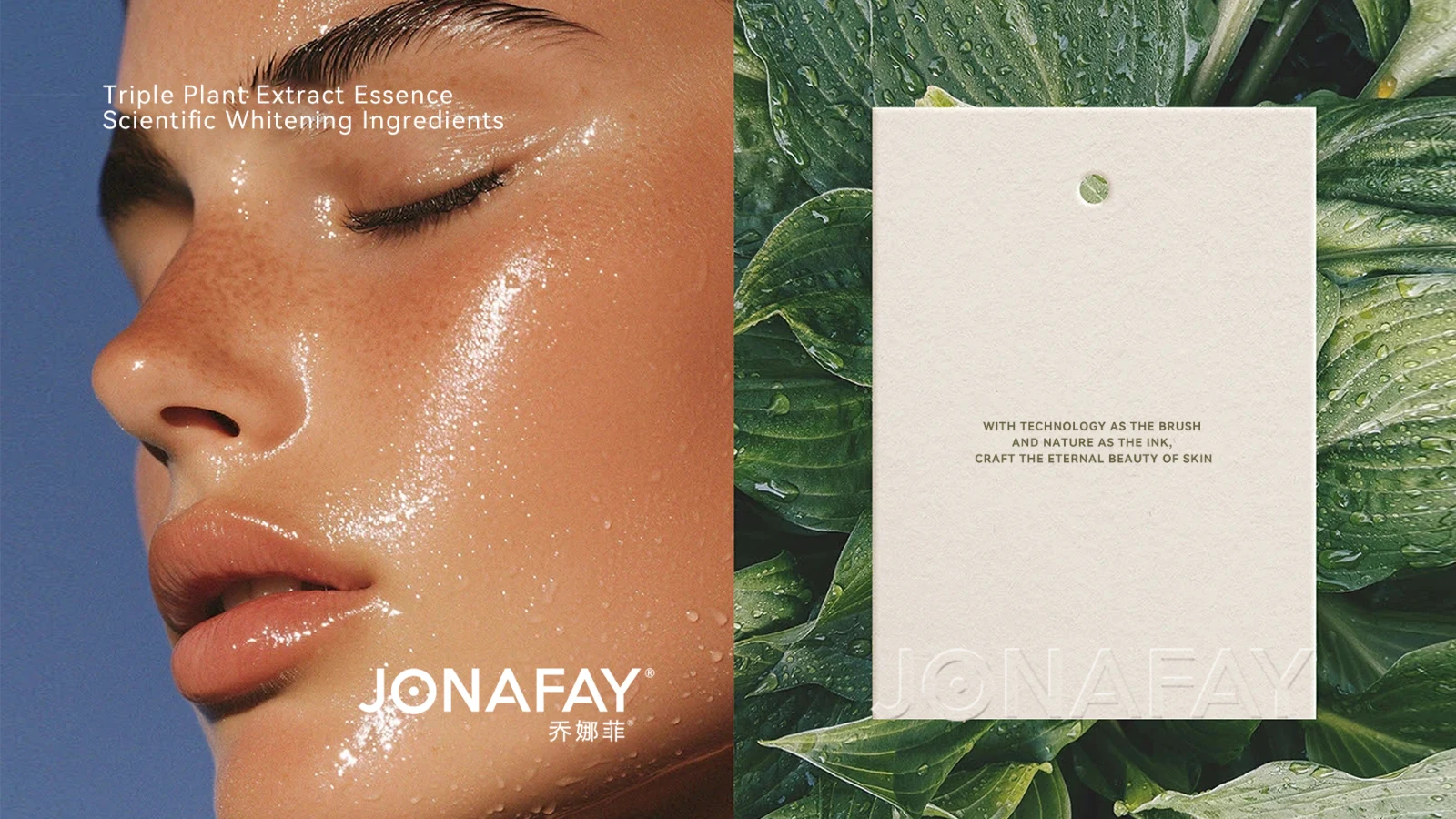
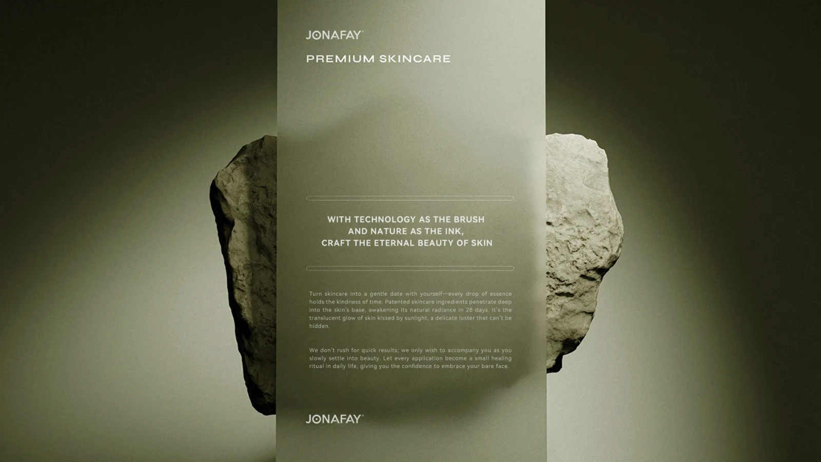
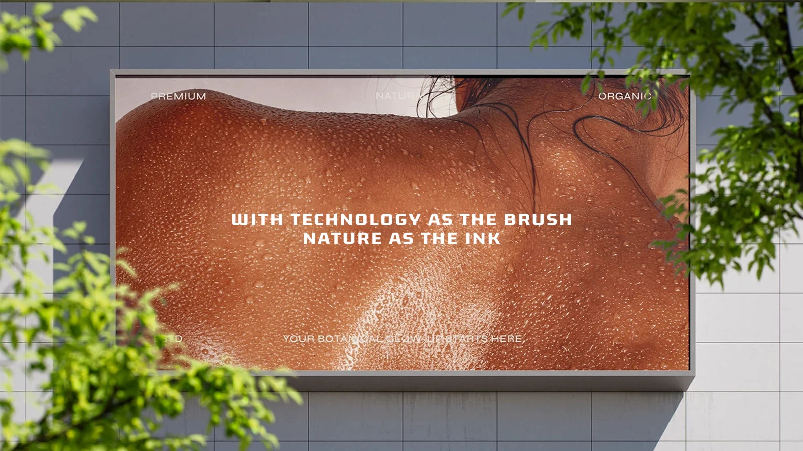
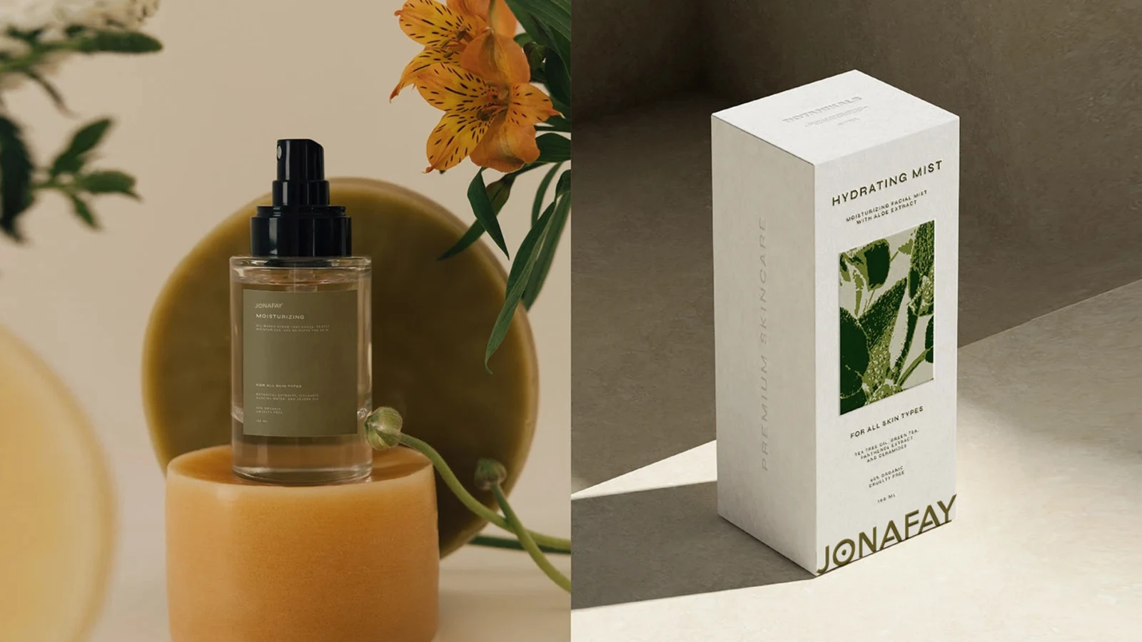
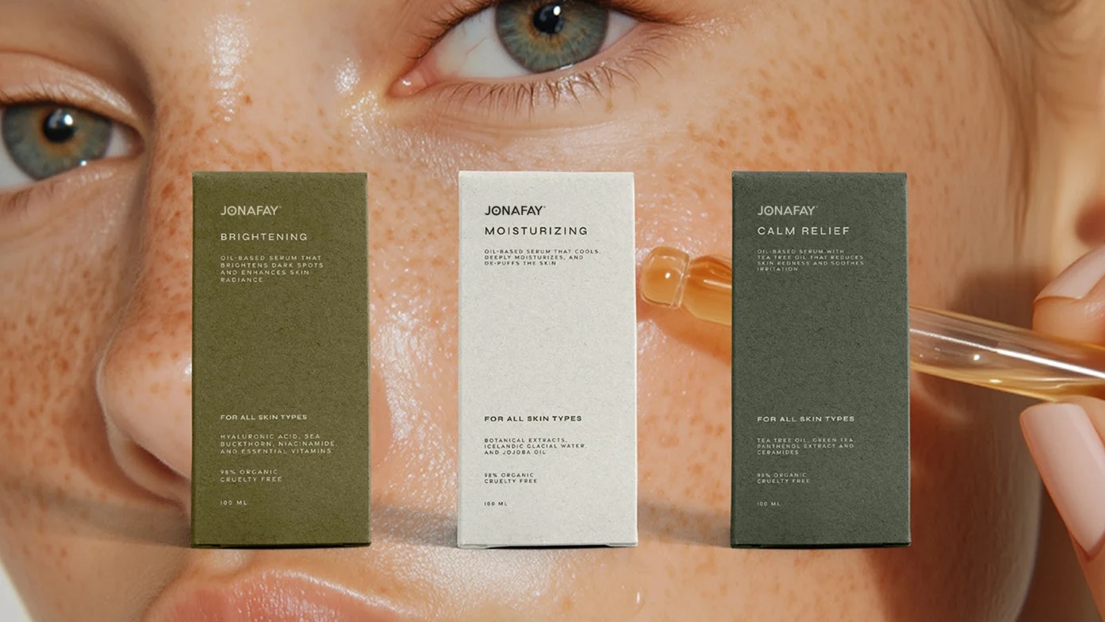
JONAFAY's brand expression centres on skincare, connecting everyday care with plants, product textures and natural skin imagery. The project considers the relationship between the name, product photographs and text, extending a simple identity to bottles, advertisements and promotional imagery so that product content and brand character remain connected.
- Region
- Wuhan, Hubei
- Industry
- Skincare
- Scope
- Visual identity · Brand applications
- Project year
- —
AChallenge
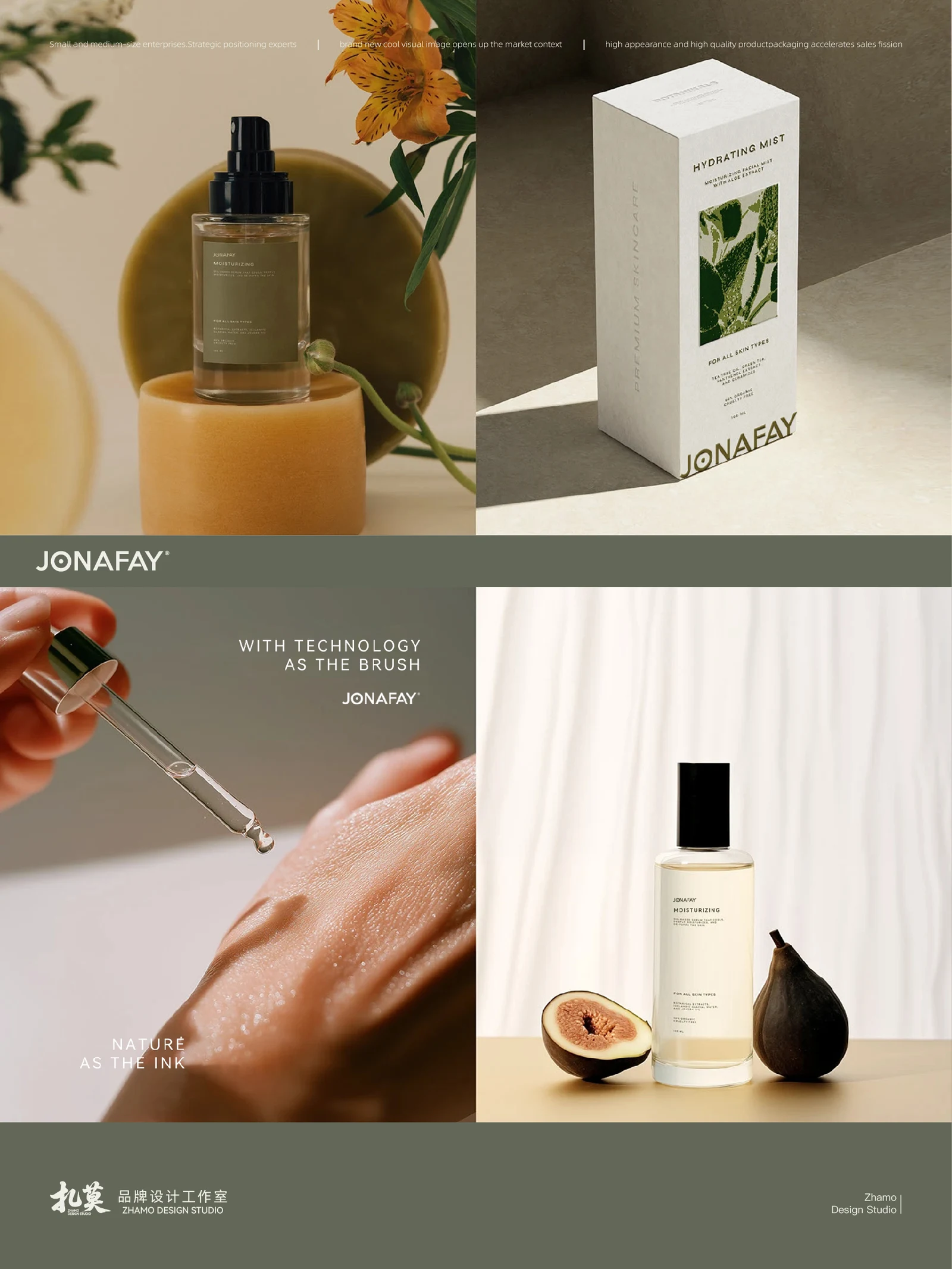
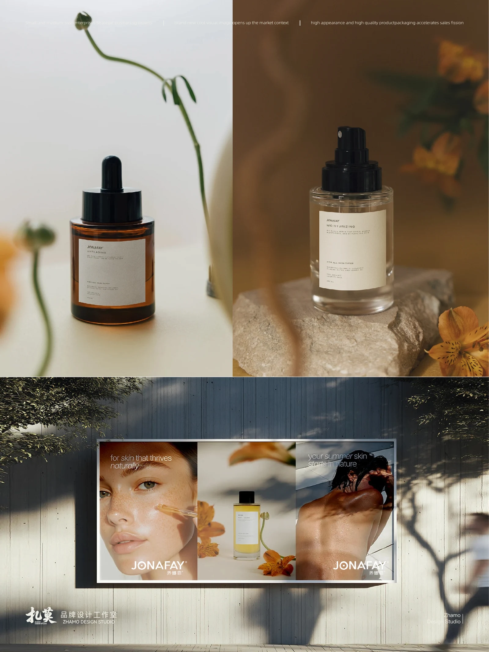
The JONAFAY presentation centres on skincare products, botanical imagery and skin details.
BThinking
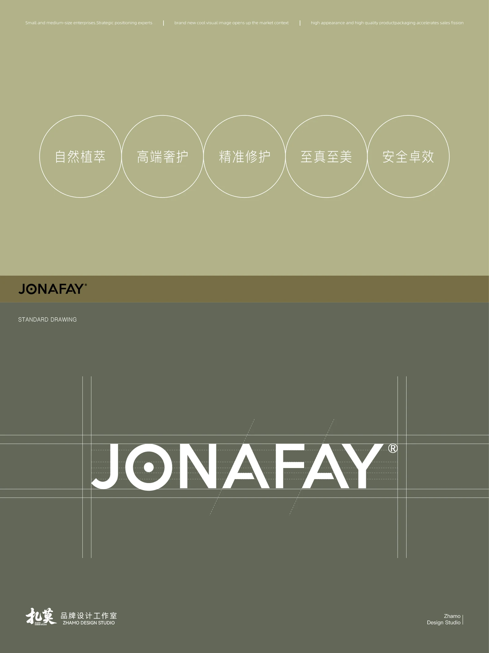
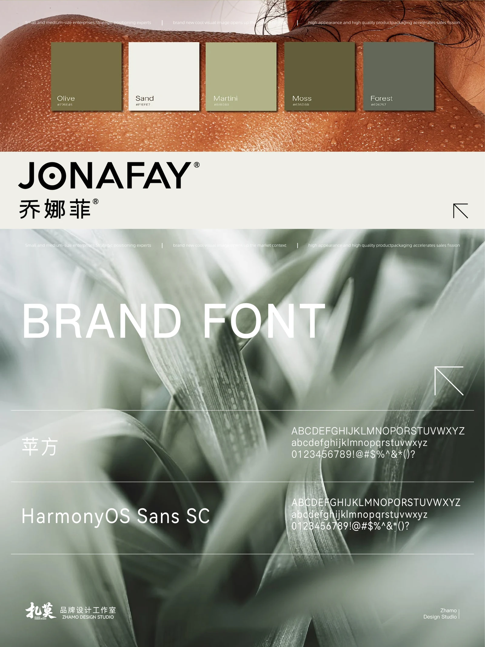
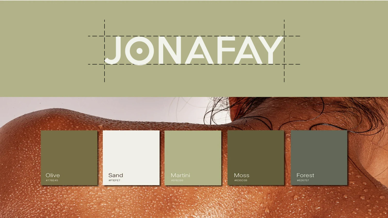
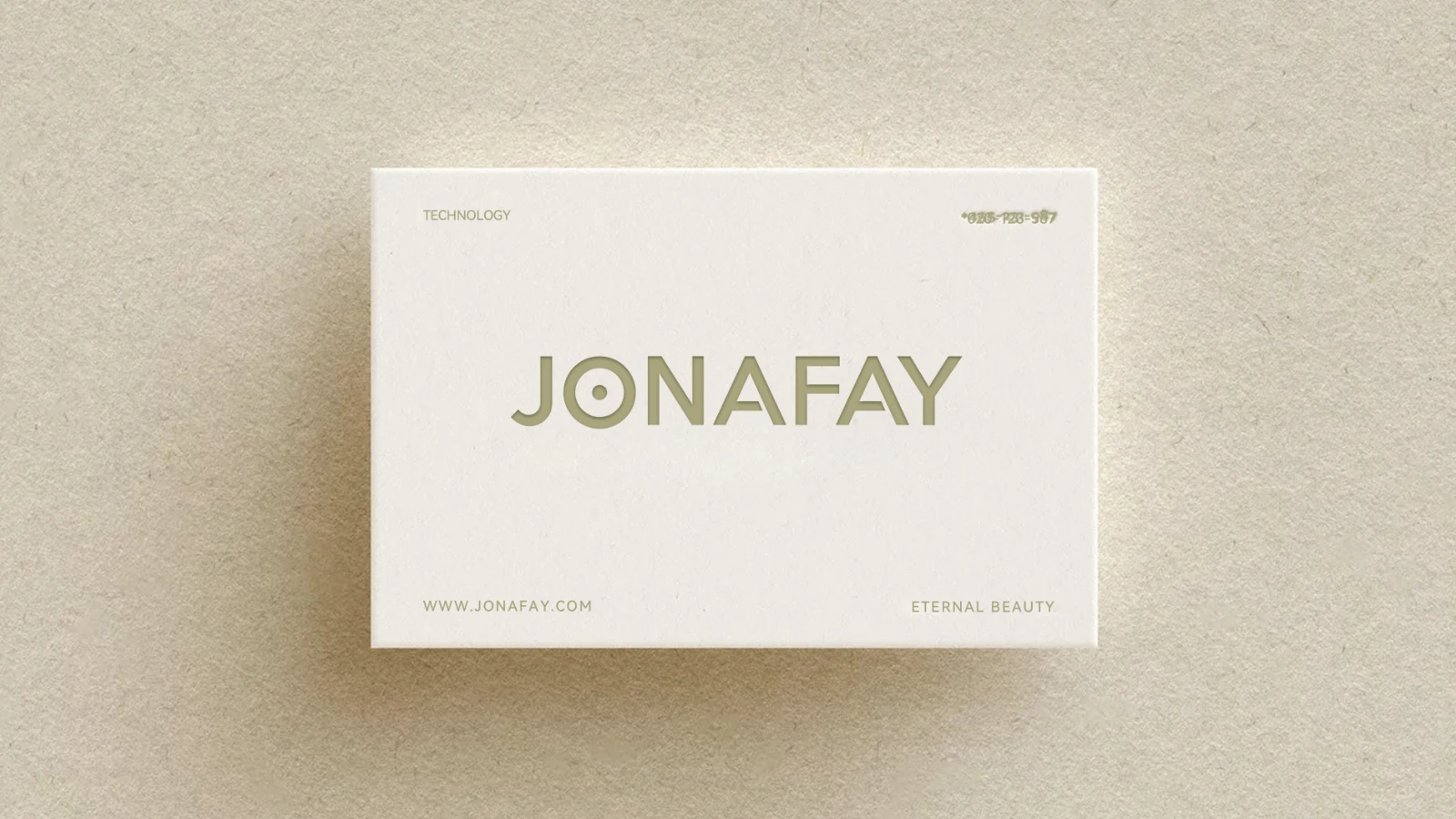
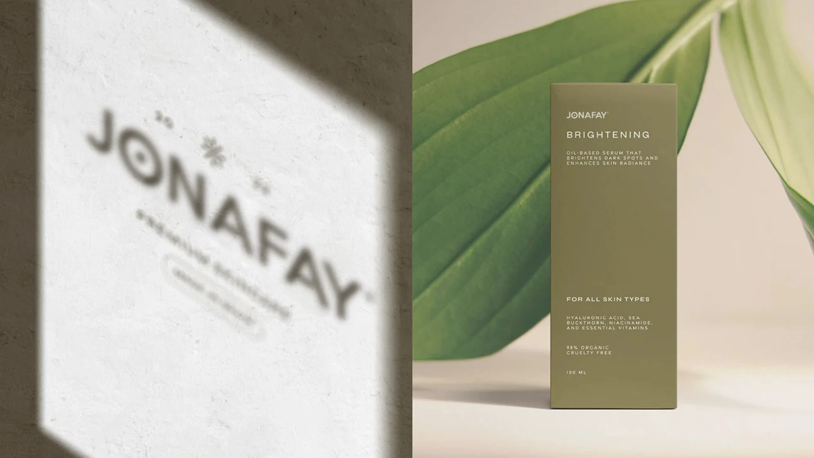
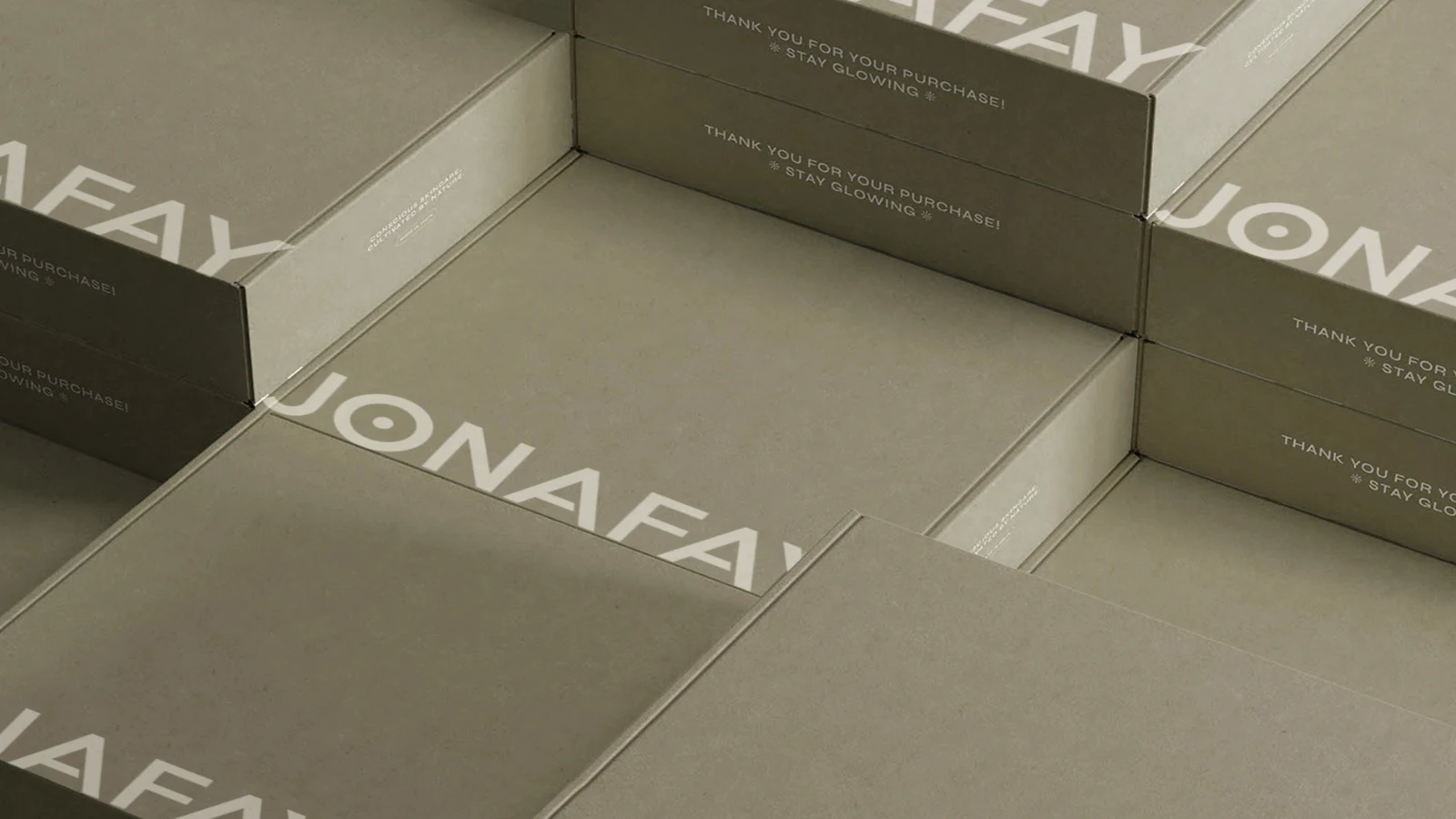
Restrained lettering includes a dot within the wordmark as a distinguishing detail, with product naming kept separate from photography.
CDesign
Olive, tan and cream form a muted palette alongside plants, oil textures and natural skin imagery.
DApplication
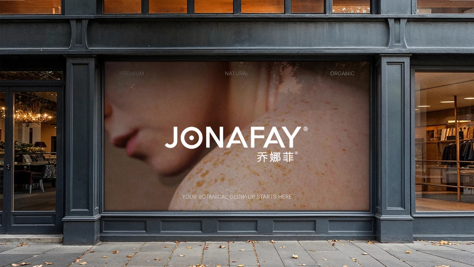
Bottles, product advertisements and outdoor posters show applications without converting efficacy wording into verified claims.
ExploreExplore further
Contact
Tell us about your brand
Bring your existing materials and the problem you most want to solveWe will work out the next step together
ouryoung7943
Office
Room 1905, Unit 1, Building 1, North Gate, Yinhe Xijiang Hepan, No. 99 Qunhui North Road, Longquanyi District, Chengdu, Sichuan, China