
TABAN
From decorative cushions to everyday rest
Taban builds on cushions and home accessories, focusing on leaning, holding and support during rest. It connects everyday tiredness with practical comfort, helping people consider cushions for reading and relaxing as well as decoration.
- Region
- Yangzhou, Jiangsu
- Industry
- Home cushions
- Scope
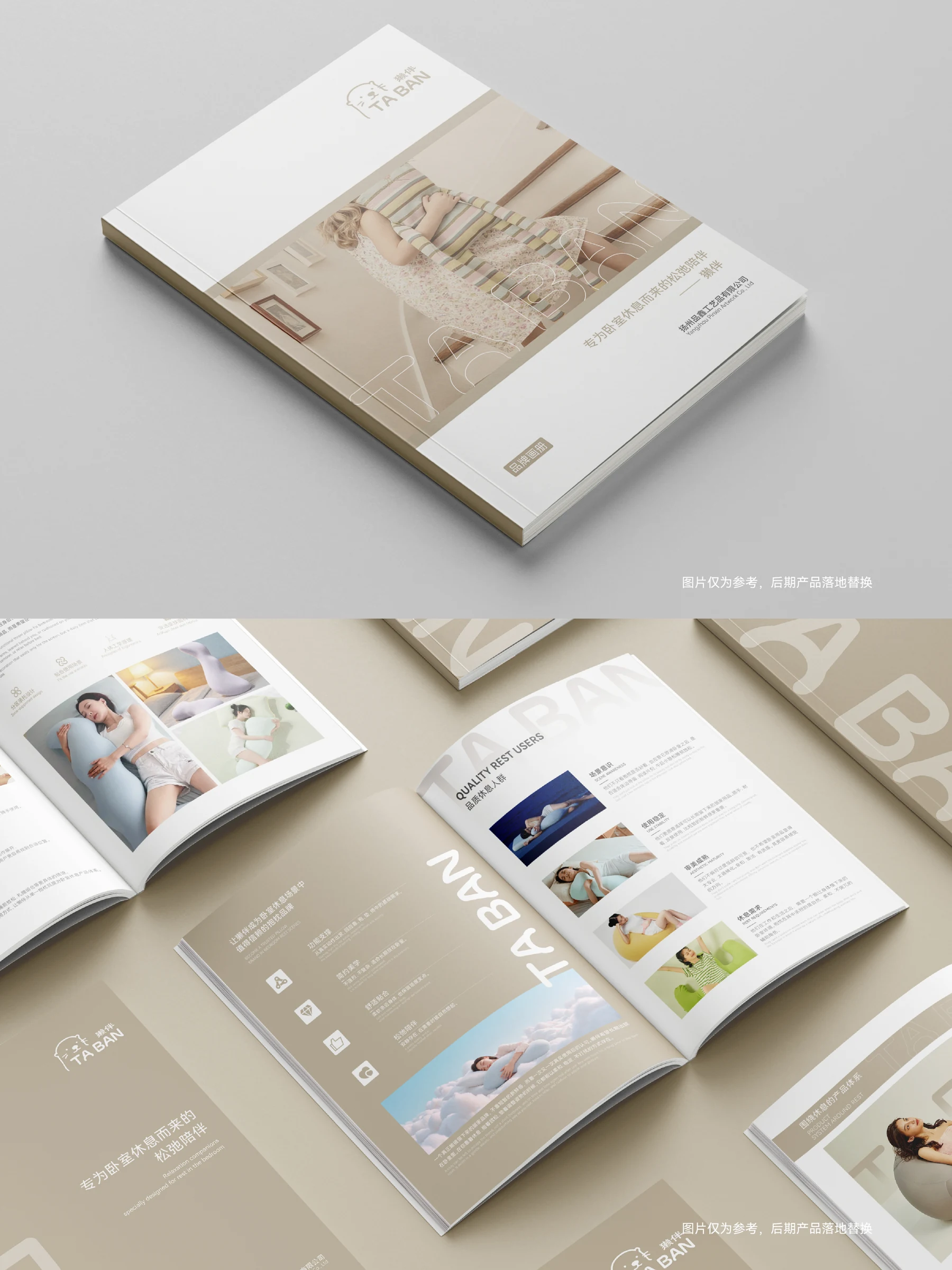
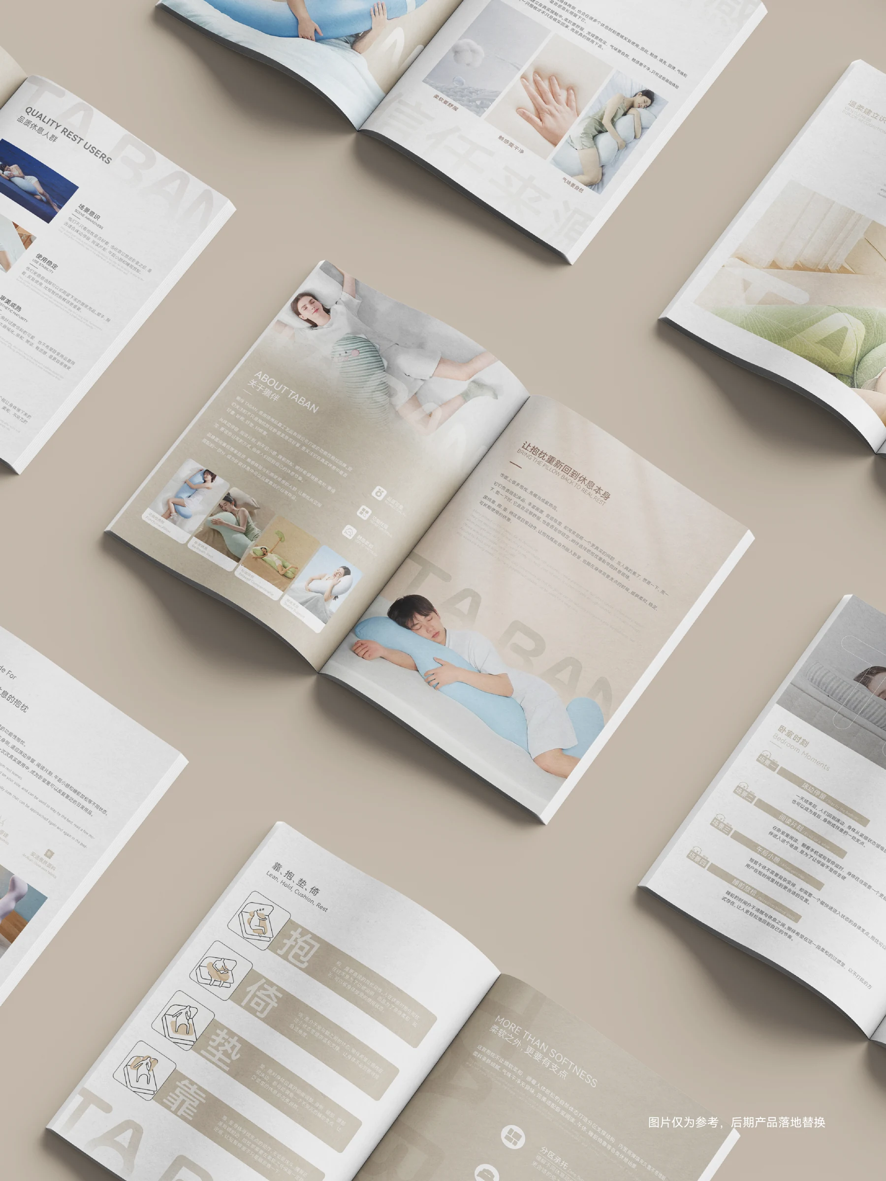
- Brand strategy · Visual identity · Brand catalogue
AChallenge The task
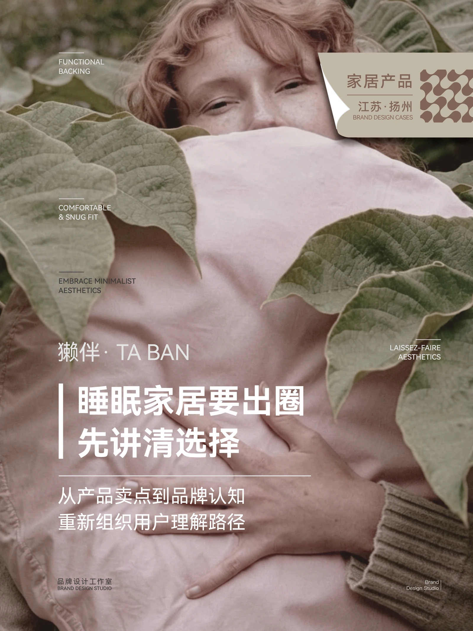
TABAN builds on cushions and home accessories. The project asks why a cushion should be chosen for real resting movements in the bedroom, beyond decoration.
BThinking The key decision
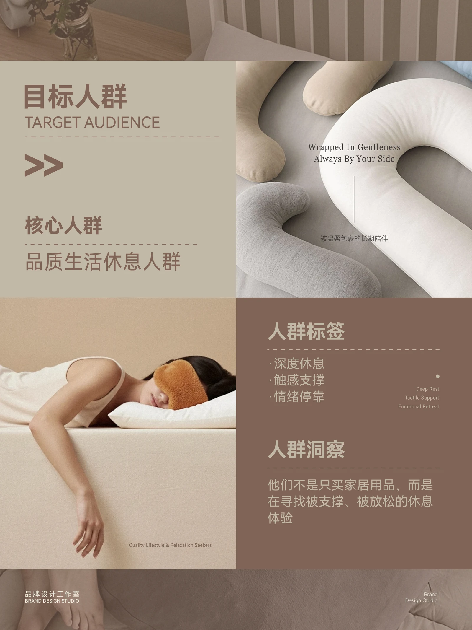
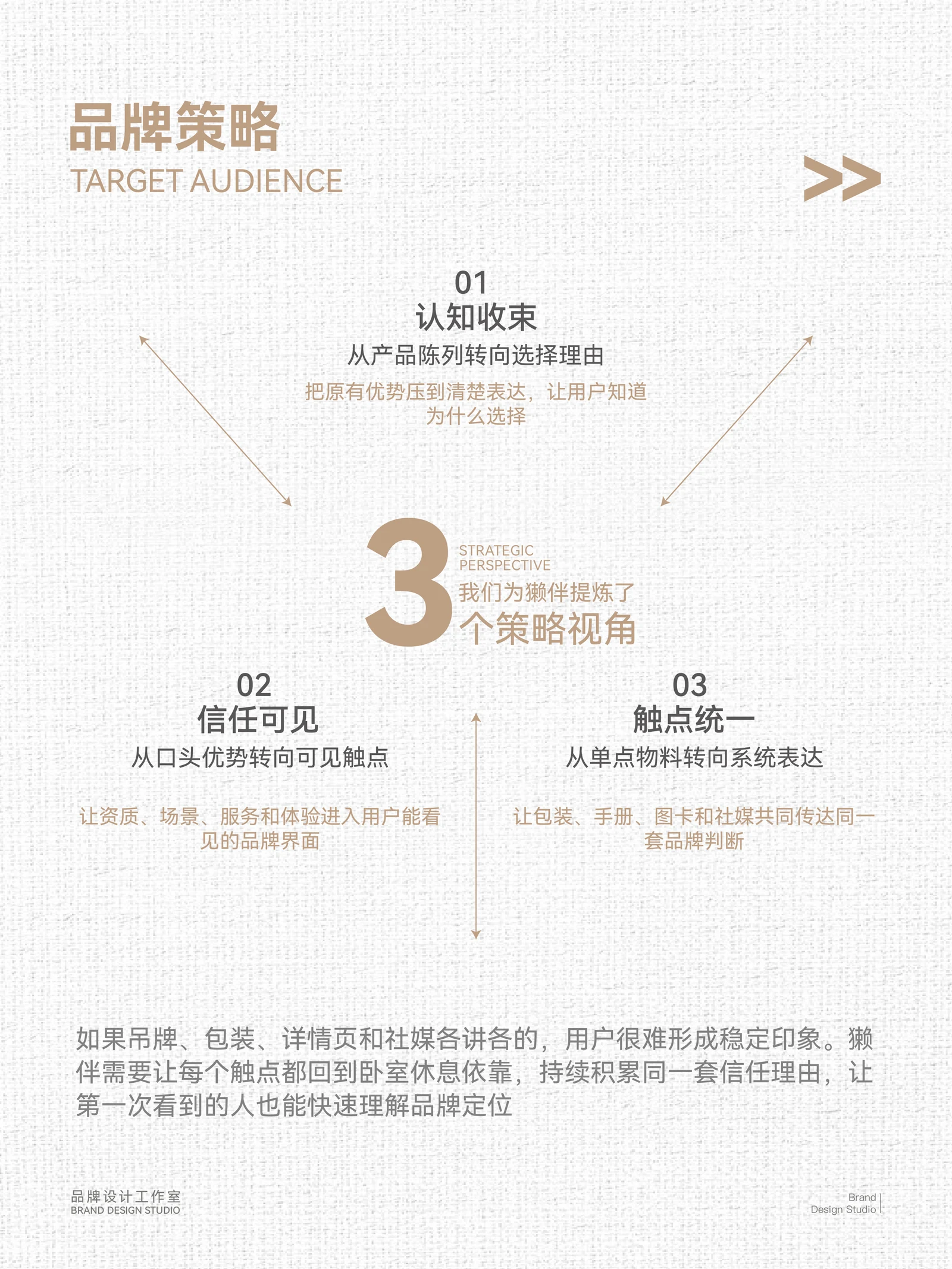
The positioning focuses on functional bedroom cushions, organising products around leaning, hugging and support. The message connects a familiar moment of tiredness with the brand.
CDesign Content & visual work
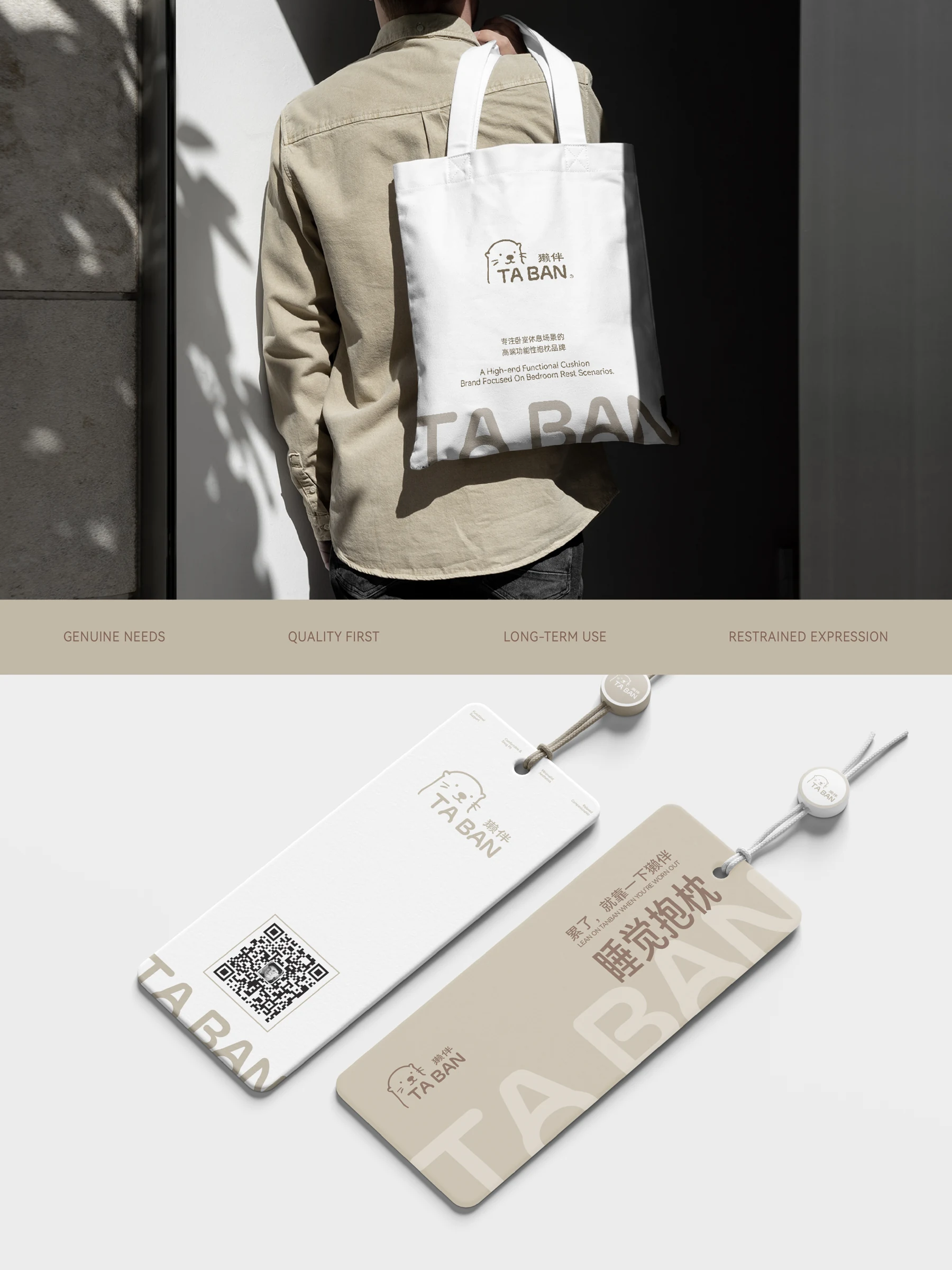
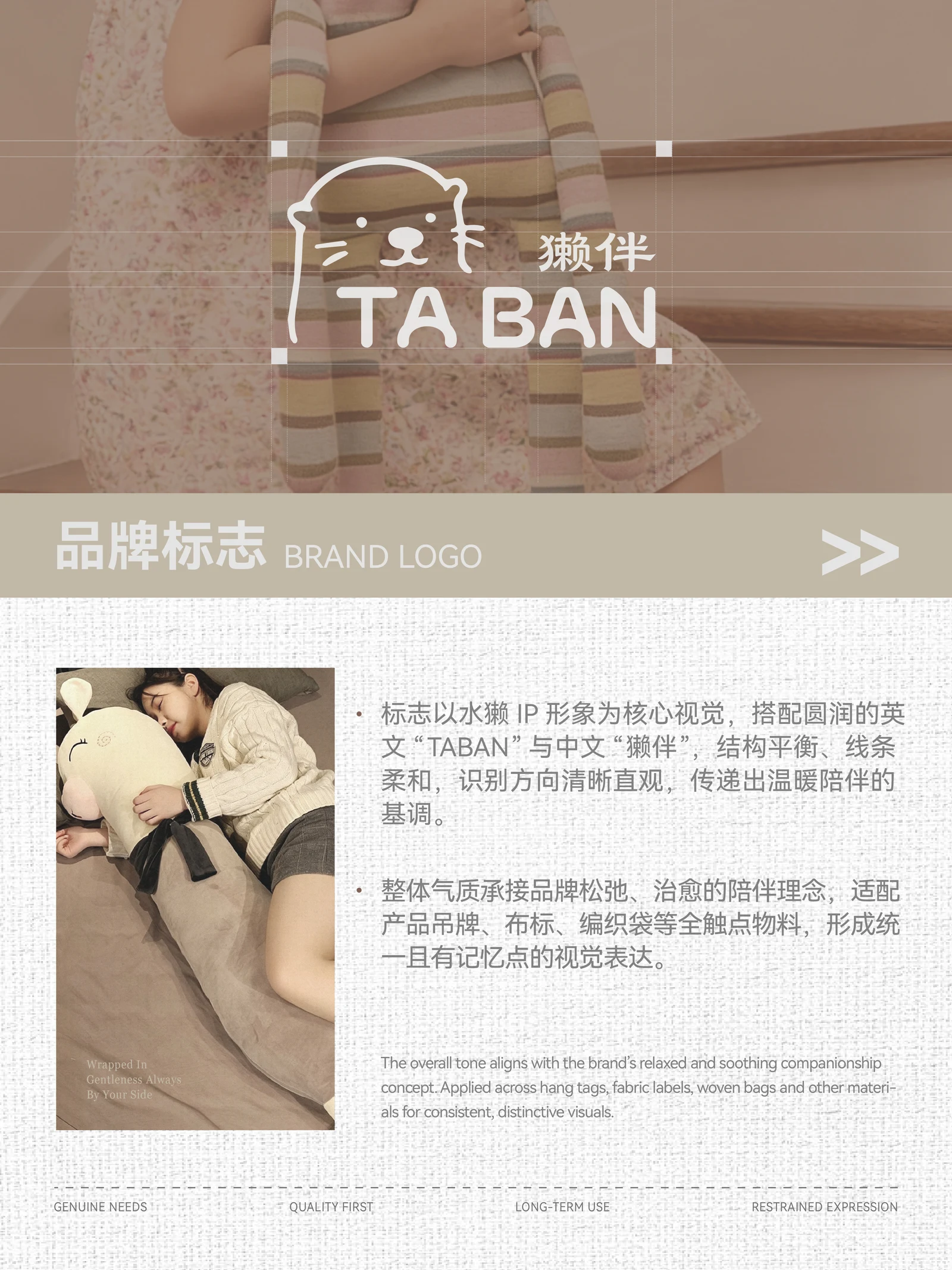
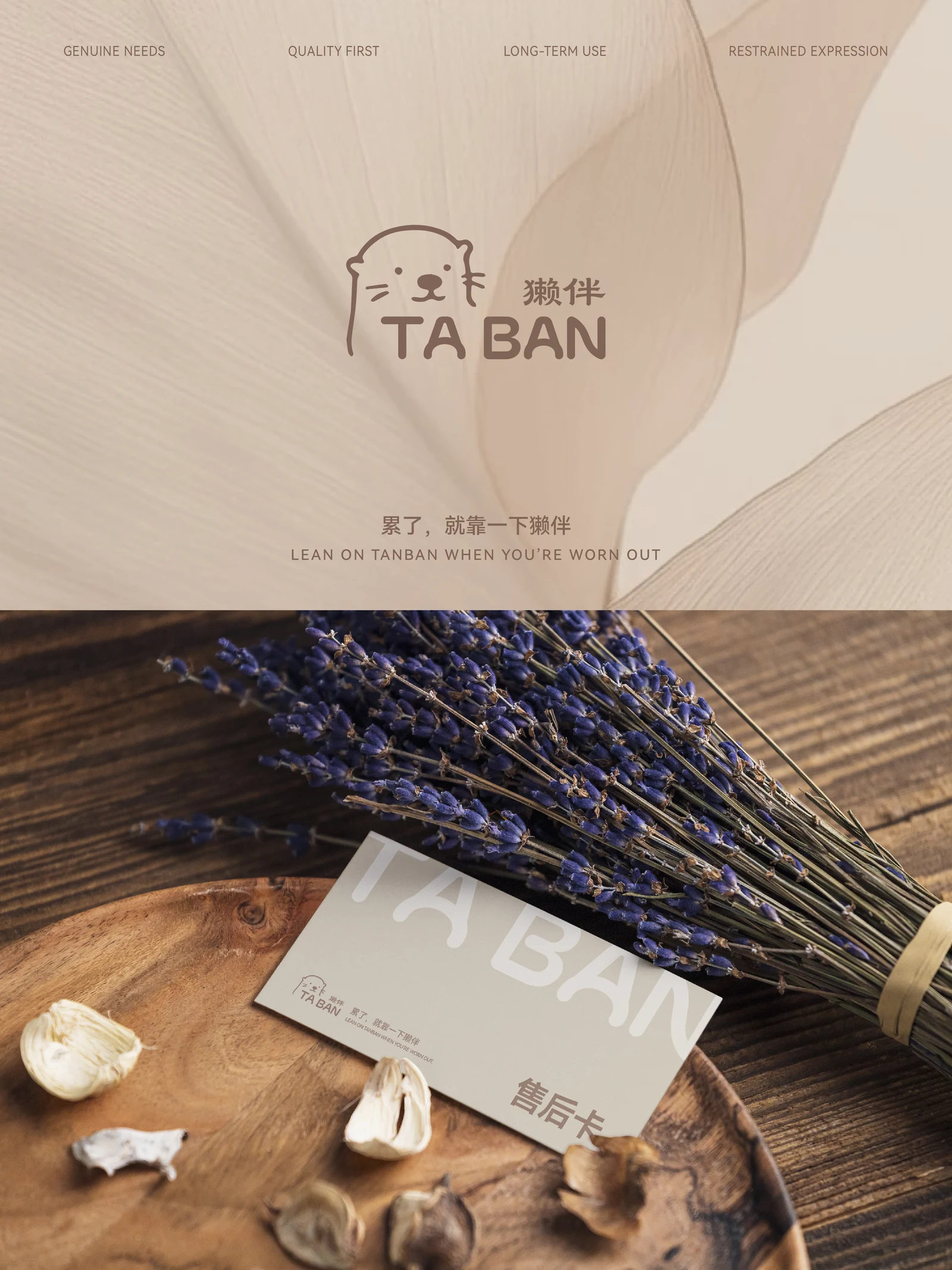
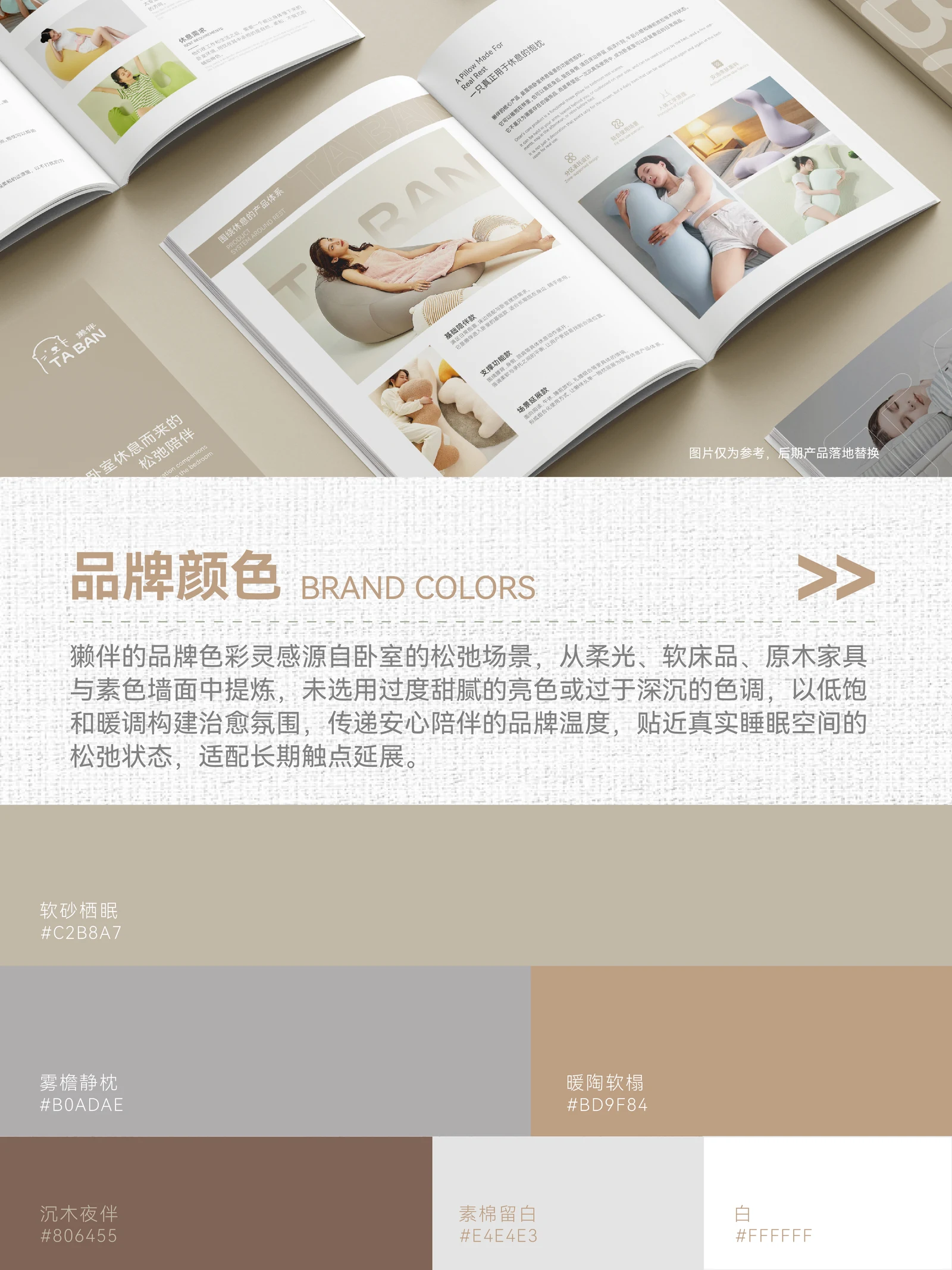
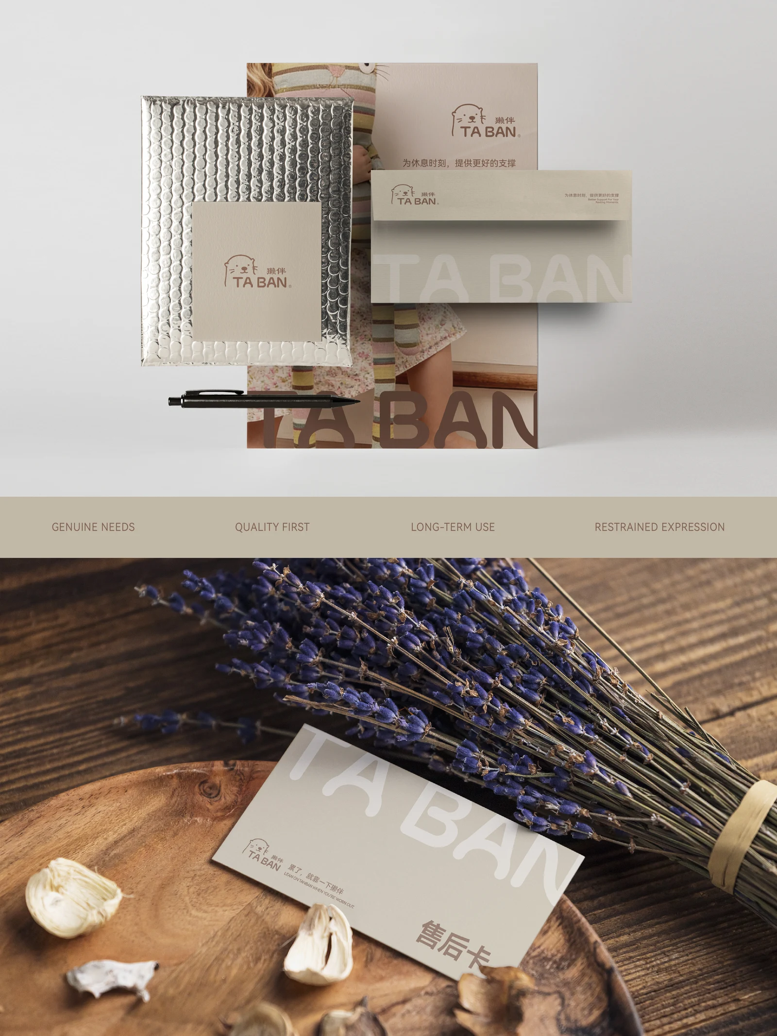
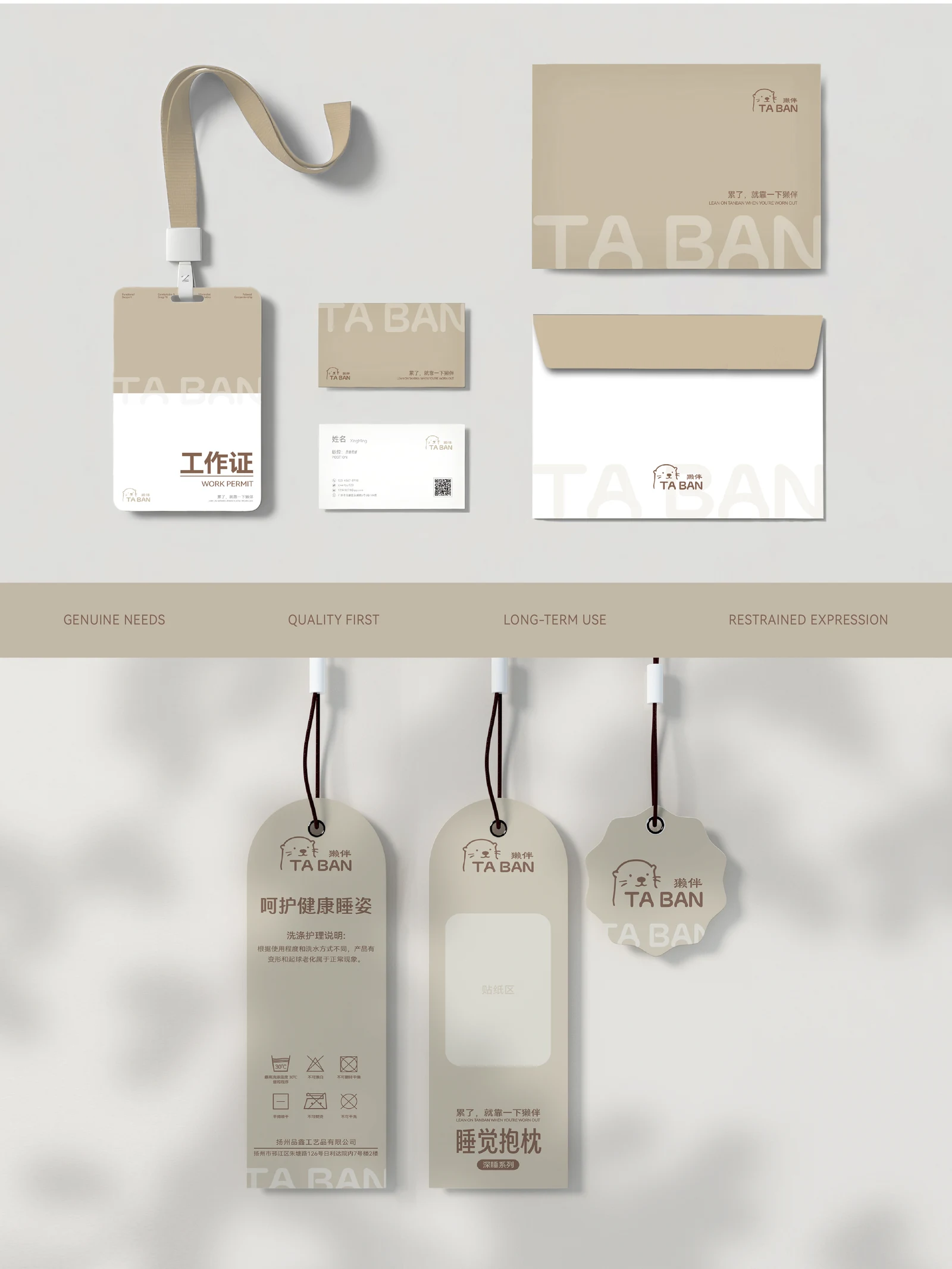
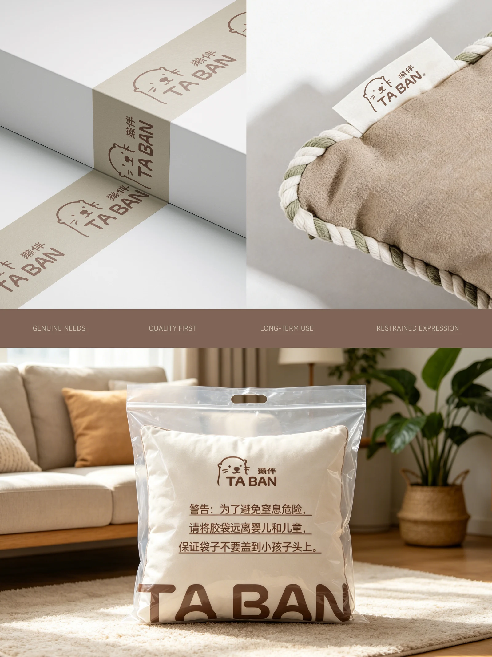
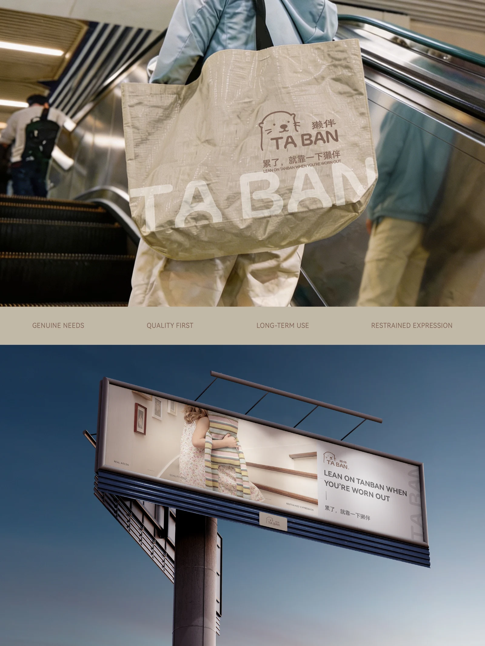
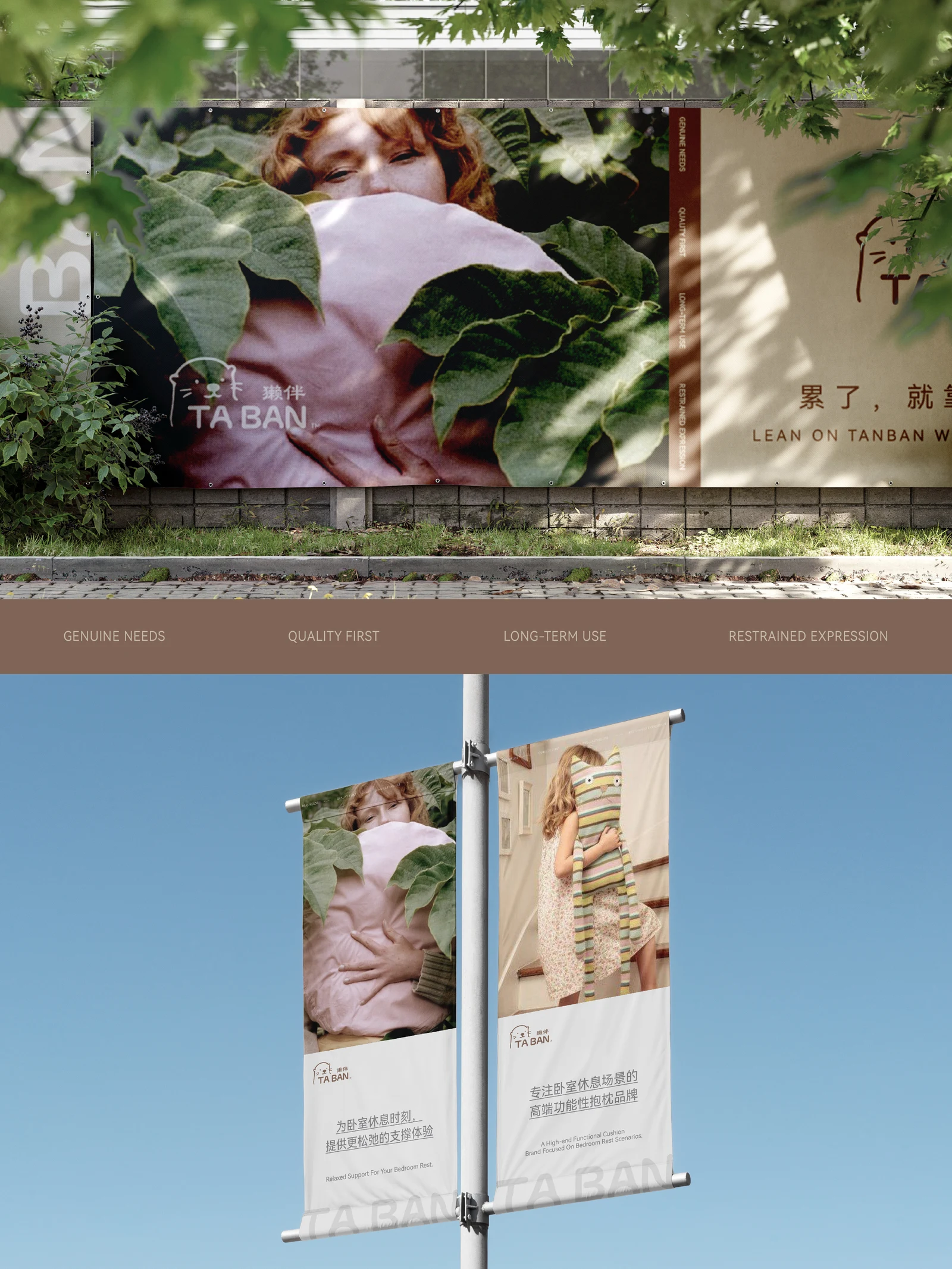
An otter symbol, the TABAN wordmark, muted colours and simple layouts create a friendly identity without a medical-device appearance or purely decorative cuteness.
DApplication Applications & delivery
Positioning, product structure, messaging, catalogue and identity share a bedroom-rest focus, guiding product development, sales introductions and communication.
Strategy explained
- Core challenge
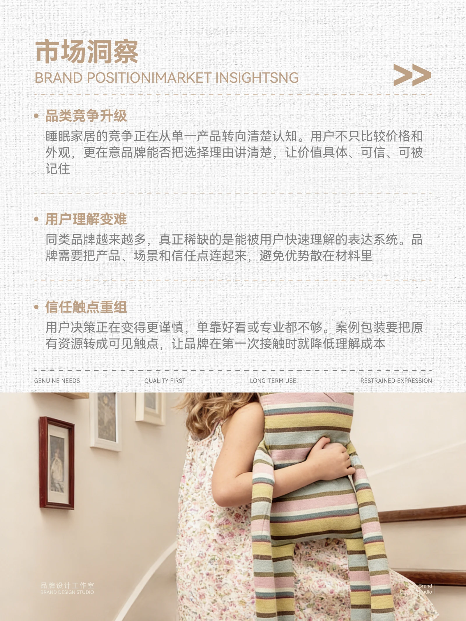
- Cushions are easily seen as decoration, with their role in resting left unclear.
- Strategic focus
- Focus on bedroom rest and organise products around practical resting actions.
- Brand slogan
- Feeling tired? Lean on Taban.
- Role of the slogan
- Connect a tired moment, an action and the brand name.
- Underlying principle
- Define the task first, then support the experience through size, filling, rebound and touch.
Explore Explore further
Contact
Tell us about your brand
A new brand, an existing brand that needs a clearer direction, or a specific design task: it can start with a conversation.
ouryoung7943
Office
Room 1905, Unit 1, Xijiang Hepan, Chengluo Avenue, Longquanyi District, Chengdu, China