
Jianxiaodu
Fine lettering and soft curves for a body-care identity
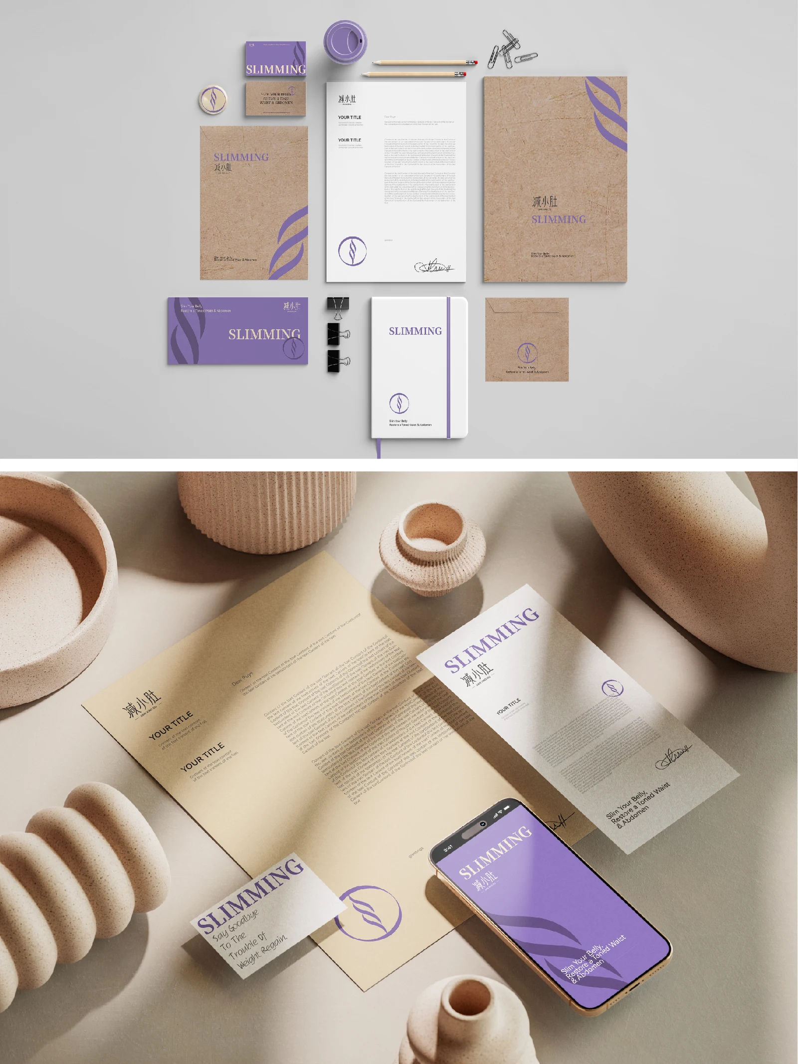
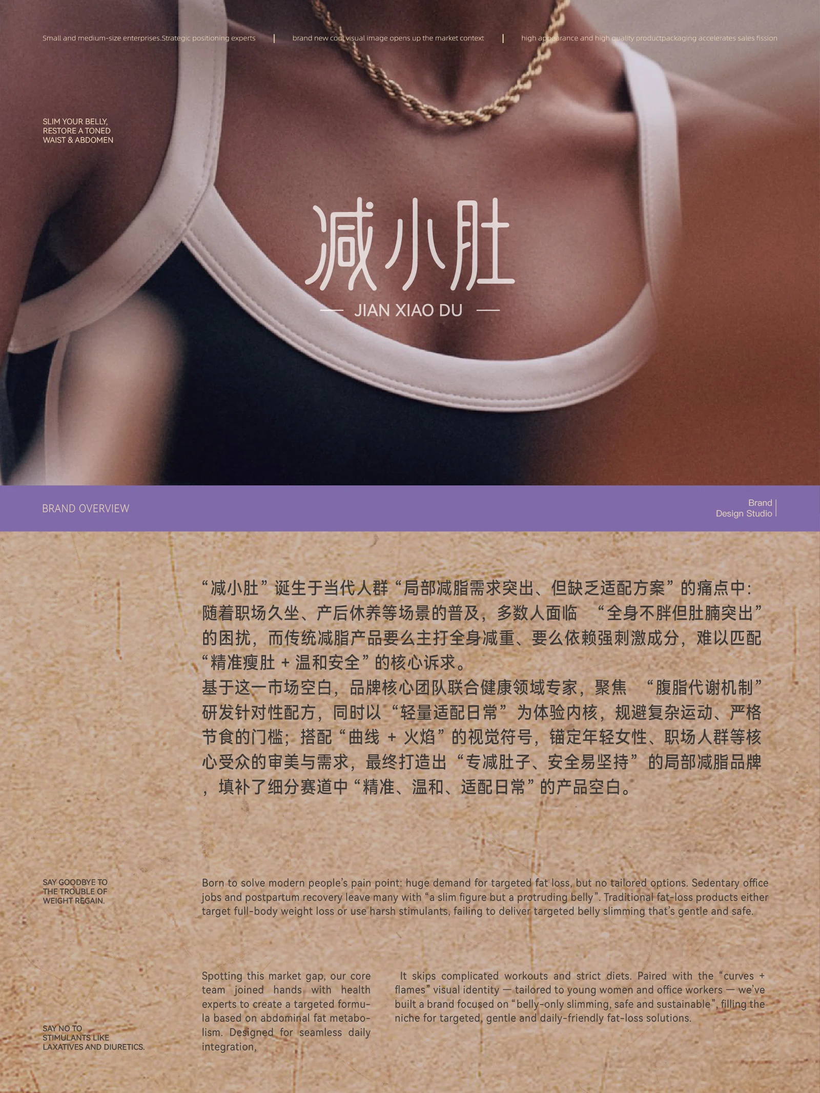
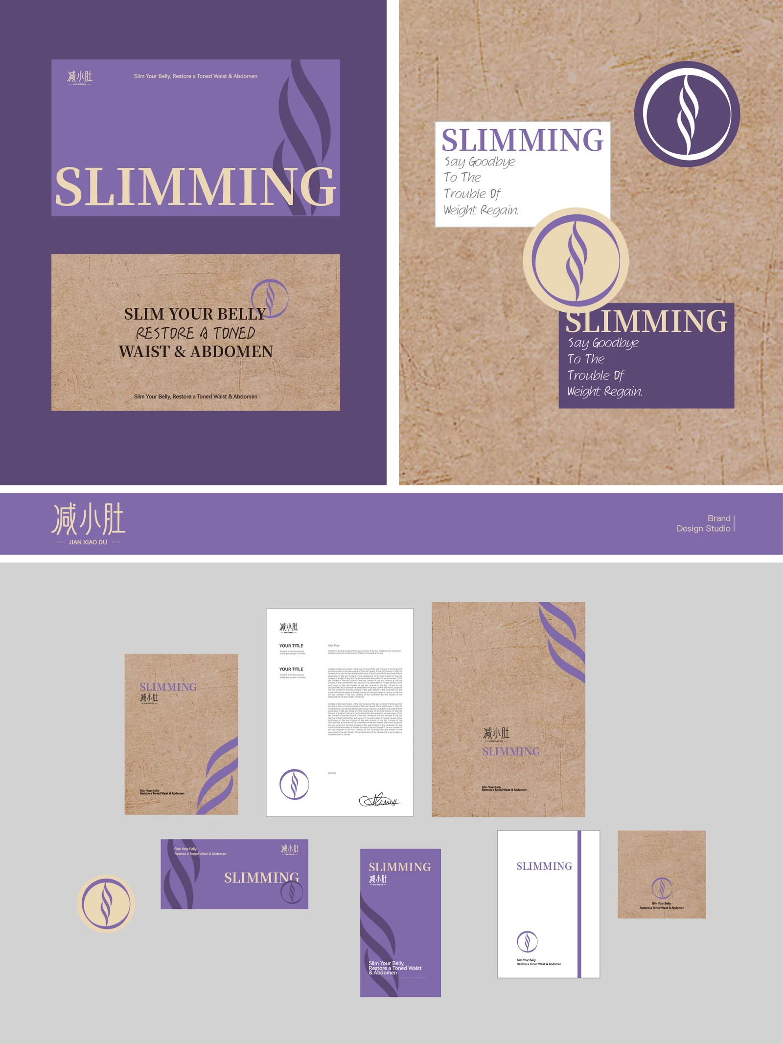
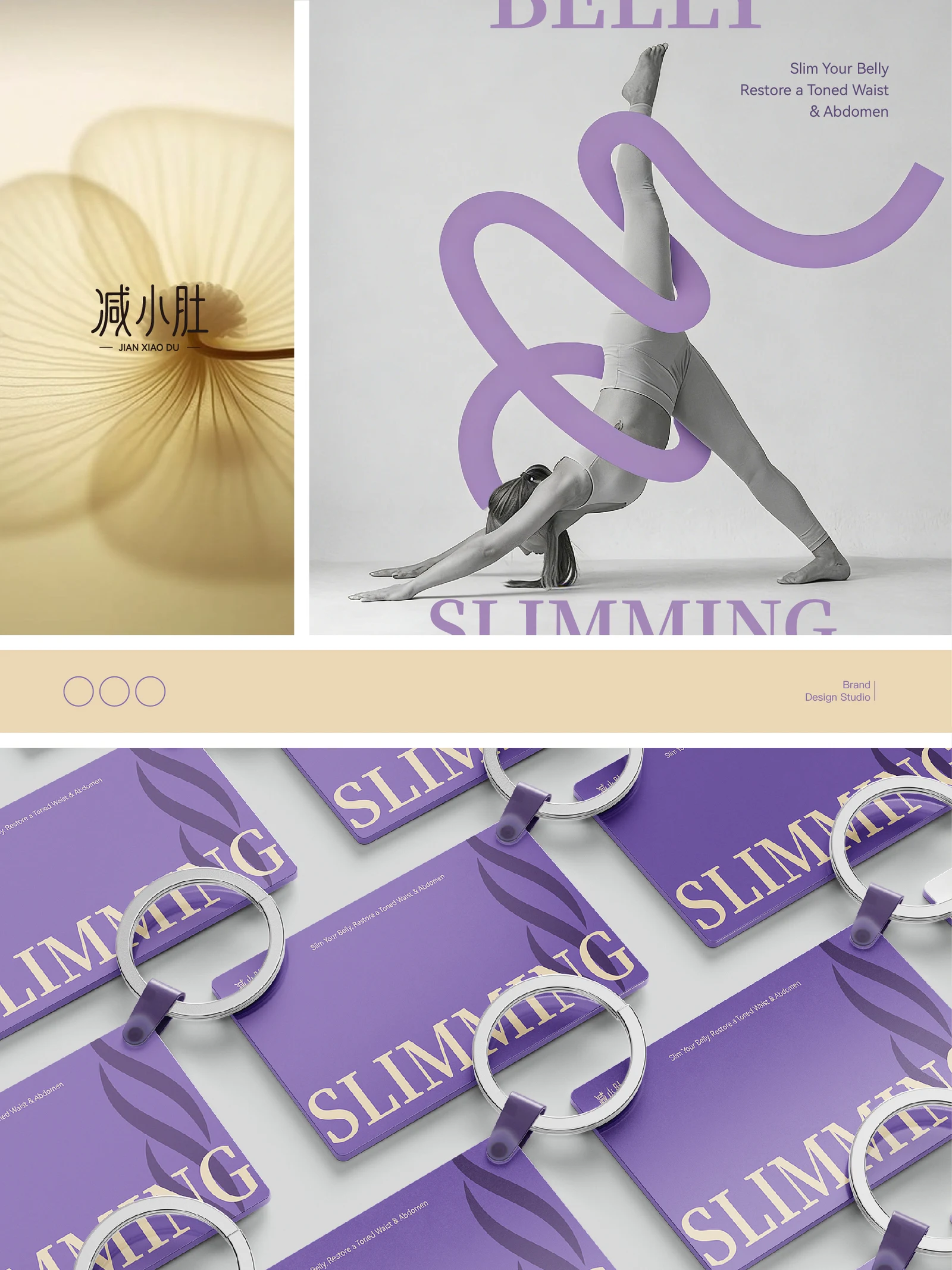
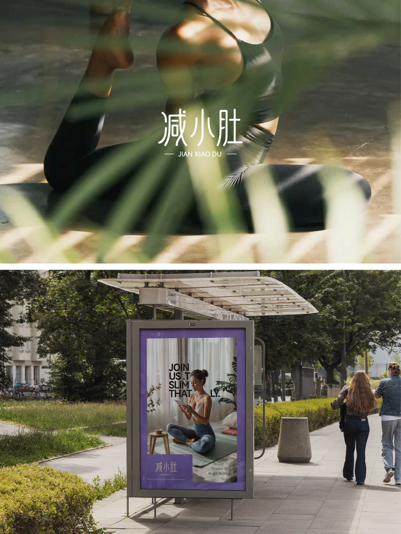
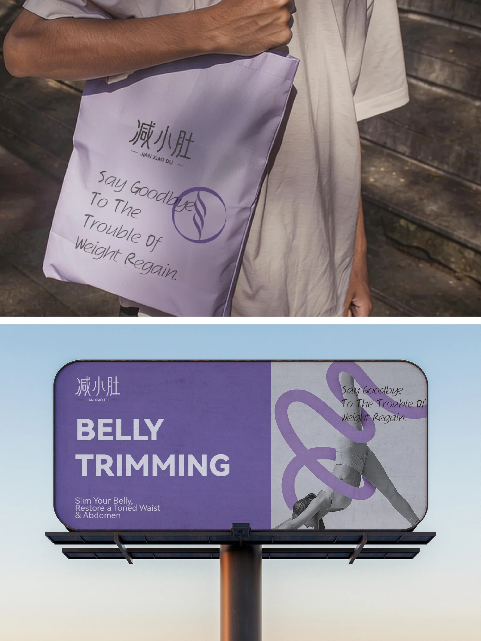
Jianxiaodu's project explores a visual identity for body care and beauty, with people and natural scenes providing its context. Slim lettering, curves and soft colours connect different materials, extending to business cards, envelopes and promotional imagery so that the brand name and its care setting share a clear, continuous expression.
- Region
- Changzhou, Jiangsu
- Industry
- Body care and beauty
- Scope
- Visual identity · Brand applications
- Project year
- —
AChallenge
The Jianxiaodu presentation sets out a visual direction for body care and beauty.
BThinking
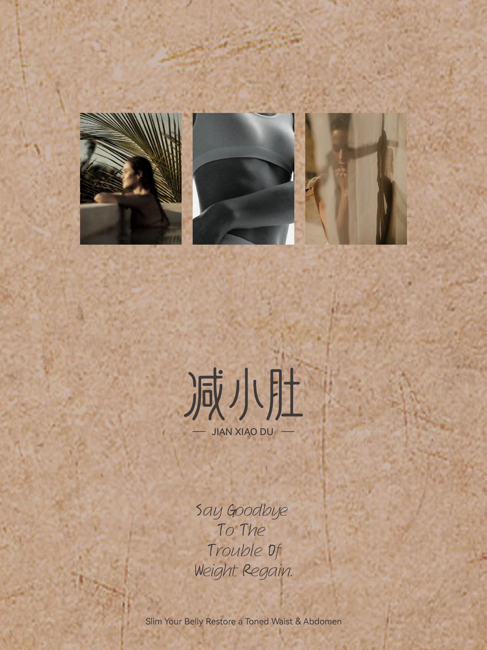
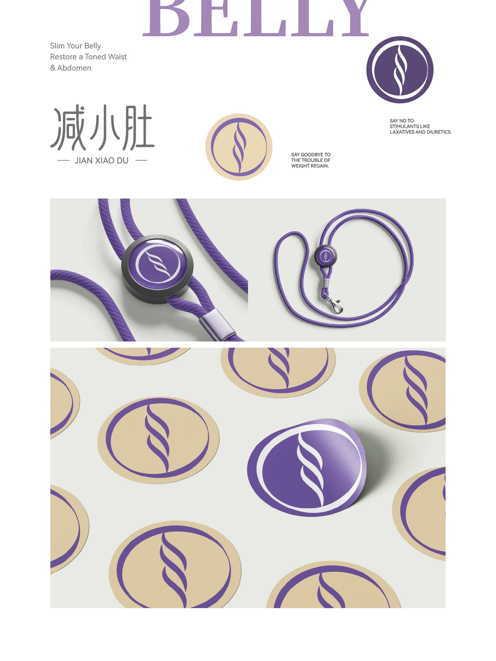
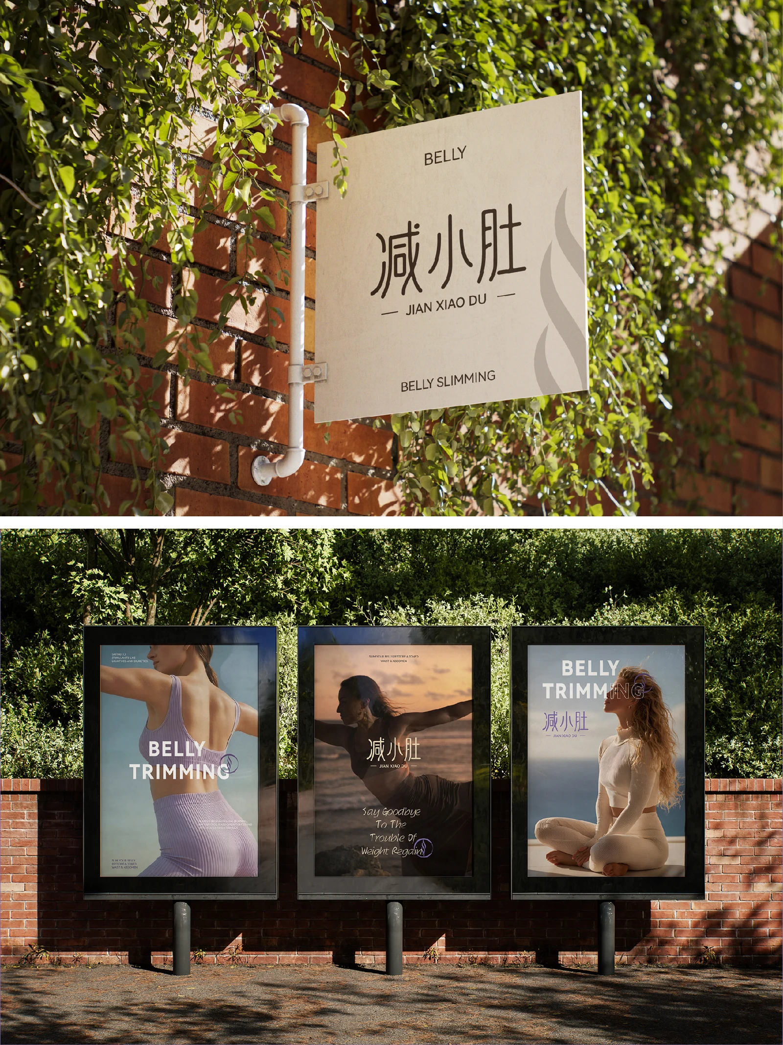
Fine Chinese lettering combines with an oval curved symbol, supported by portraits and natural settings.
CDesign
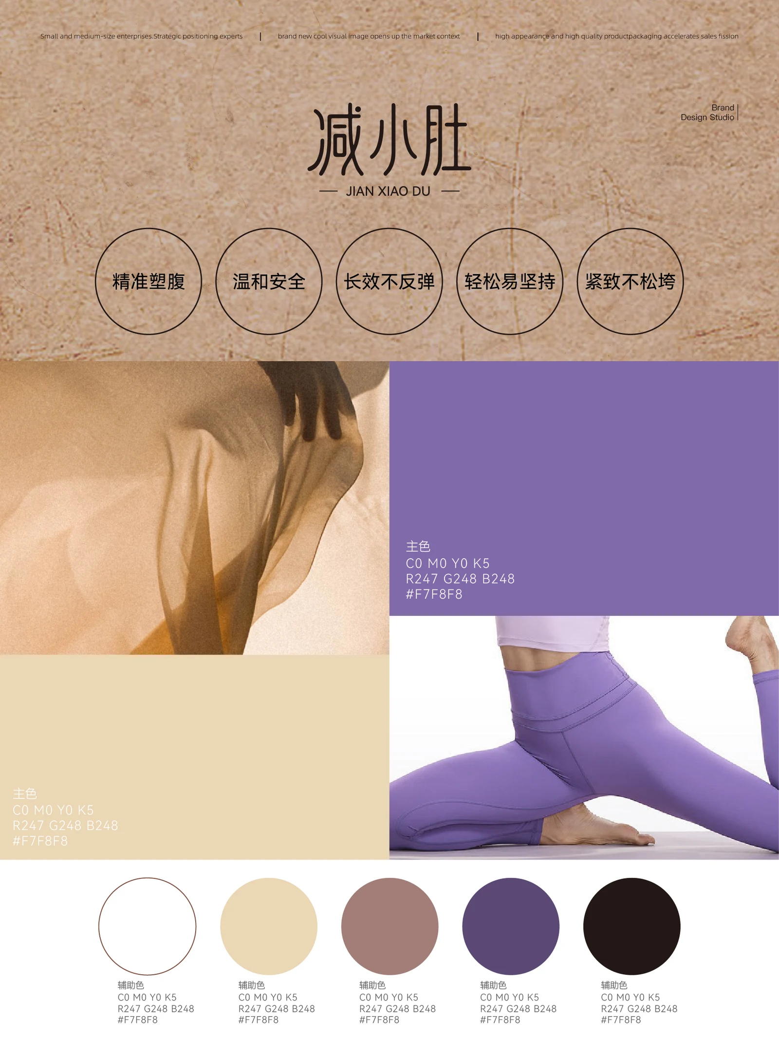
Purple, lavender, kraft tones and white form the material palette, with the identity shown on light and dark backgrounds.
DApplication
Cards, envelopes and outdoor posters demonstrate usage without promising weight loss or physical outcomes.
ExploreExplore further
Contact
Tell us about your brand
Bring your existing materials and the problem you most want to solveWe will work out the next step together
ouryoung7943
Office
Room 1905, Unit 1, Building 1, North Gate, Yinhe Xijiang Hepan, No. 99 Qunhui North Road, Longquanyi District, Chengdu, Sichuan, China