
Jinbang
Giving a pharmaceutical and chemical business a clear introduction
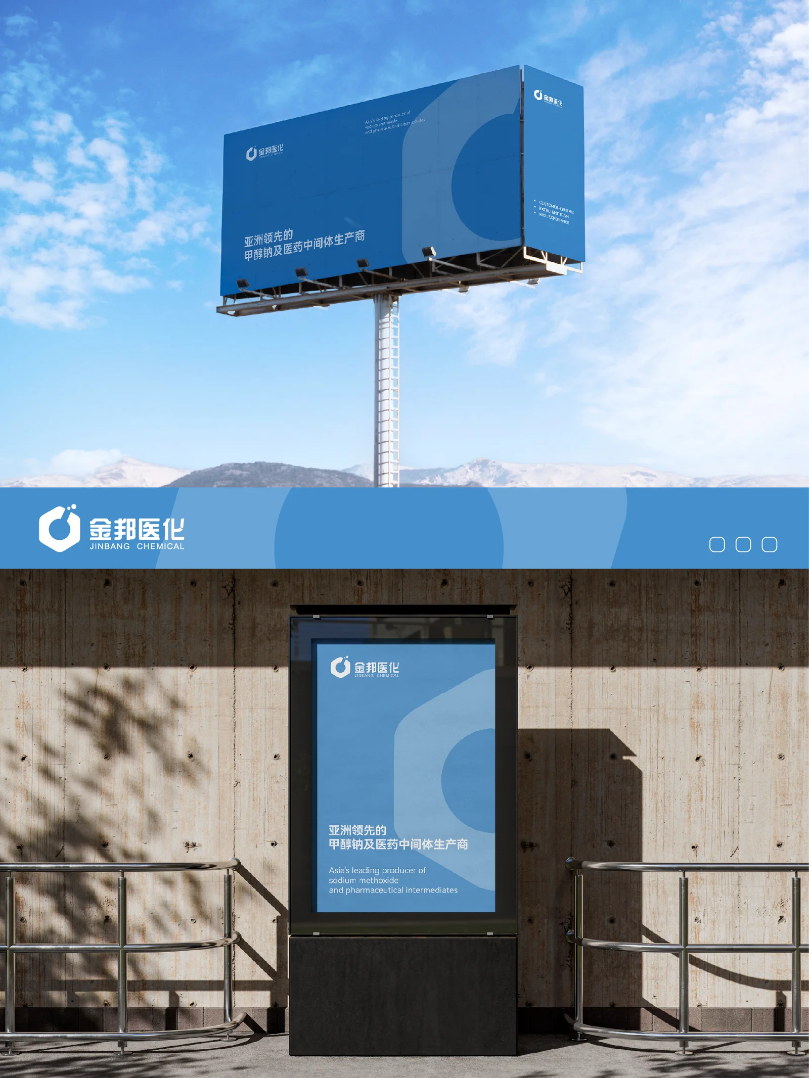
- Region
- Chuzhou, Anhui
- Industry
- Pharmaceuticals & chemicals
- Scope
- Brand Strategy & Design
- Year
- 2018
AChallenge The task
Jinbang's strengths span products, R&D, standards and service. A catalogue alone cannot establish priorities. The identity also needs to support domestic use, English materials and overseas communication, helping customers understand the company before visiting its factory.
BThinking The key decision
The case uses sodium methoxide expertise as the entry point, then introduces broader pharmaceutical and chemical supply capabilities. Information moves from the main strength to products and services. The visual direction emphasizes simplicity, stability and bilingual recognition.
CDesign Content & visual work
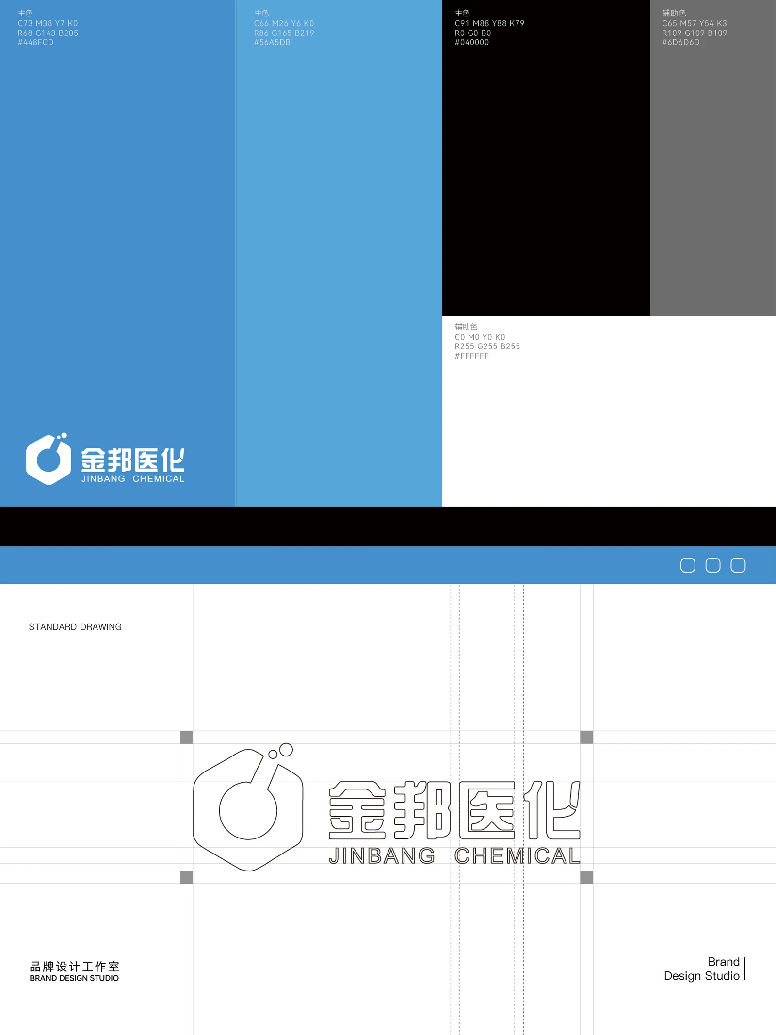
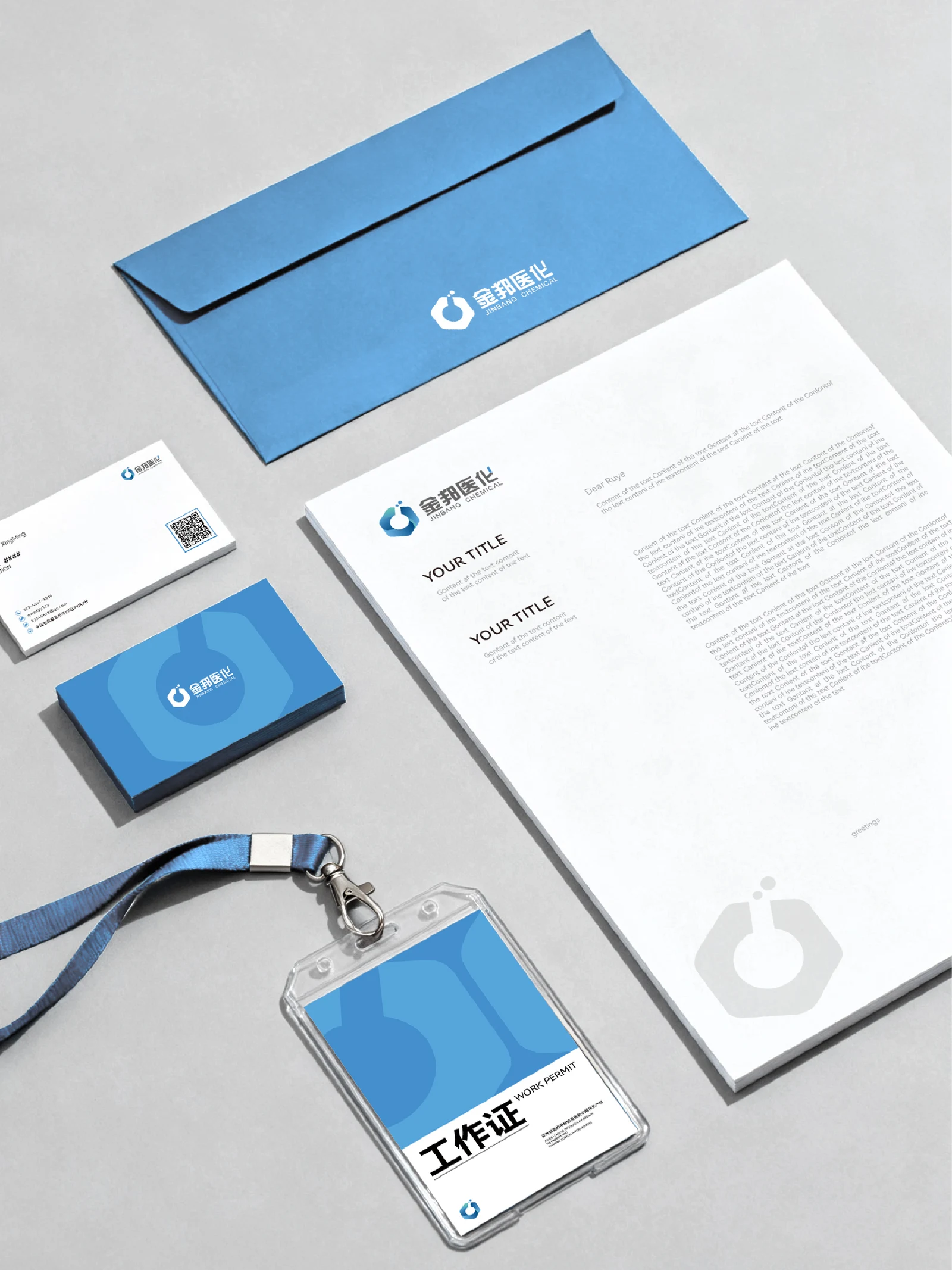
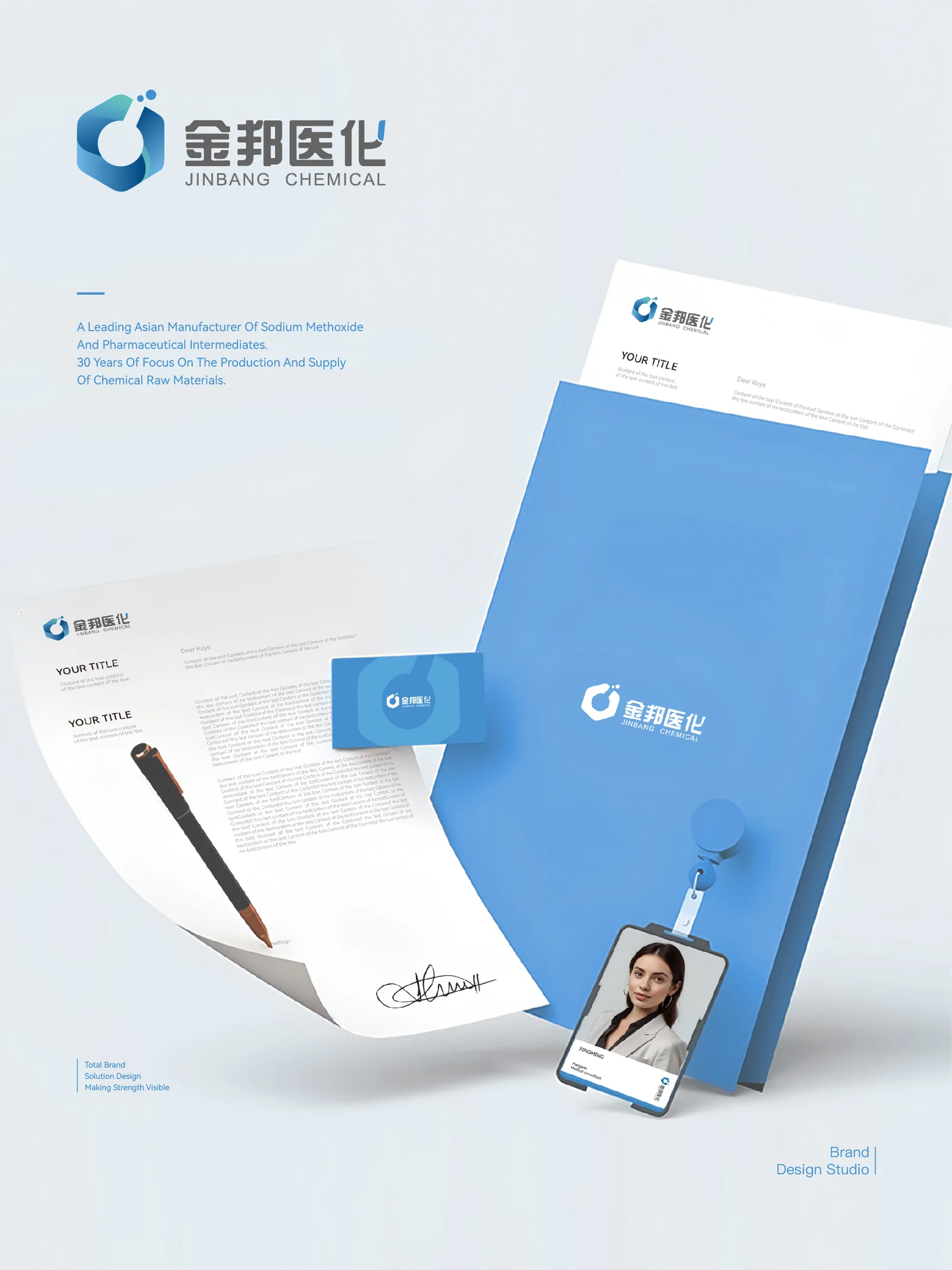
The logo updated in 2018 uses a hexagonal outline for stability, with a laboratory-vessel shape in negative space and a dot suggesting a reaction bubble. A blue-to-teal gradient adds a clean, fluid quality. The bilingual name and symbol remain clear across sizes and applications.
DApplication Applications & delivery
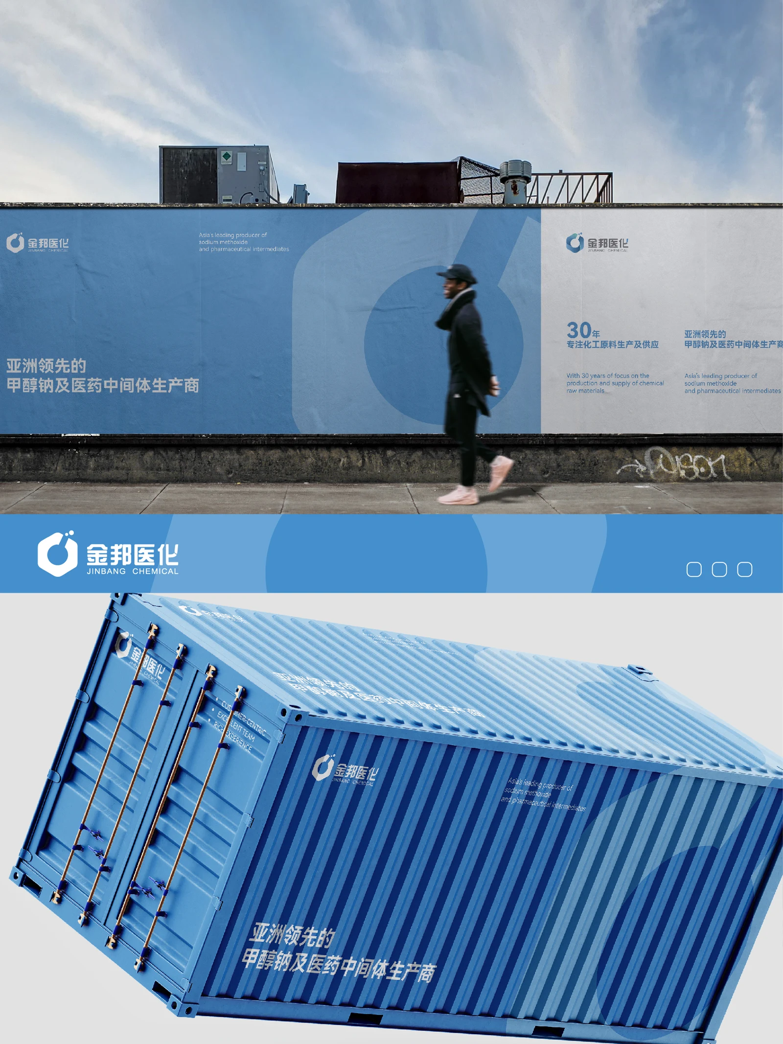
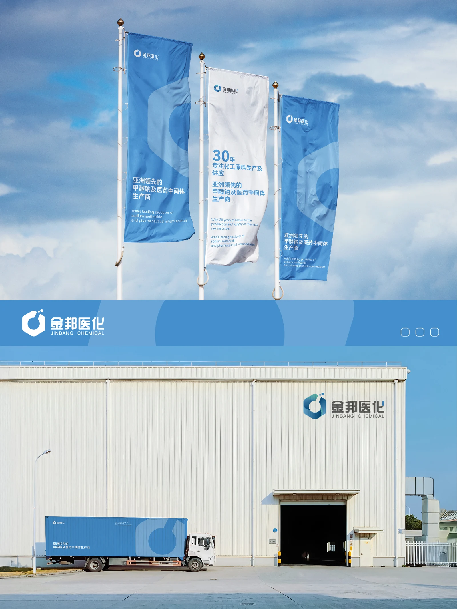
The identity appears in company materials and at the factory entrance. On-site photos connect the logo and name to actual production and office spaces. The company introduction starts with sodium methoxide expertise and opens into product, technology and service information.
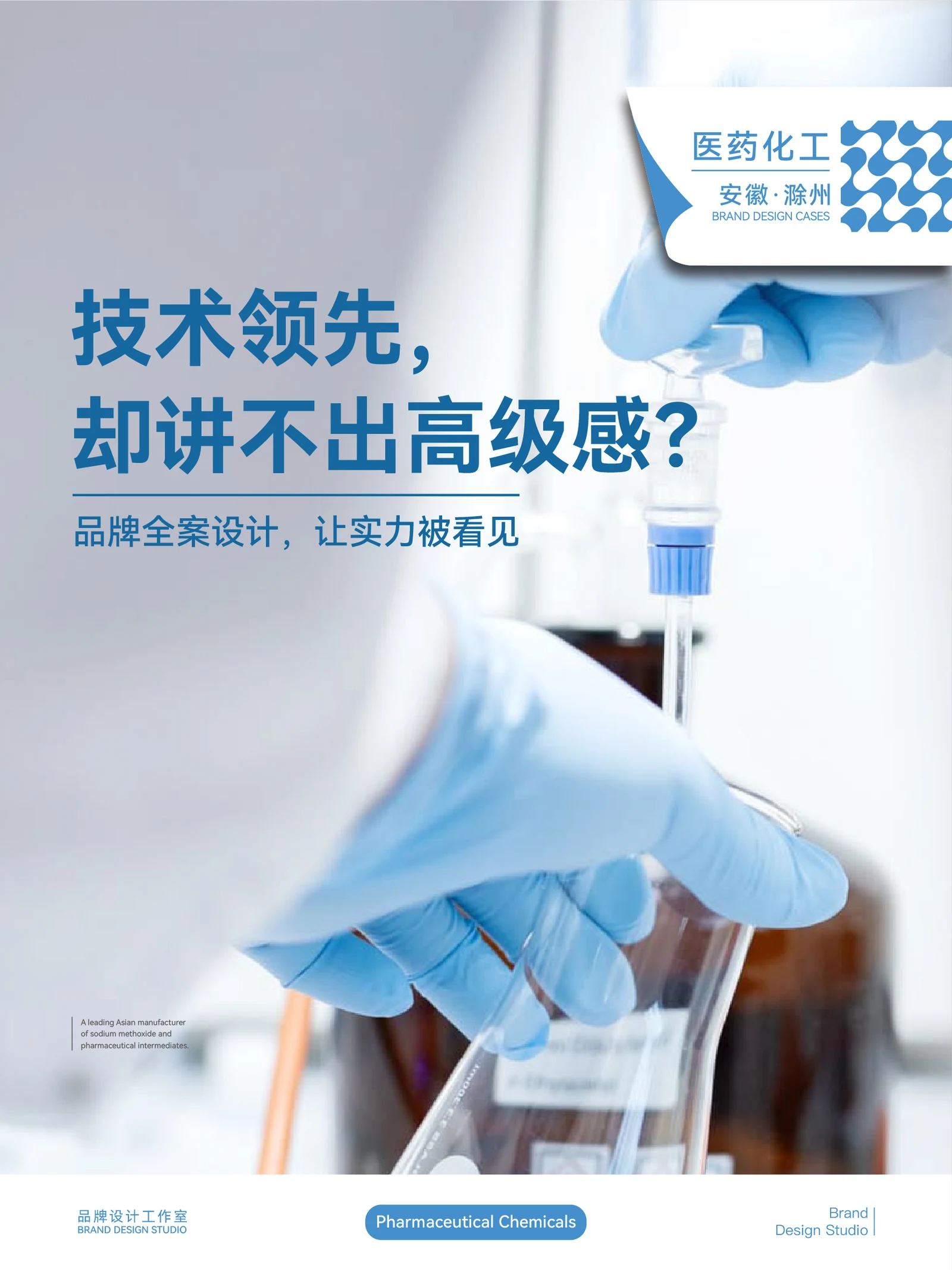
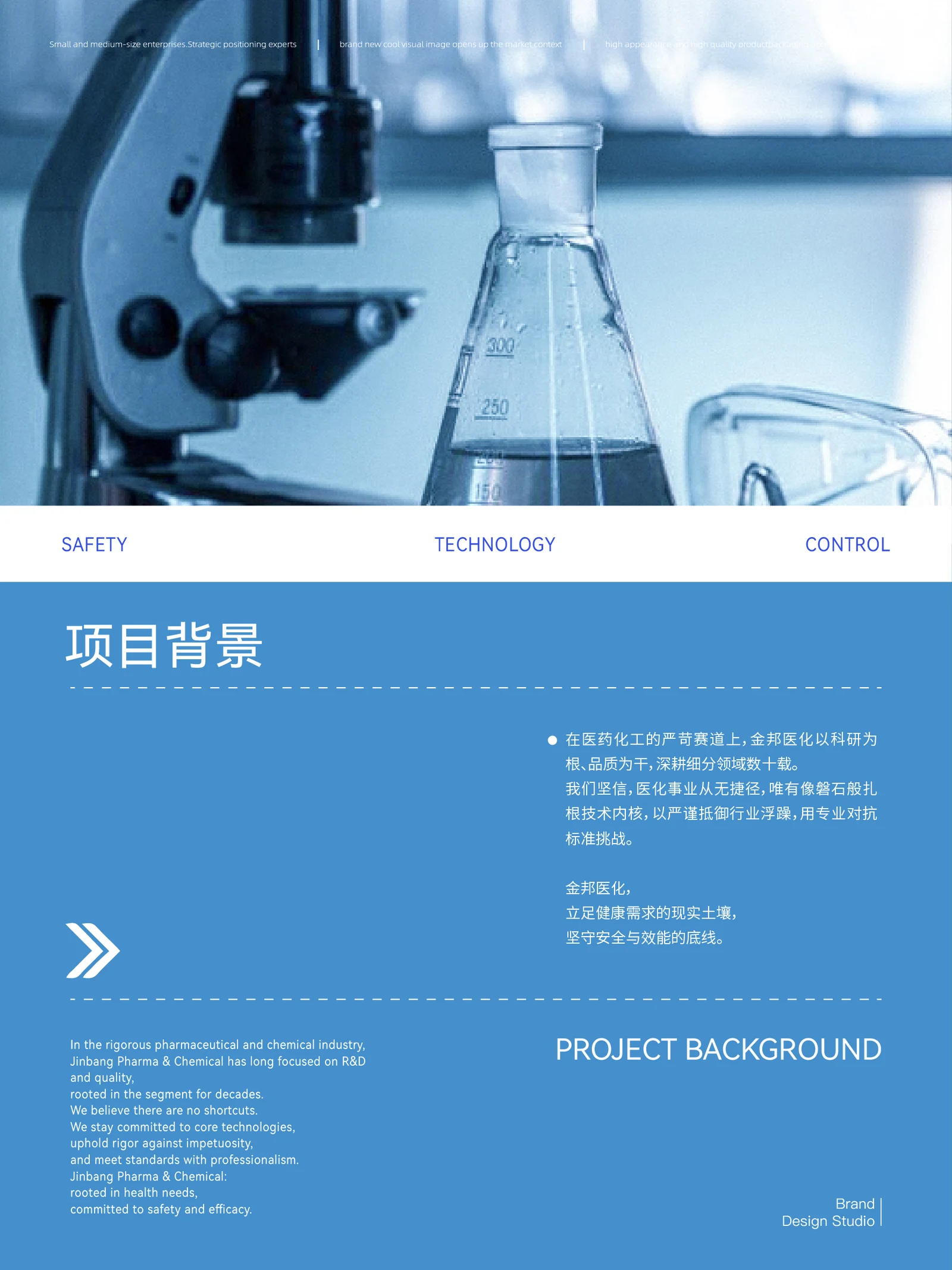
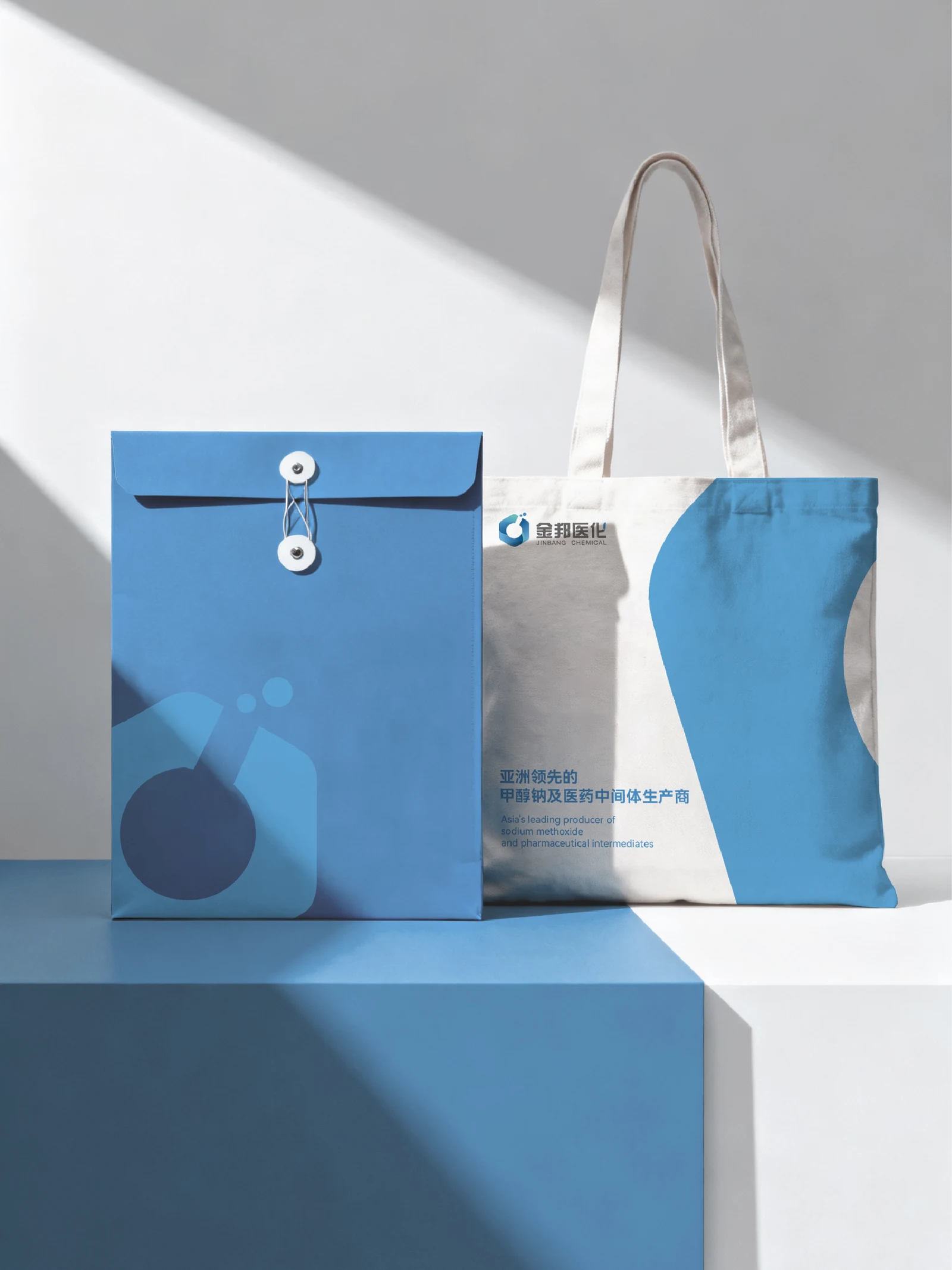
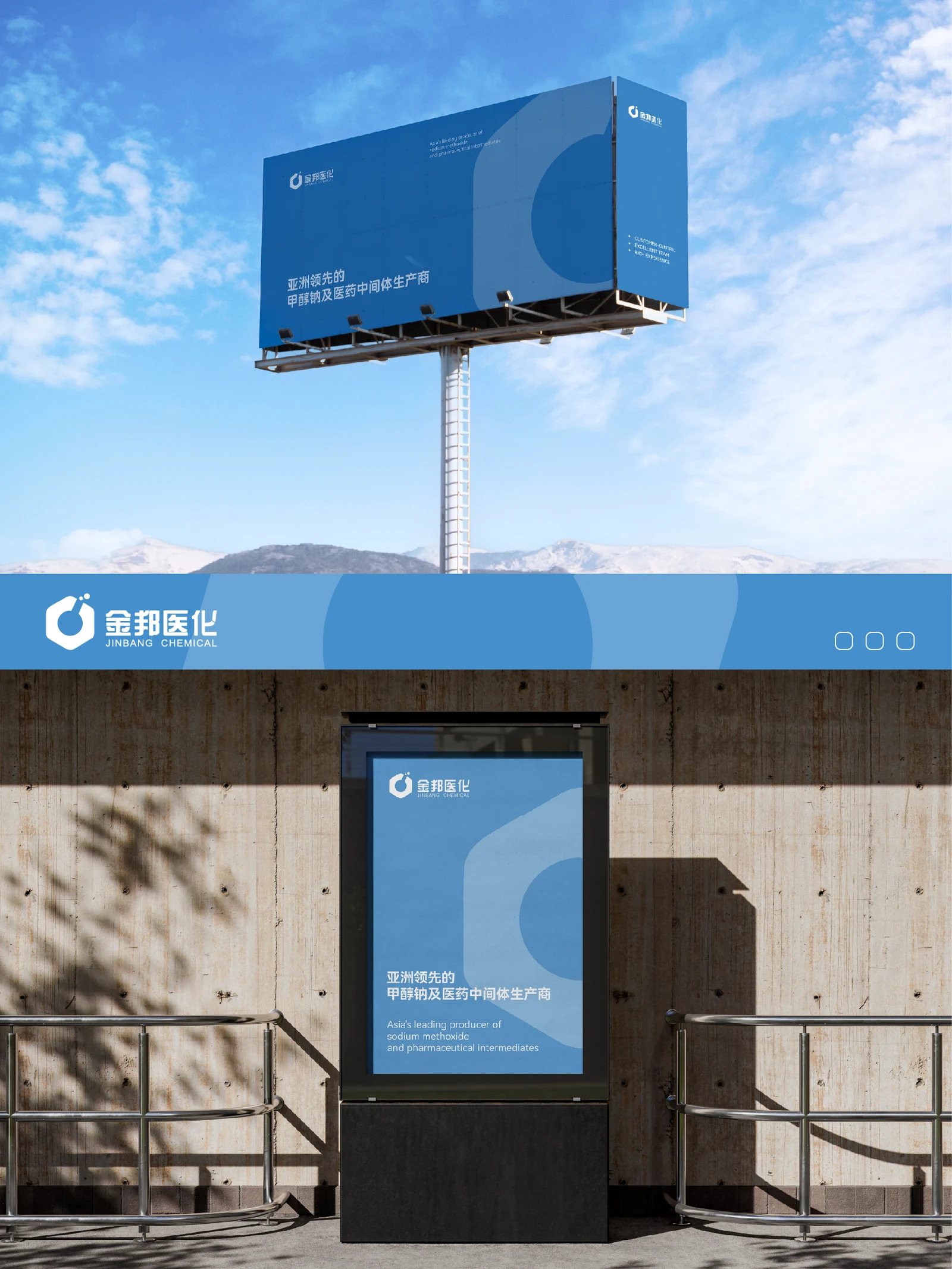
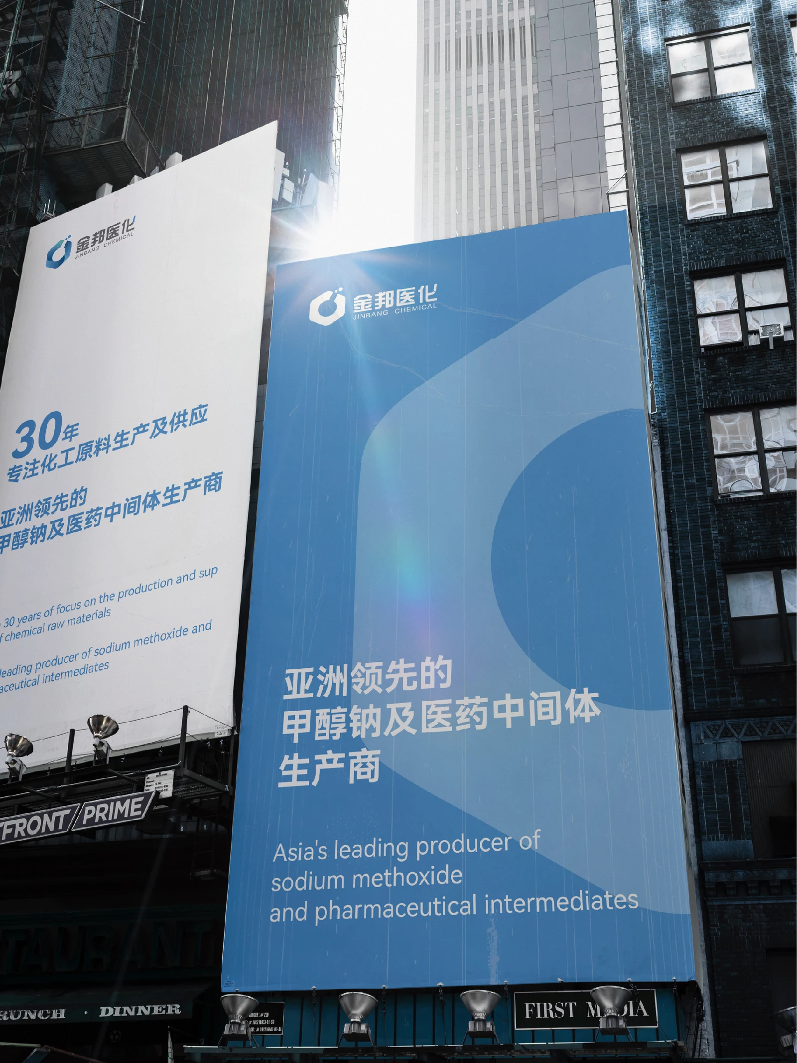
On site Photos from the project
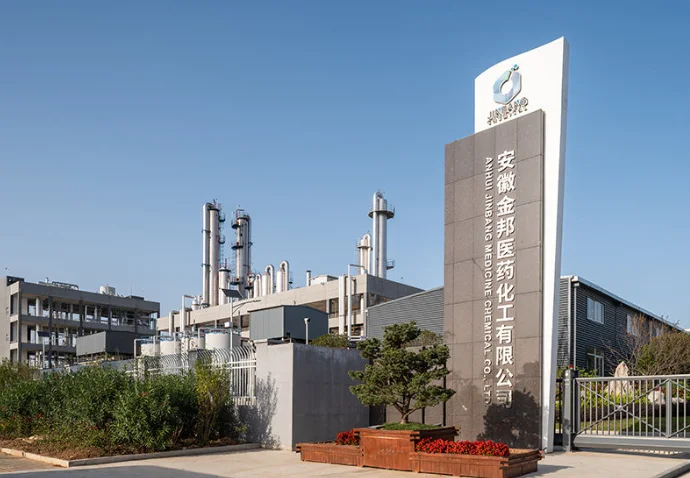
Public sources
Explore Explore further
Contact
Tell us about your brand
A new brand, an existing brand that needs a clearer direction, or a specific design task: it can start with a conversation.
ouryoung7943
Office
Room 1905, Unit 1, Xijiang Hepan, Chengluo Avenue, Longquanyi District, Chengdu, China