
Long Yachang
Bold lettering and a duck character for a food identity
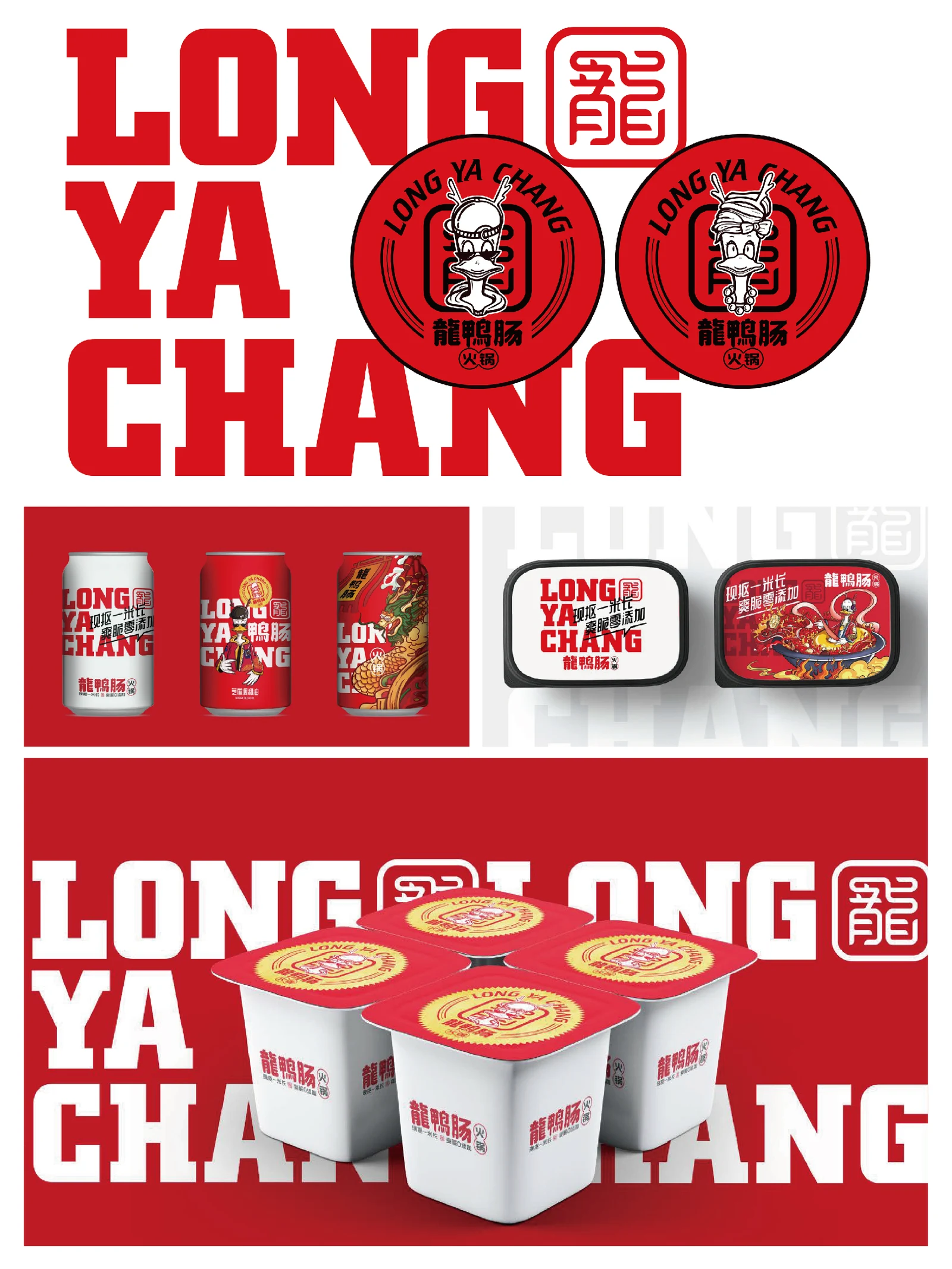
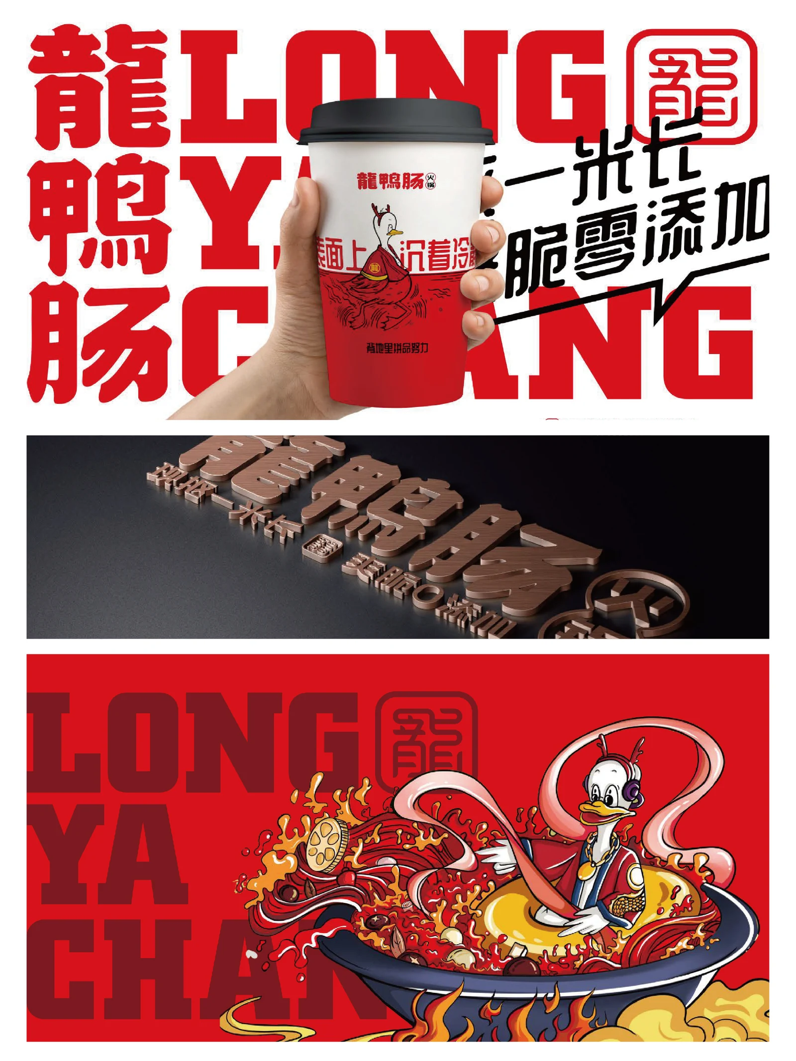
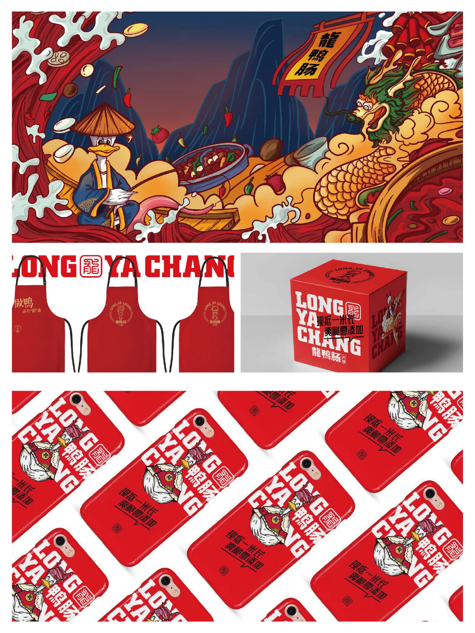
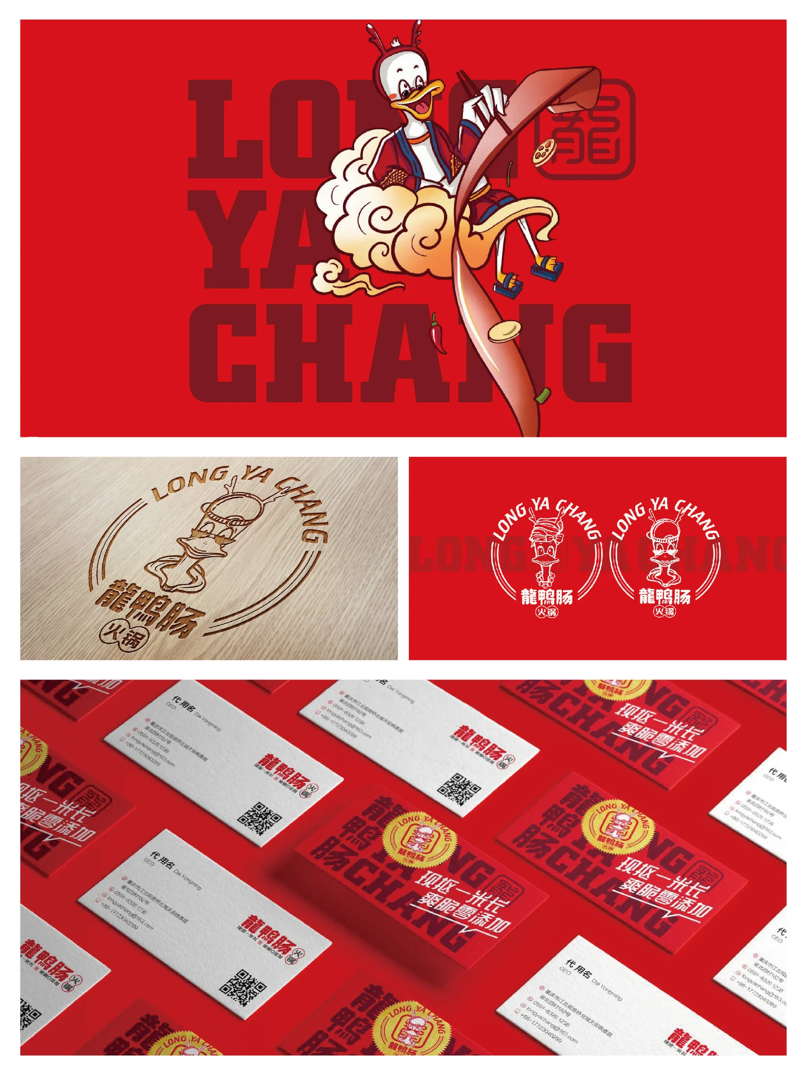
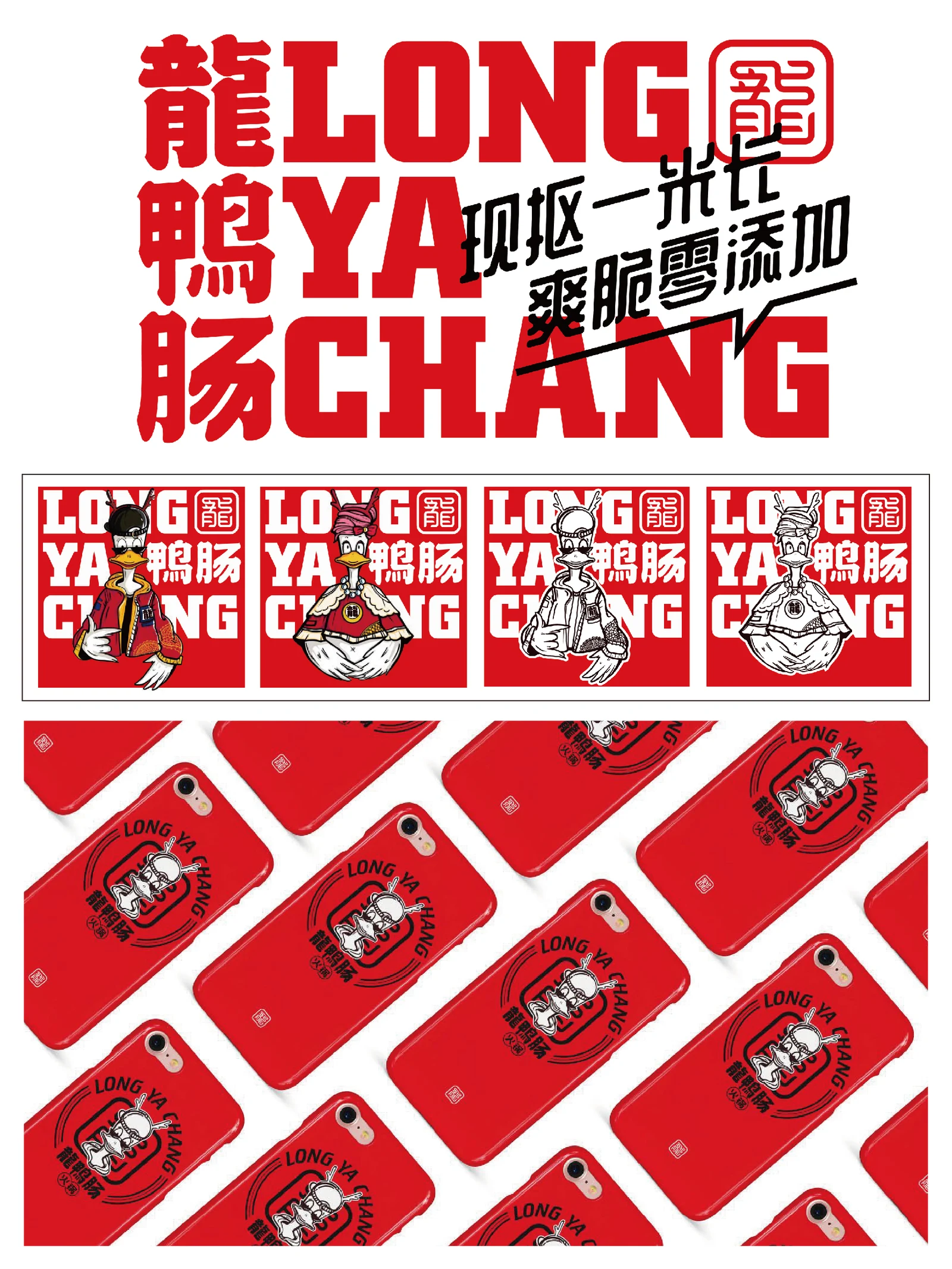
Long Yachang's project centres on dining, food and takeaway settings, using the product name and a duck character as shared points of recognition. Costume details, cloud motifs and a circular badge develop the character across food containers, takeaway cups and storefront signage, keeping the brand recognisable at different sizes and locations.
- Region
- China · Sichuan
- Industry
- Food and dining
- Scope
- Visual identity · Brand applications
- Project year
- —
AChallenge
The Long Yachang work combines prominent naming with a duck character for a food identity.
BThinking
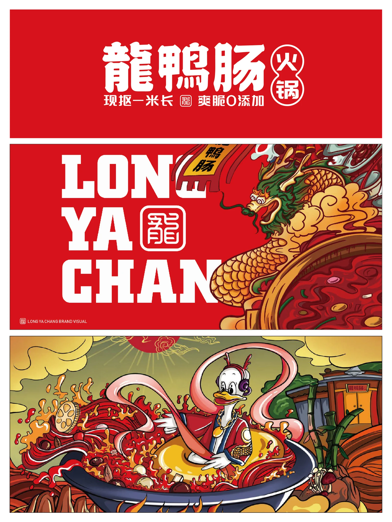
Costume details, clouds and curling lines add narrative elements, while circular badges adapt the character to smaller spaces.
CDesign
Bright red contrasts with black and white, and oversized LONG YA CHANG lettering recurs across layouts.
DApplication
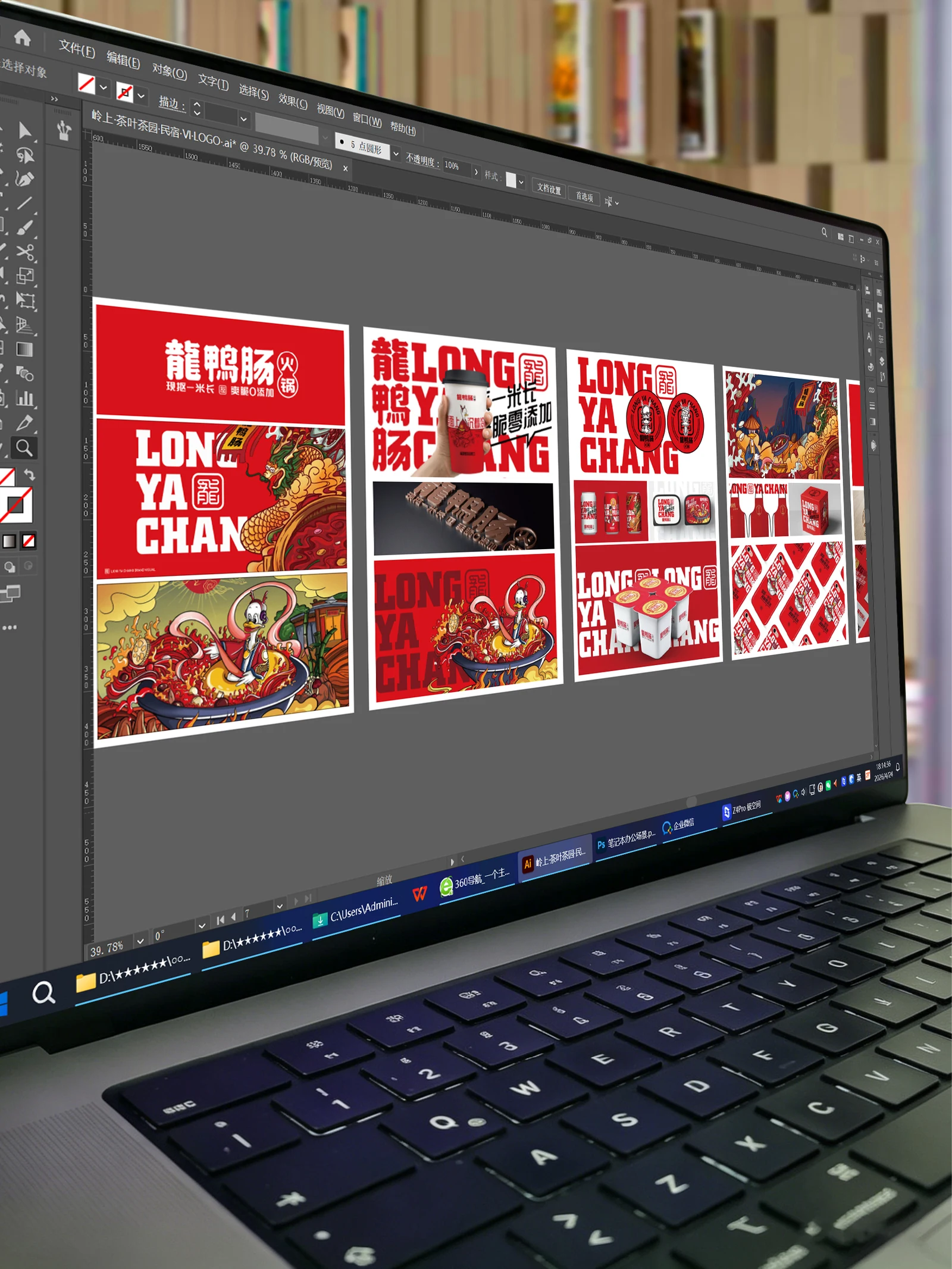
Takeaway cups, food containers, cards and signage show applications; promotional wording in the artwork is not treated as verified product testing.
ExploreExplore further
Contact
Tell us about your brand
Bring your existing materials and the problem you most want to solveWe will work out the next step together
ouryoung7943
Office
Room 1905, Unit 1, Building 1, North Gate, Yinhe Xijiang Hepan, No. 99 Qunhui North Road, Longquanyi District, Chengdu, Sichuan, China