
Sihong Economic Development Zone
Clear naming across economic-zone identity directions
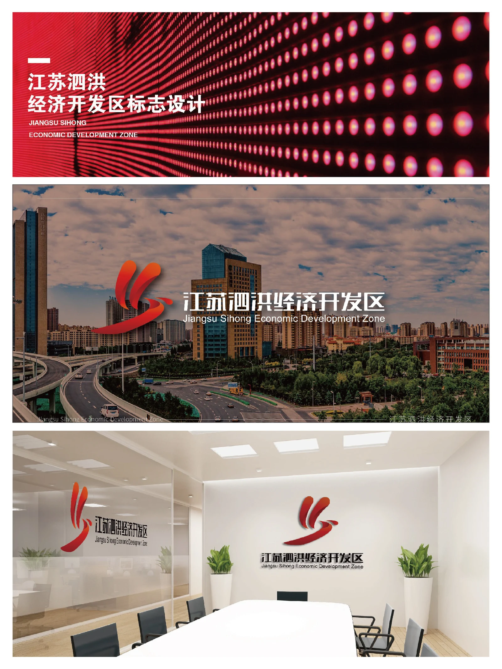
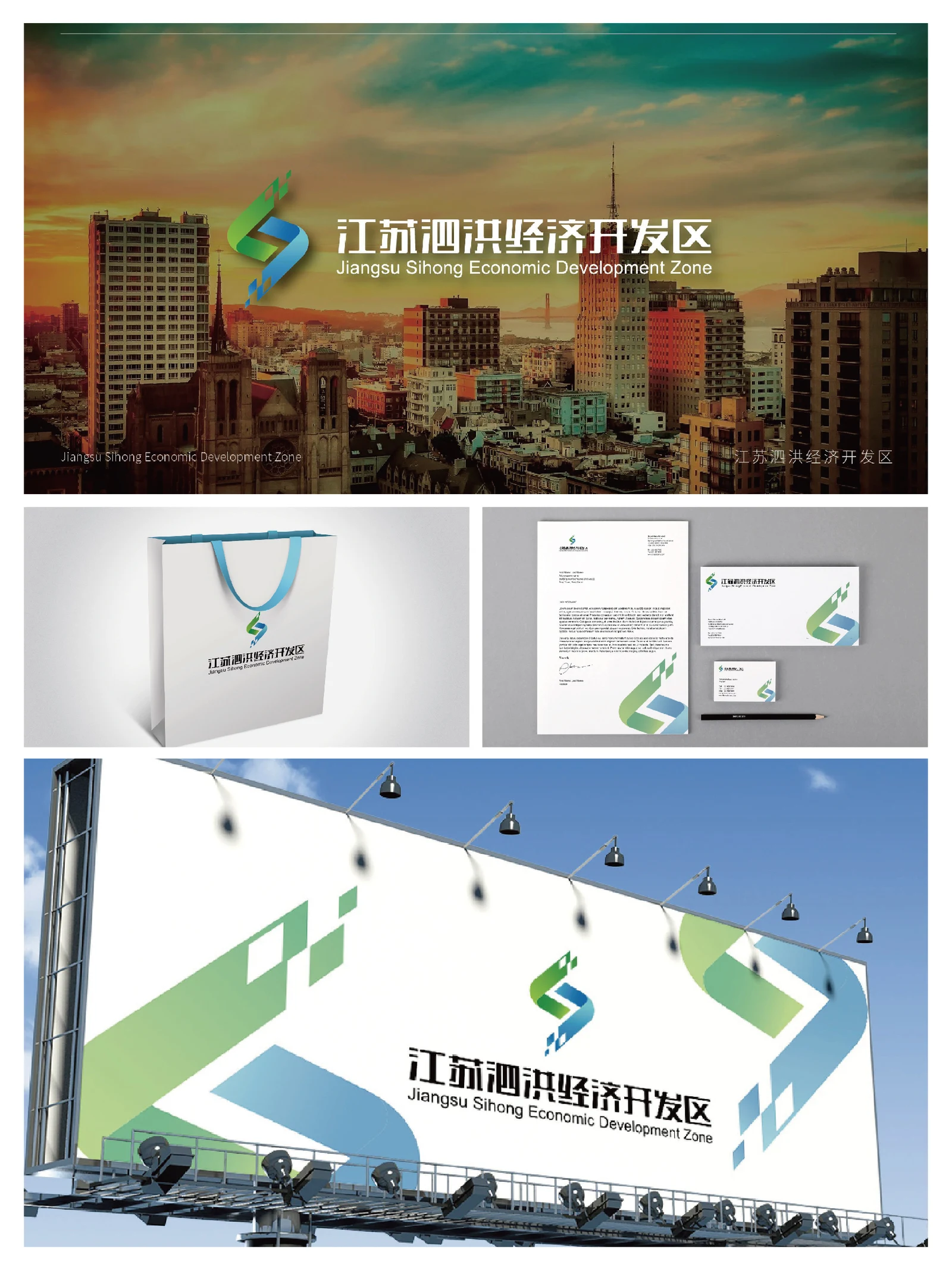
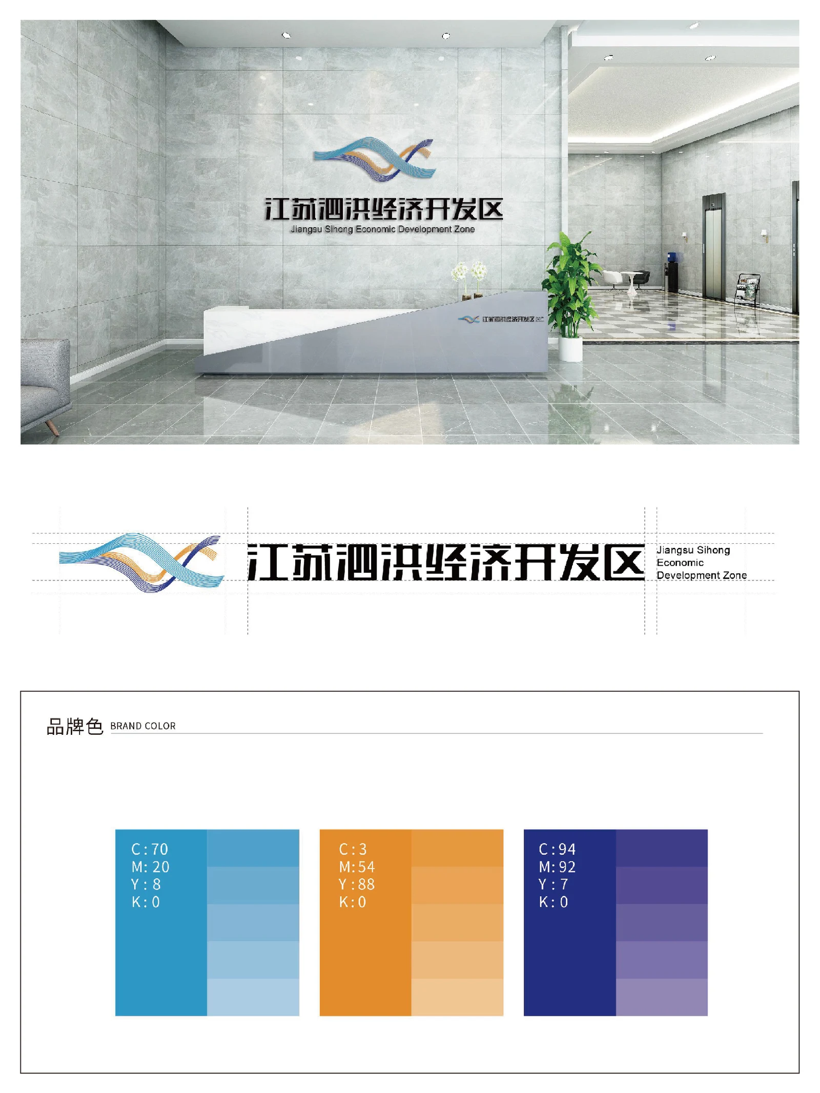
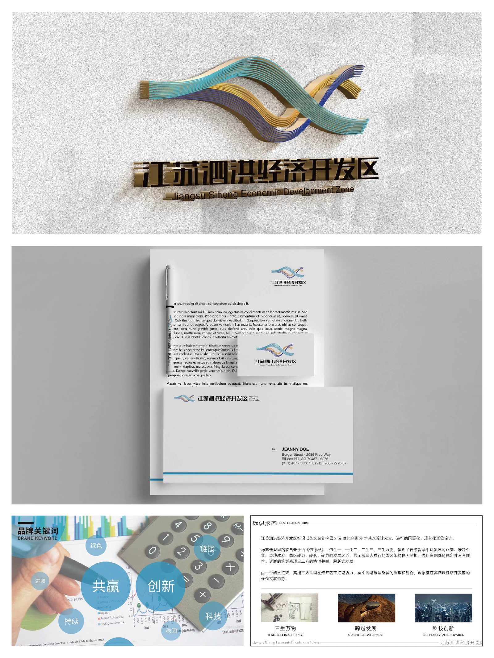
The Sihong Economic Development Zone project addresses visual communication for a development-zone institution, where the full name needs to appear clearly across documents, office materials and environmental displays. The collection retains several logo proposals, each exploring its own relationship between symbol and name across paper goods, covers and display imagery.
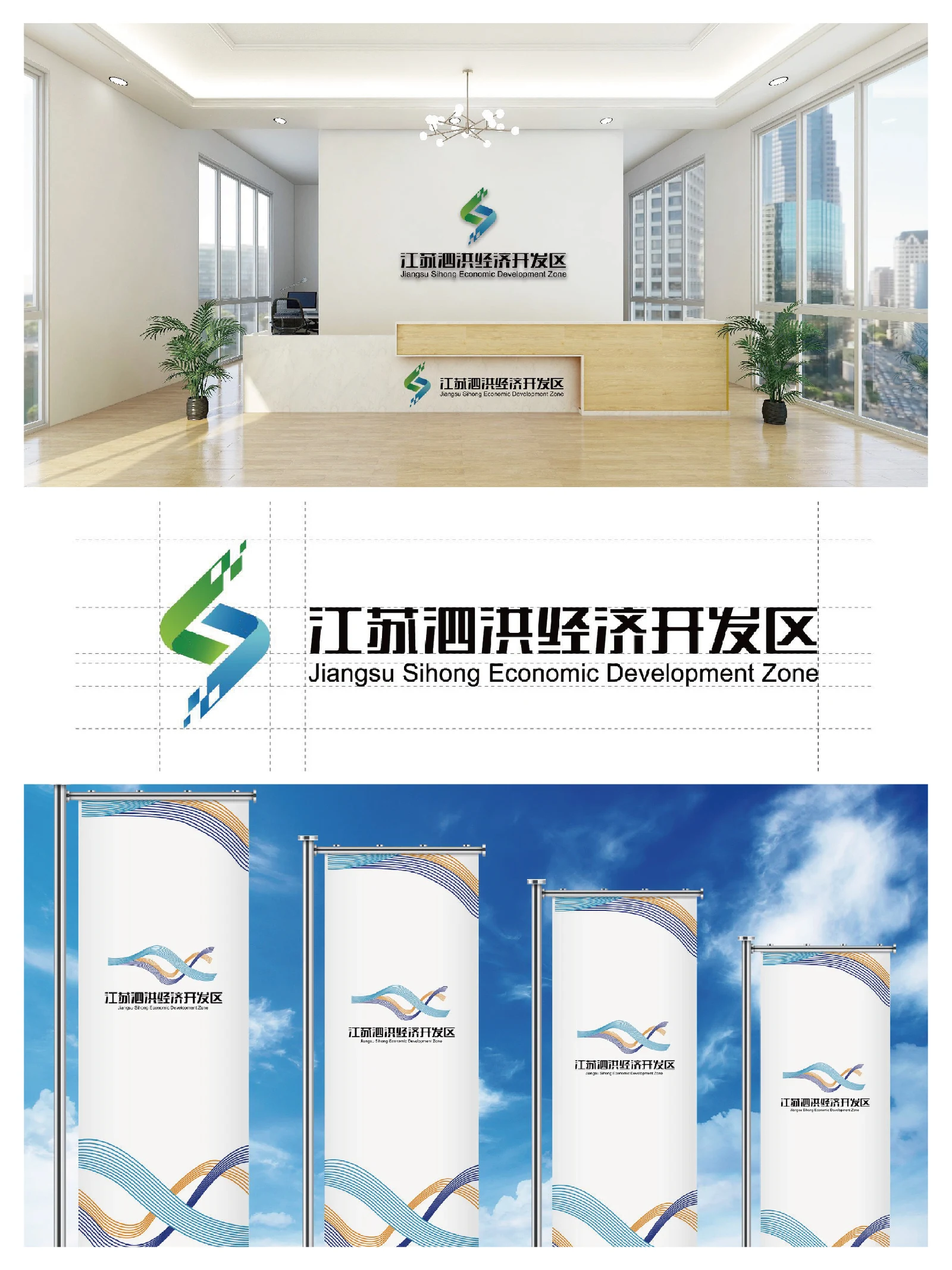
- Region
- Sihong, Jiangsu
- Industry
- Economic zone and public institution
- Scope
- Visual identity · Brand applications
- Project year
- —
AChallenge
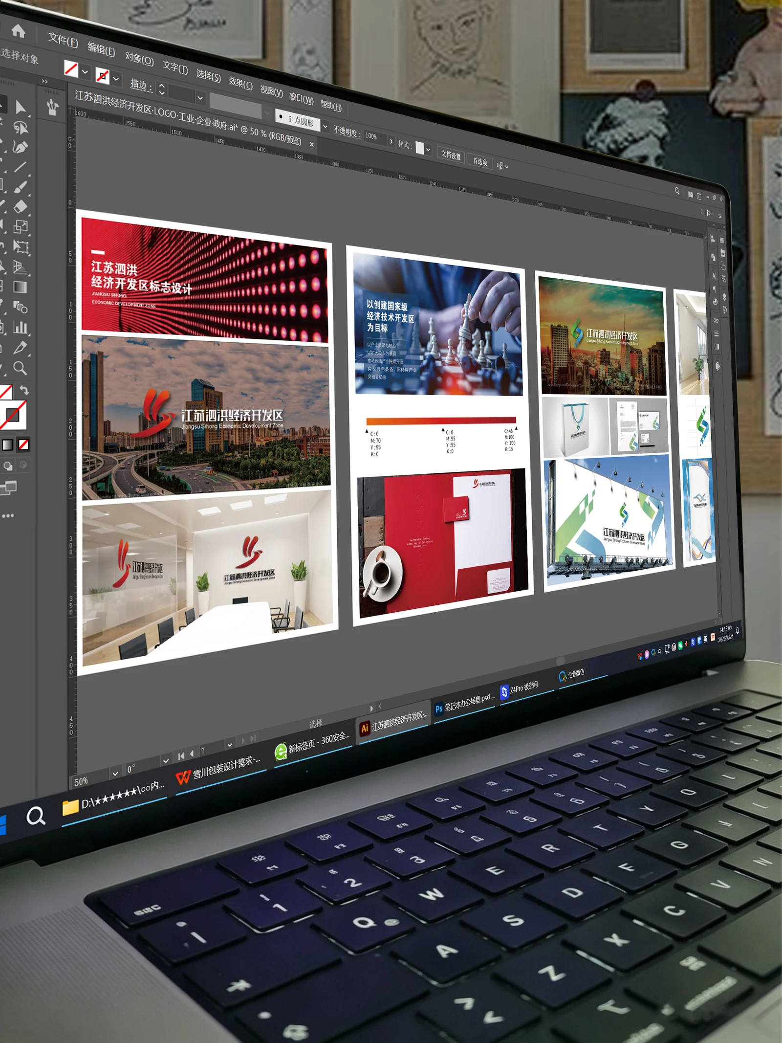
The Jiangsu Sihong Economic Development Zone presentation retains several identity directions with colour and application examples.
BThinking
Curved, faceted and flowing symbols are compared with a consistently readable institutional name.
CDesign
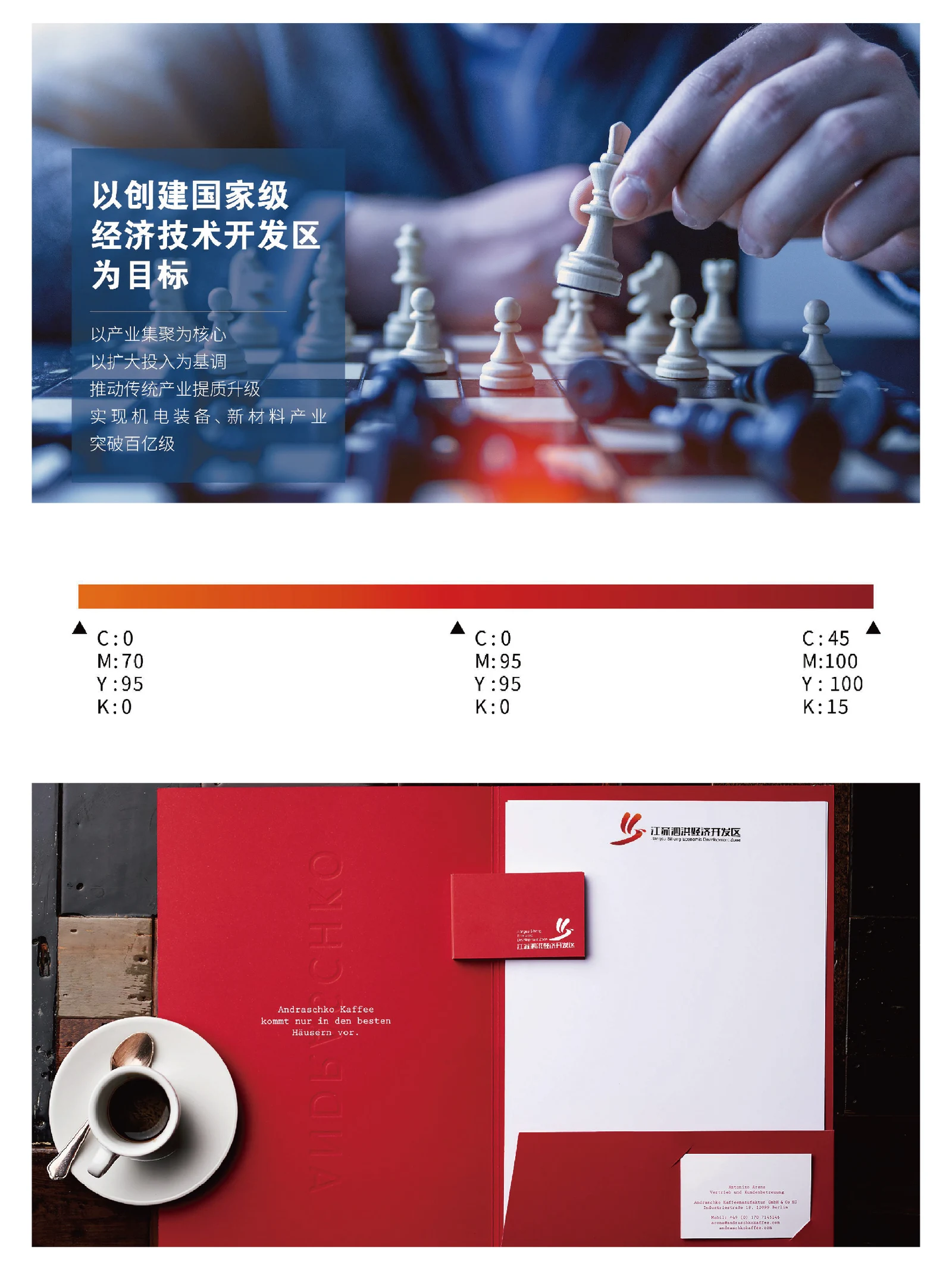
Red, blue-green and multicolour approaches remain separate proposals rather than one combined final standard.
DApplication
Stationery, covers, bags, outdoor graphics and reception visuals show application scales. Historical development goals are not presented as current administrative status.
ExploreExplore further
Contact
Tell us about your brand
Bring your existing materials and the problem you most want to solveWe will work out the next step together
ouryoung7943
Office
Room 1905, Unit 1, Building 1, North Gate, Yinhe Xijiang Hepan, No. 99 Qunhui North Road, Longquanyi District, Chengdu, Sichuan, China