
Weijian
Repeated lines as a spatial-design identity
- Industry
- Spatial design
- Scope
- Visual identity · Brand applications
AChallenge The task
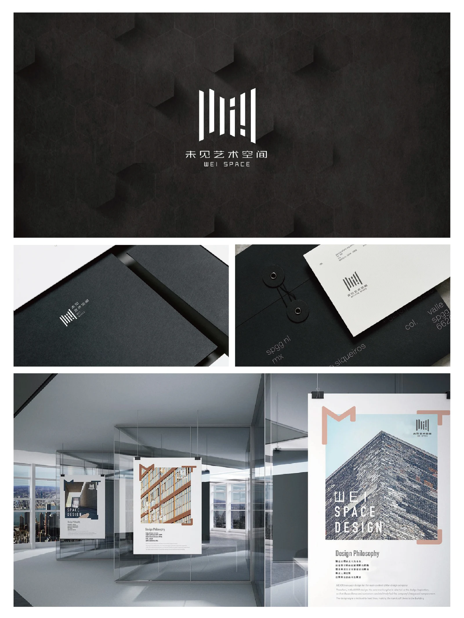
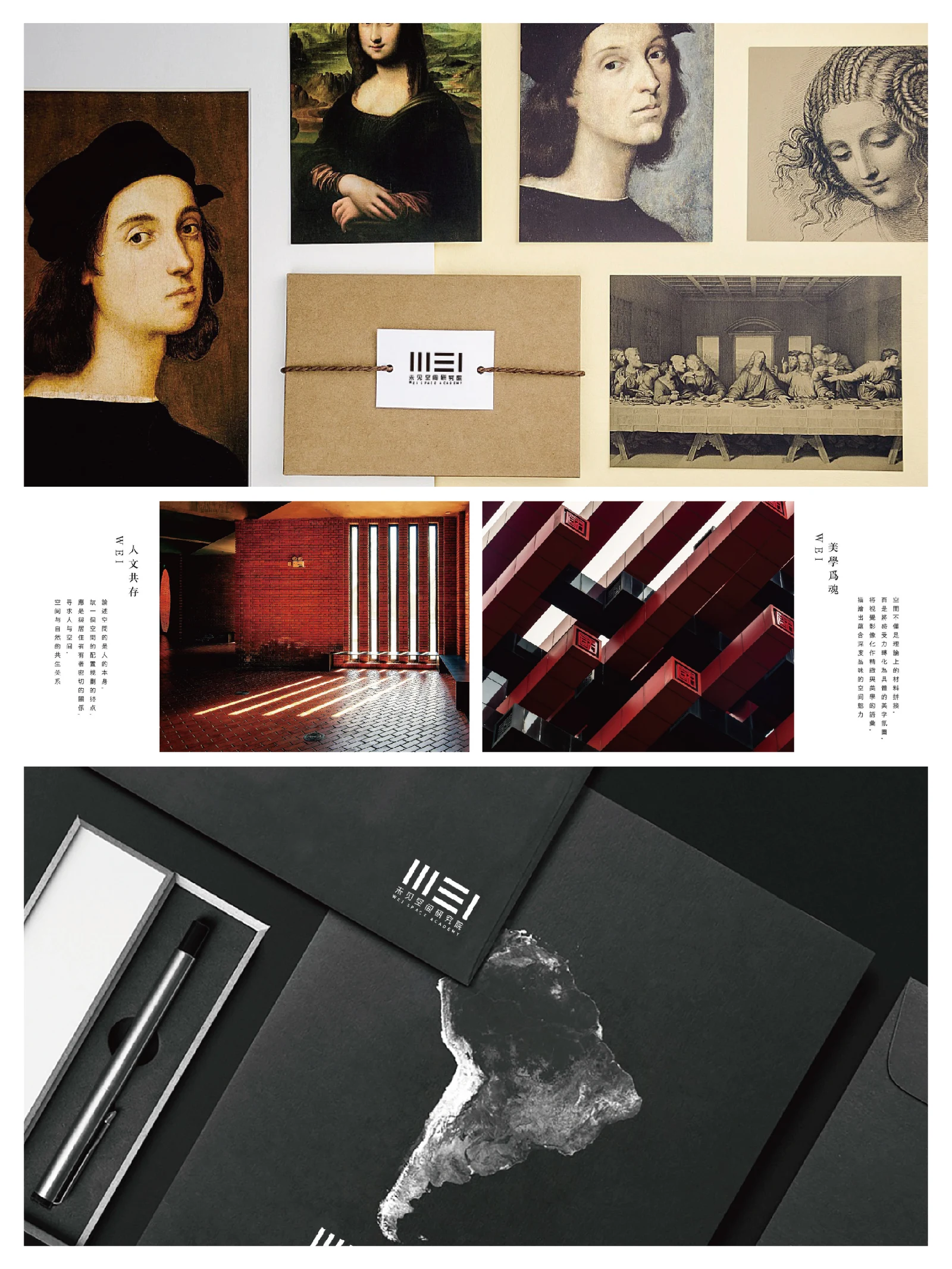
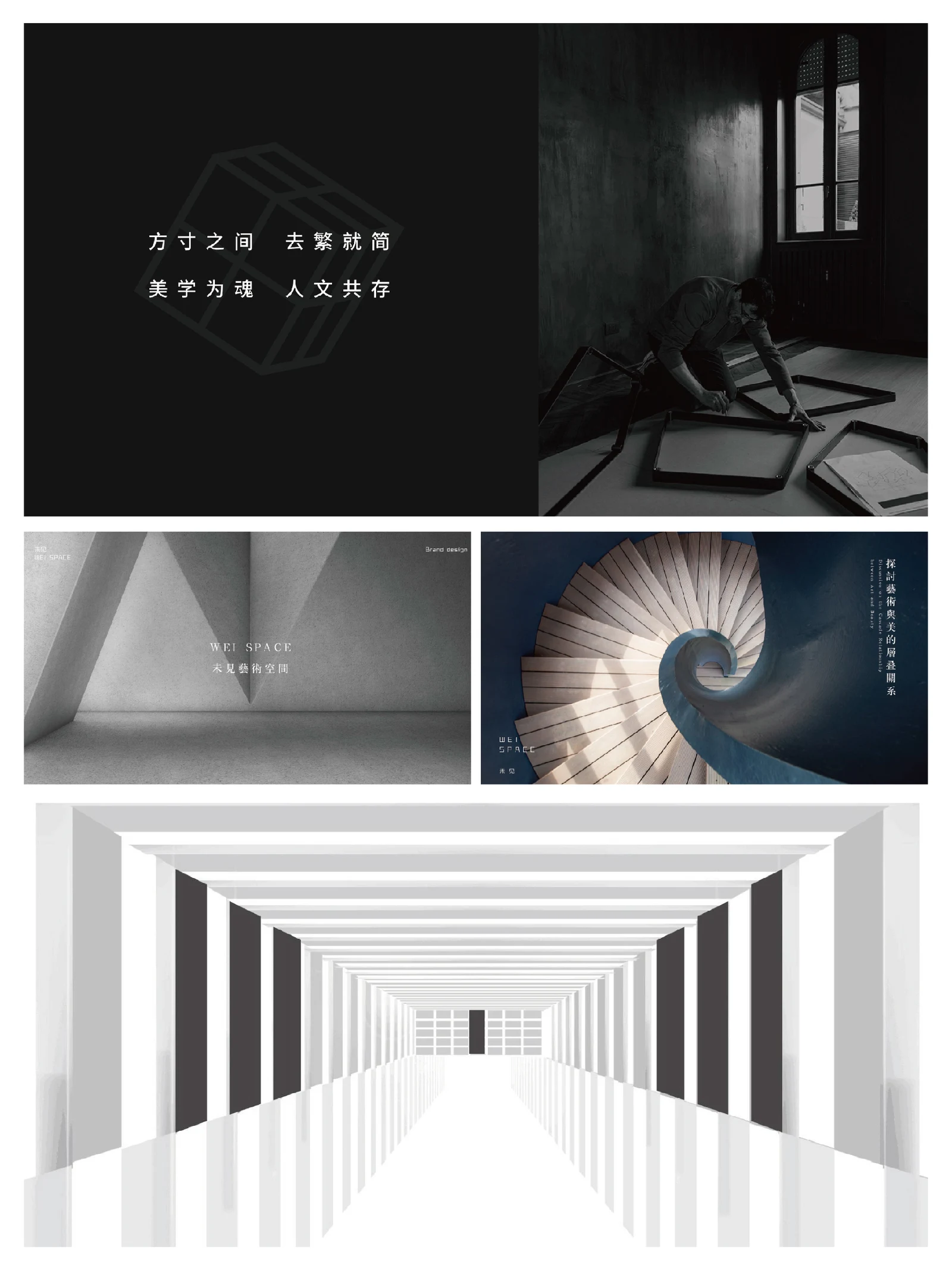
The Weijian proposal uses architecture, light and exhibition imagery to present an art and spatial-design identity.
BThinking The key decision
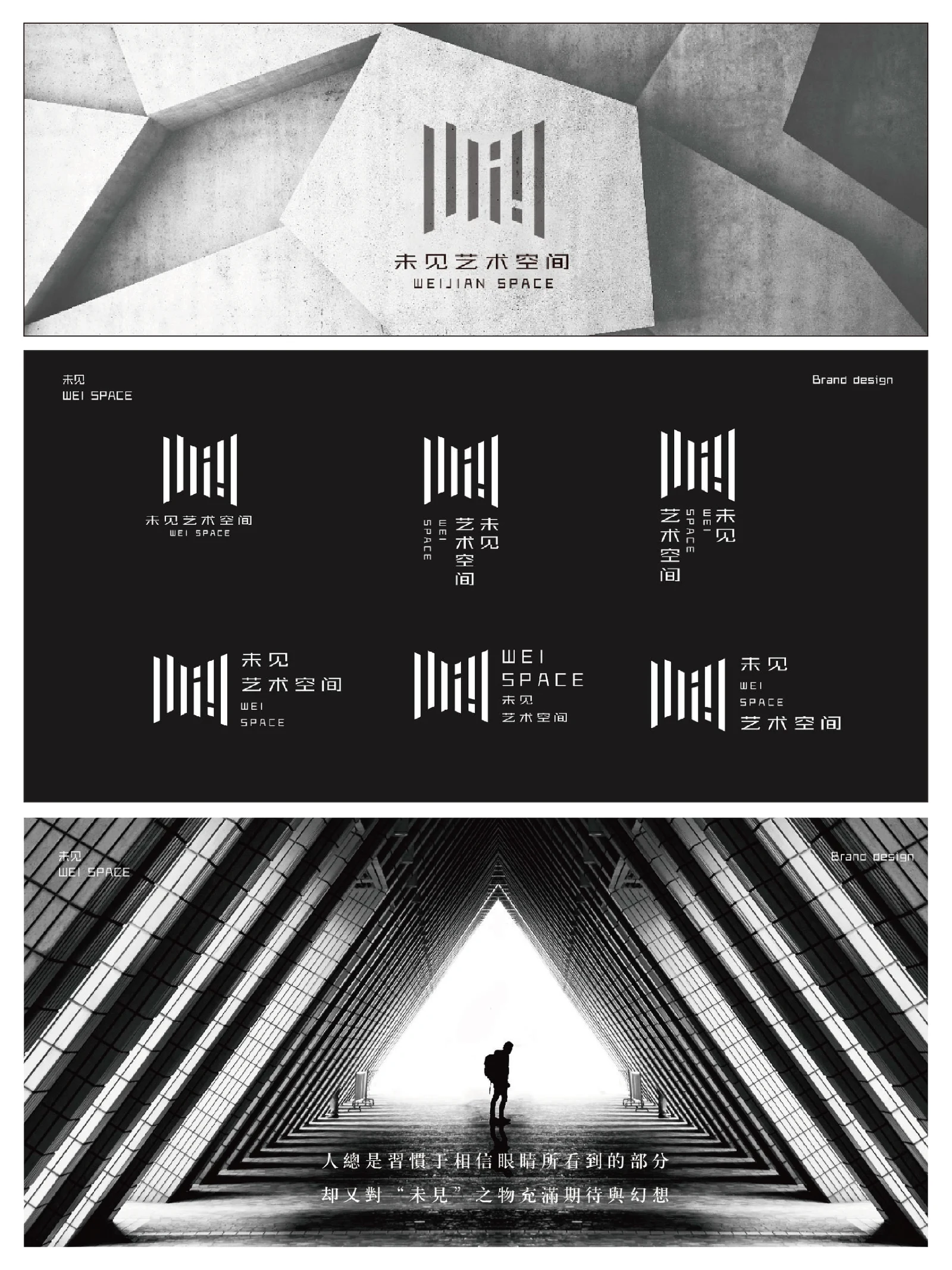
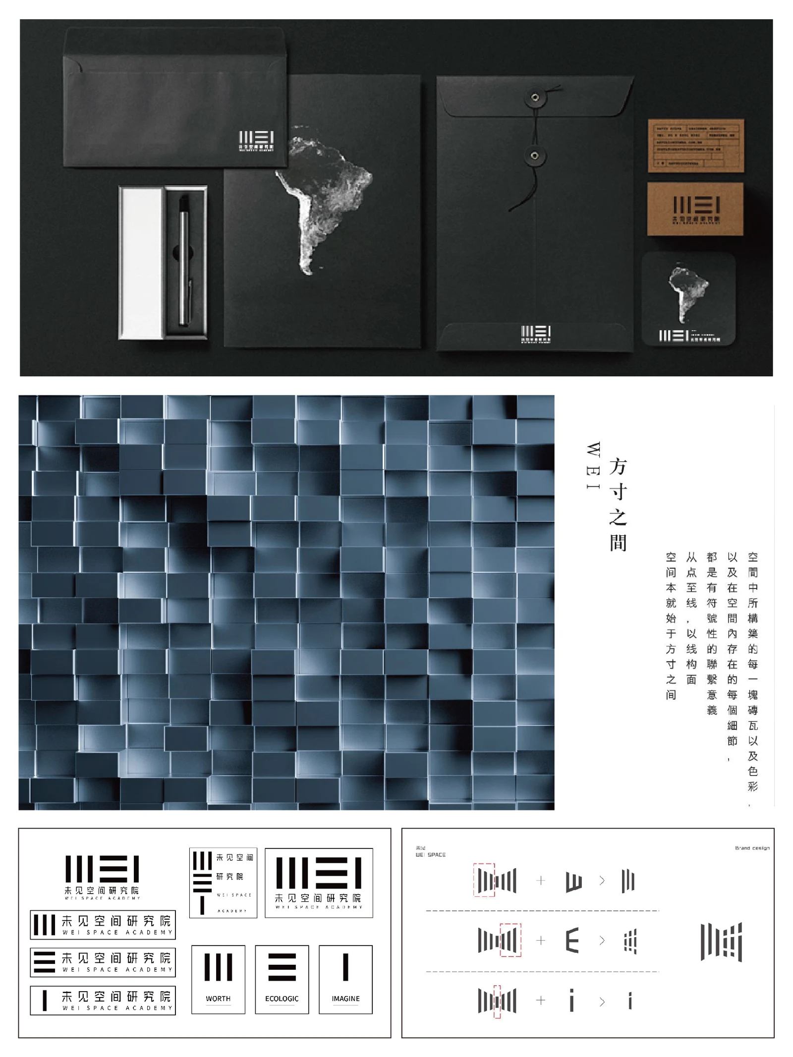
Repeated vertical strokes and gaps create a mark usable on both small documents and larger spatial graphics.
CDesign Content & visual work
Black, white and dark grey emphasise rhythm, density and structural form, supported by restrained lettering.
DApplication Applications & delivery
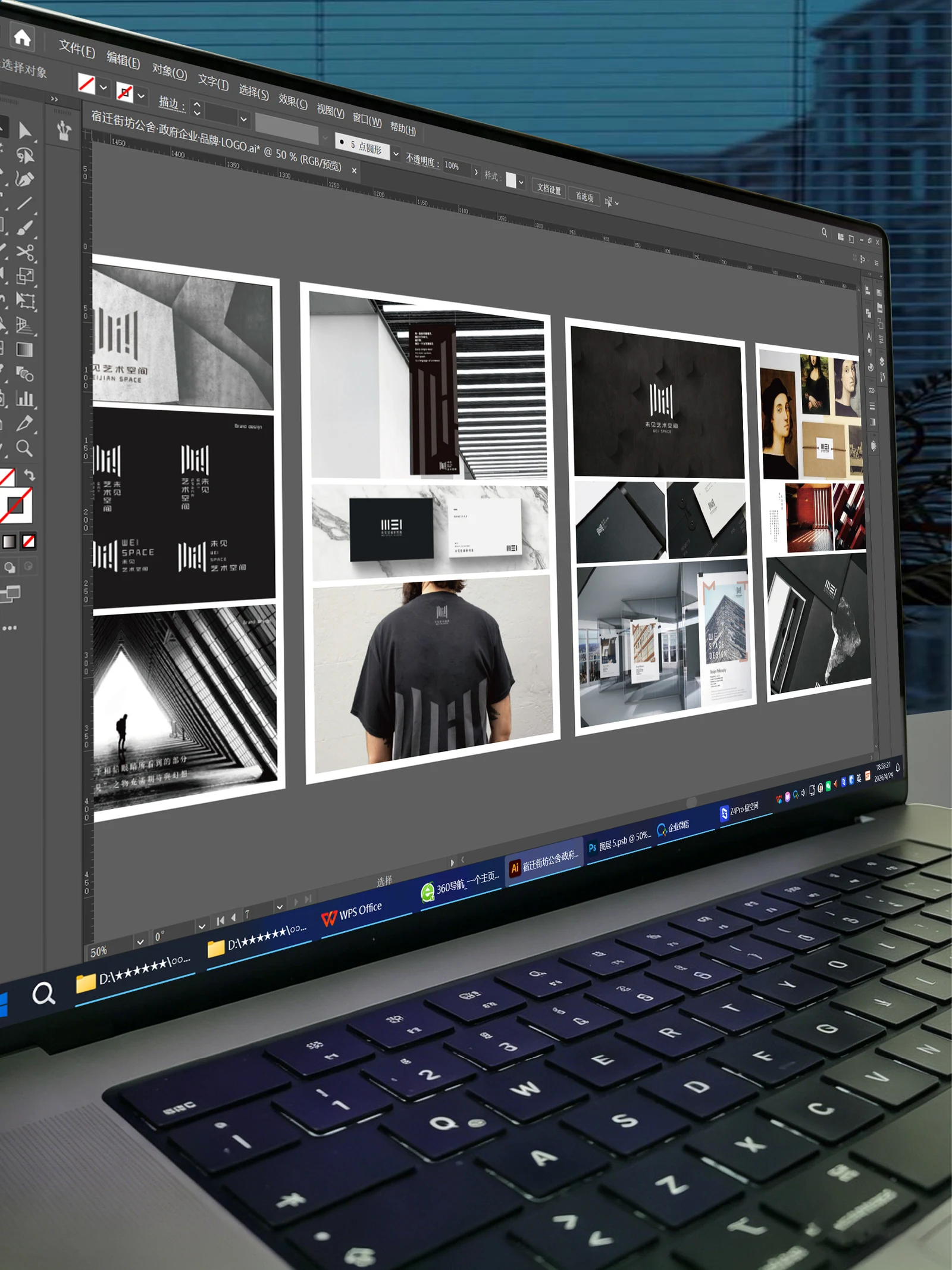
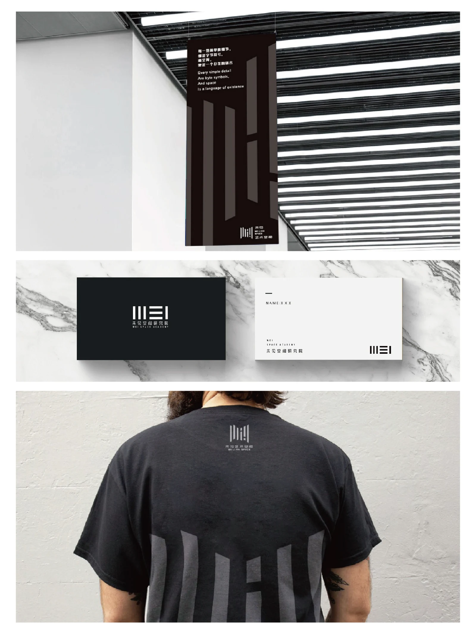
Cards, folders, clothing, posters and exhibition applications extend the system. Spatial imagery is not a construction-delivery record.
Explore Explore further
Contact
Tell us about your brand
A new brand, an existing brand that needs a clearer direction, or a specific design task: it can start with a conversation.
ouryoung7943
Office
Room 1905, Unit 1, Xijiang Hepan, Chengluo Avenue, Longquanyi District, Chengdu, China