
SnowValley · Range overview
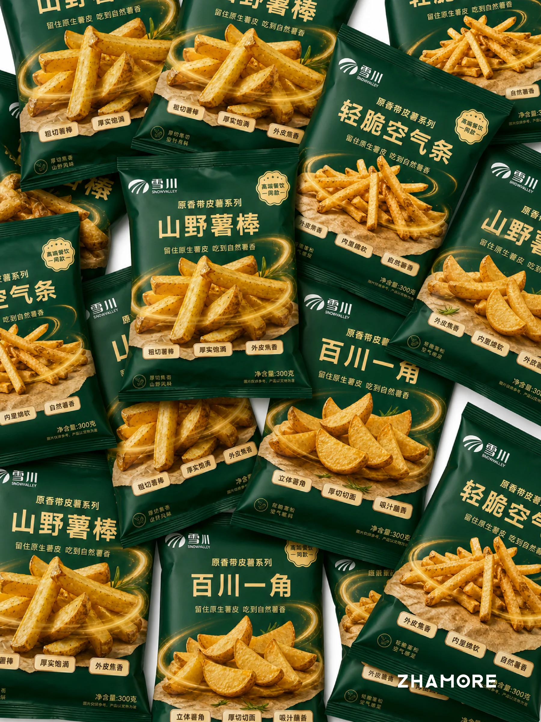
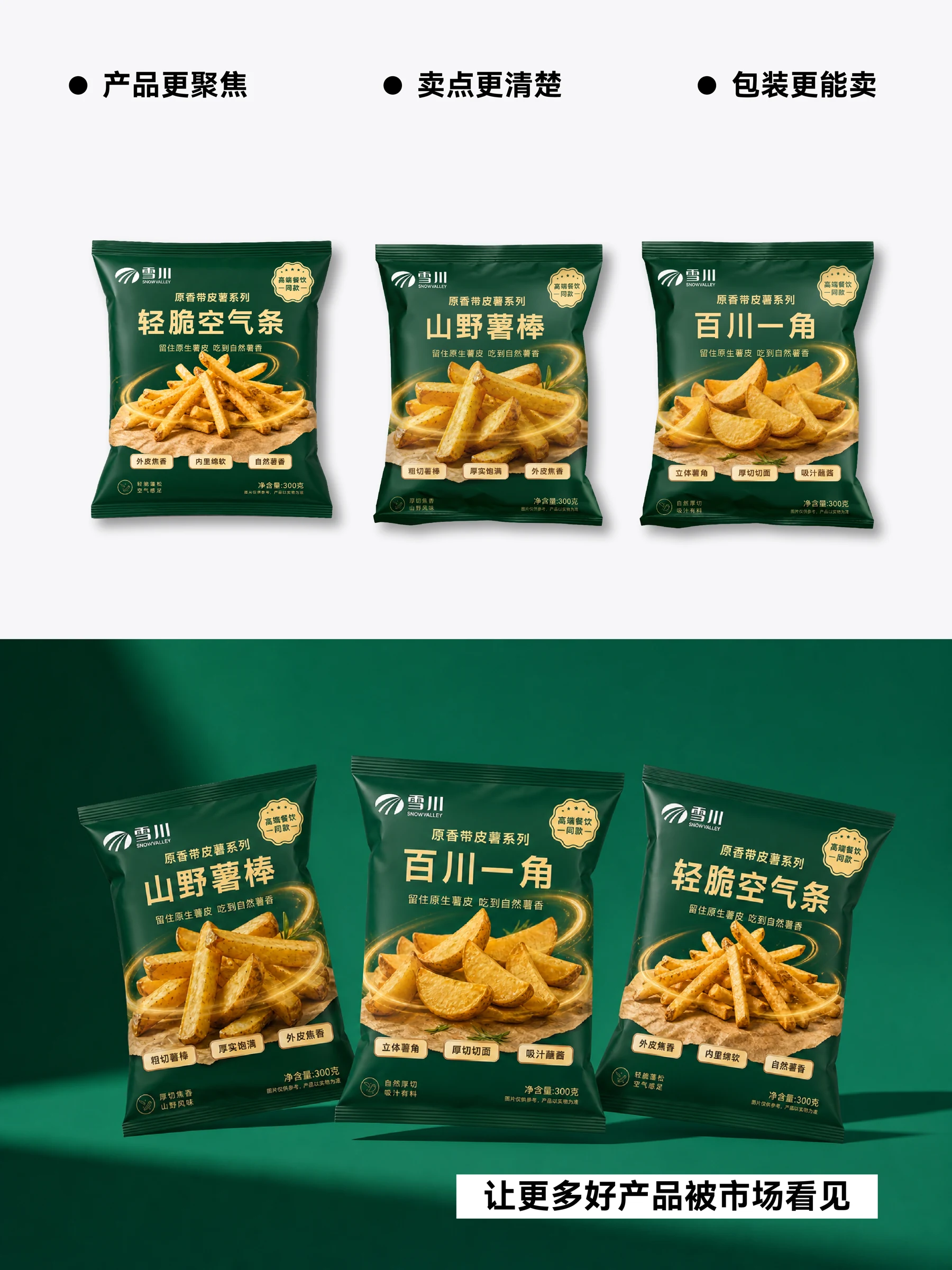
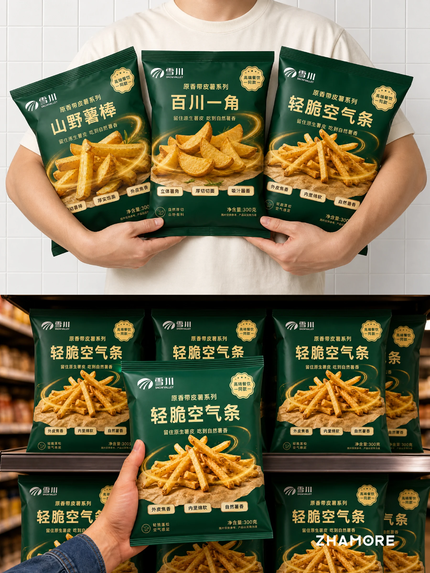
SnowValley’s packaging needs to make the range recognisable while giving each product a distinct identity. We organised names, texture messages and front-of-pack information around the character of skin-on potatoes, helping shoppers understand the different cuts and remember each product. This overview presents the three-product skin-on range and links to the separate Wheat Crisps and Colorful Potato Crisps packaging projects
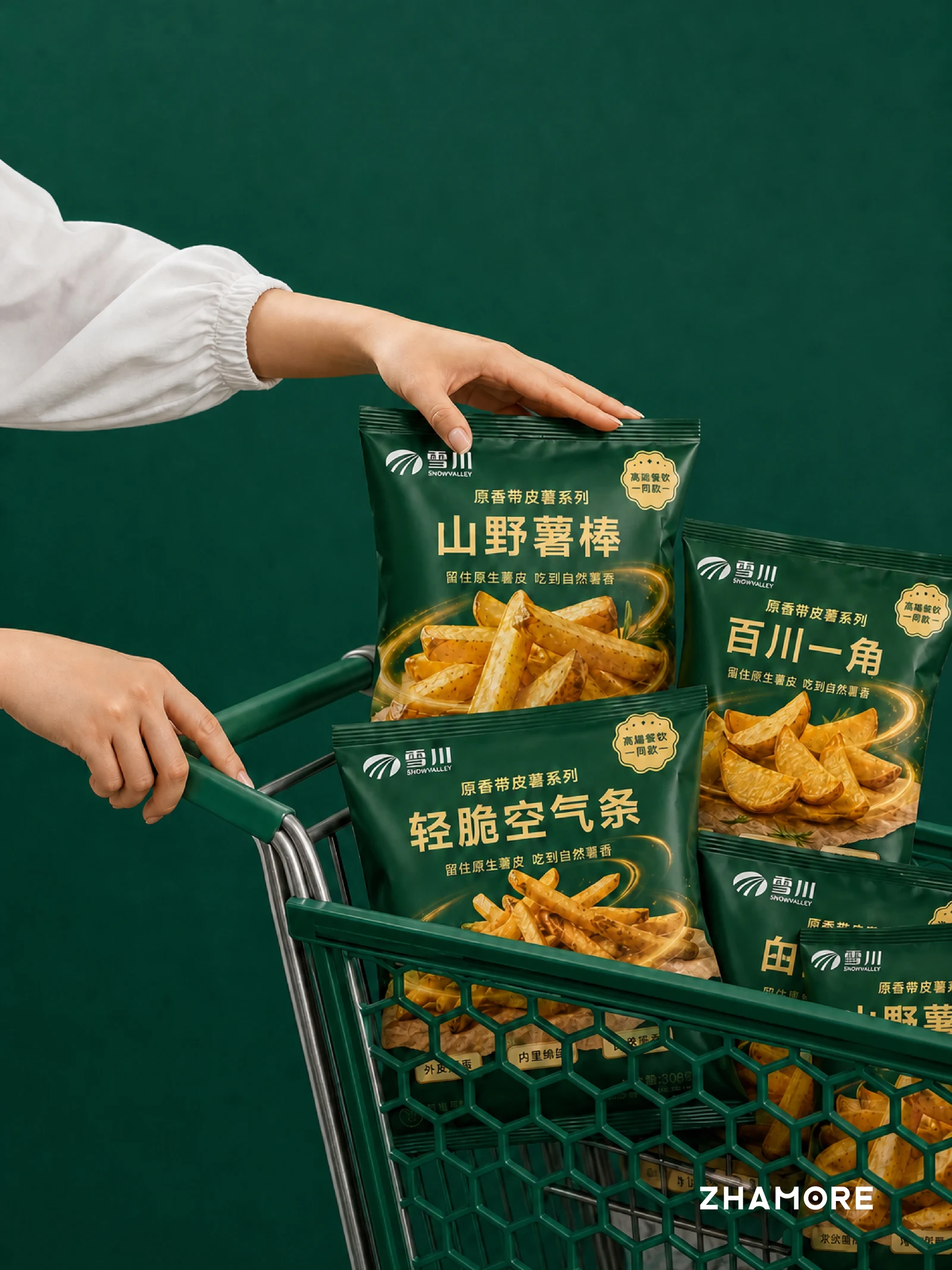
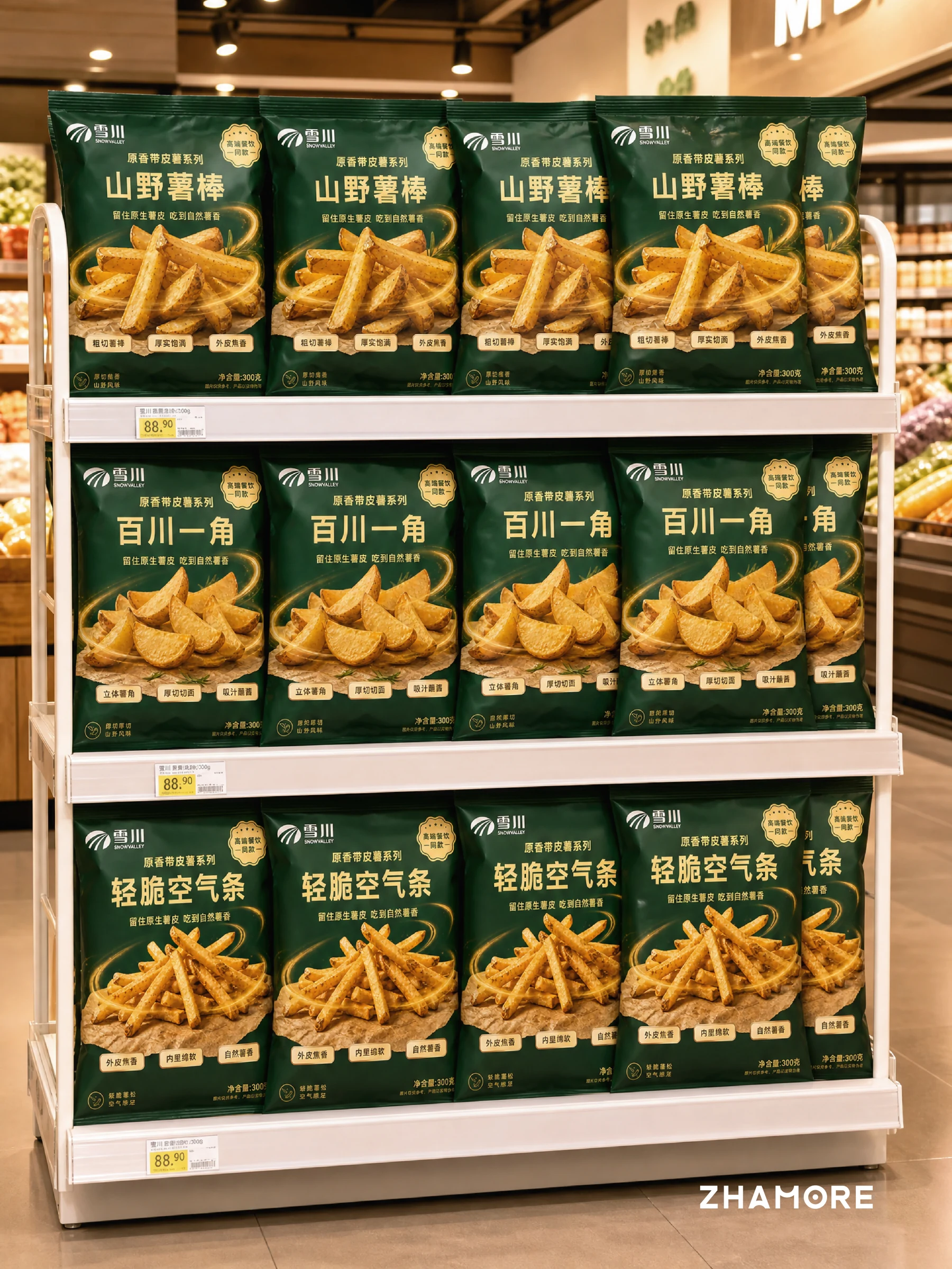
This SnowValley packaging project focuses on potato products, organising a shared identity for the skin-on range while distinguishing different cuts. Air Fries, Rustic Potato Sticks and Potato Wedges represent fine fries, coarse fries and thick-cut wedges. The overview connects these three products and leads to the separate Mai Xiang Cui and Colorful Potato Crisps designs.
Brand highlights
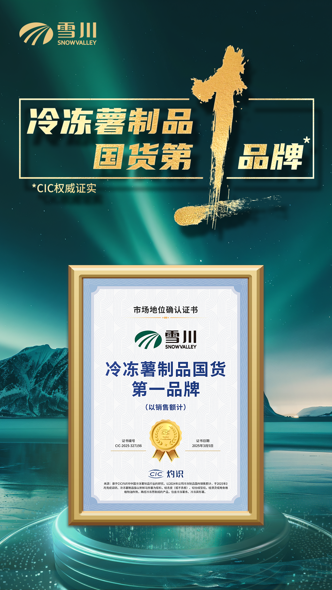
- No. 1 Chinese Brand in Frozen Potato Products
By 2024 sales revenue in China · CIC market position certification
- Best Quality Supply Chain
2024
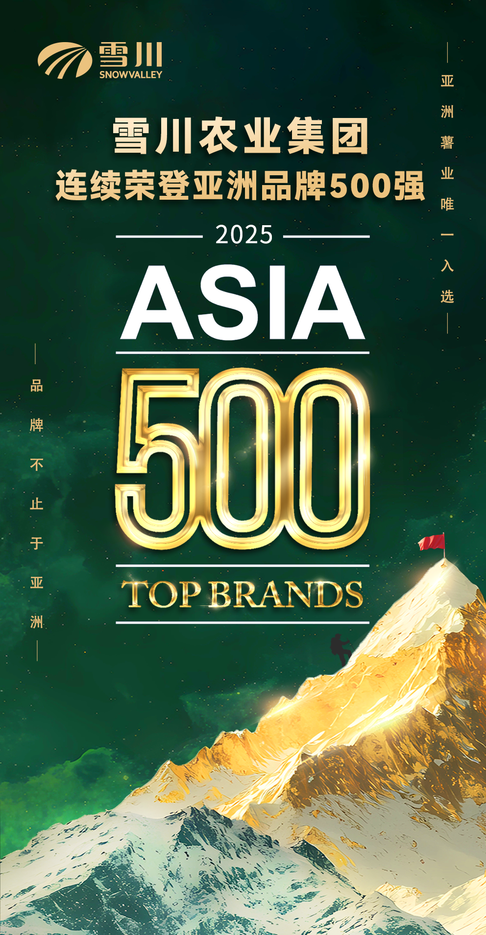
- Asia’s Top 500 Brands
2025
- China’s Top 500 Brands
2025
- China New Food Ingredients Category Champion
2025 · Frozen potato products
- Region
- Zhangjiakou, Hebei
- Industry
- Potato product packaging
- Scope
- Packaging strategy · Visual design · Series applications
- Project year
- —
Series Identity
The skin-on range needs a shared identity before shoppers can understand the differences between its three products. Consistent brand placement, a series name and a common flavour message connect the packs. Skin-on character and golden product imagery bring recognition and appetite together on the front
Product Distinction
Air Fries, Rustic Potato Sticks and Potato Wedges correspond to extra-thin fries, thick-cut fries and wedges. Memorable product names work alongside descriptive cut names. Distinct texture messages—light and airy, thick-cut and roasted, or substantial and suited to dipping—help shoppers choose within the range
Information Hierarchy
The front is organised around brand, range, product name and texture cues. “Keep the original potato skin, enjoy the natural potato flavour” carries the shared message, while each pack adds its own eating cues. Imagery shows the cut first; words explain the difference without competing for attention
Visual Application
Deep green contrasts with golden potato imagery, while a woodgrain direction evokes a natural ingredient feel. The packs share an identity structure but retain distinct names and product images across range displays and shopping scenes. Wheat Crisps and Colorful Potato Crisps have separate cases explaining their own approaches
ExploreExplore further
Contact
Tell us about your brand
Bring your existing materials and the problem you most want to solveWe will work out the next step together
ouryoung7943
Office
Room 1905, Unit 1, Building 1, North Gate, Yinhe Xijiang Hepan, No. 99 Qunhui North Road, Longquanyi District, Chengdu, Sichuan, China